- Looker & Looker Studio
- Looker Forums
- Exploring & Curating Data
- Help needed with Drill Up/Down
- Subscribe to RSS Feed
- Mark Topic as New
- Mark Topic as Read
- Float this Topic for Current User
- Bookmark
- Subscribe
- Mute
- Printer Friendly Page
- Mark as New
- Bookmark
- Subscribe
- Mute
- Subscribe to RSS Feed
- Permalink
- Report Inappropriate Content
- Mark as New
- Bookmark
- Subscribe
- Mute
- Subscribe to RSS Feed
- Permalink
- Report Inappropriate Content
Hi all. I've been working with GLS for a few months and I've hit a bit of a wall with my understanding.
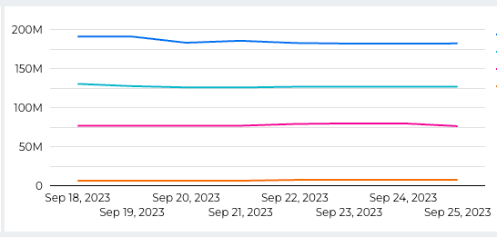
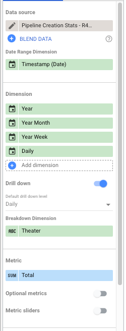
I have a source of data that shows sales opportunities, including data about which partners are involved with each deal. I need to show the sum of values by partner (which works perfectly well) and show how this has changed over time (also works). I'm getting a fresh copy of data for every day of the week, this allows me to see what has changed, and when - it also means that if an opportunity exists for 7 days, it's in the data source 7 times. When I show a graph using the "snapshot" as the time/date, I get everything I want.
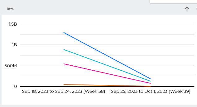
When I want to drill up, to show per-week or per-month stats, it shows 7x or 28x the value (as it's cumulating every day/week). I think what I need is to change the metric when drilling up, such that it shows an average for that period, not a total - I just can't work out how to do this, without breaking the graphs when I'm looking at the daily figures. I don't want an average on the deals, as I don't want to know the average deal value, I want to know the total for every day, and then the average of these totals for the week/month. Does this make sense?


I guess I've got a structural problem with how I'm working with the data, I just don't know how to achieve what I want to see. I don't want to lose the granularity in my source, as I need to see how individual opportunities can affect the overall number. Any advice gratefully received!
- Labels:
-
Dashboards
-
access grant
4 -
actionhub
9 -
Actions
14 -
Admin
4 -
alert
29 -
Analytics
2 -
Analytics Block
56 -
API
12 -
bar
10 -
bestpractice
4 -
BigQuery
8 -
blocks
1 -
boards
4 -
Bug
168 -
cache
2 -
case
2 -
chart
17 -
cohort
1 -
connection
5 -
connection database
1 -
content access
1 -
content-validator
2 -
count
6 -
custom dimension
9 -
custom field
19 -
custom measure
8 -
customdimension
9 -
Dashboards
922 -
Data
5 -
Data Sources
4 -
data tab
4 -
Database
5 -
datagroup
2 -
date-formatting
14 -
dates
18 -
derivedtable
1 -
develop
1 -
development
3 -
dimension
17 -
done
8 -
download
19 -
downloading
9 -
drill-down
1 -
drilling
30 -
dynamic
1 -
embed
10 -
Errors
13 -
etl
1 -
explore
84 -
Explores
271 -
extends
1 -
feature-requests
10 -
filed
3 -
Filter
245 -
Filtering
191 -
folders
4 -
formatting
19 -
git
2 -
Google Data Studio
1 -
Google Sheets
2 -
googlesheets
7 -
graph
9 -
group by
6 -
html
12 -
i__looker
1 -
imported project
2 -
Integrations
4 -
javascript
2 -
join
2 -
json
3 -
label
4 -
line chart
17 -
link
5 -
links
3 -
liquid
22 -
Looker
6 -
Looker Studio Pro
78 -
LookerStudio
7 -
LookML
169 -
lookml dashboard
15 -
looks
290 -
manage projects
1 -
map
30 -
map_layer
5 -
Marketplace
4 -
measure
4 -
Memorystore for Memcached
1 -
merge
14 -
model
3 -
modeling
2 -
multiple select
1 -
ndt
1 -
parameter
11 -
pdf
8 -
pdt
8 -
Performance
7 -
periodoverperiod
5 -
permission management
1 -
persistence
1 -
pivot
21 -
postgresql
1 -
python
2 -
pythonsdk
2 -
Query
3 -
quickstart
4 -
ReactJS
1 -
redshift
4 -
release
16 -
rendering
8 -
Reporting
10 -
schedule
51 -
schedule delivery
5 -
sdk
1 -
Security
4 -
sharing
2 -
singlevalue
16 -
snowflake
3 -
SQL
24 -
SSO
1 -
stacked chart
10 -
System Activity
5 -
table chart
16 -
tablecalcs
144 -
Tile
12 -
time
8 -
time zone
3 -
totals
13 -
Training
1 -
Ui
19 -
usage
4 -
user access management
3 -
user management
3 -
user-attributes
6 -
value_format
4 -
view
4 -
Views
4 -
Visualizations
558 -
watch
1 -
webhook
2
- « Previous
- Next »

 Twitter