- AppSheet
- Release Notes & Announcements
- Announcements
- Re: Desktop changes coming to Preview Program
- Subscribe to RSS Feed
- Mark Topic as New
- Mark Topic as Read
- Float this Topic for Current User
- Bookmark
- Subscribe
- Mute
- Printer Friendly Page
- Mark as New
- Bookmark
- Subscribe
- Mute
- Subscribe to RSS Feed
- Permalink
- Report Inappropriate Content
- Mark as New
- Bookmark
- Subscribe
- Mute
- Subscribe to RSS Feed
- Permalink
- Report Inappropriate Content
Not a brief post, but there’s a lot to touch upon. There will be further posts, as we develop, release and get feedback, but we wanted to let you know some things we’re up to. Still a lot in the works, and iteration…
TL:DR;
We’ve been researching and working on some patterns for desktop apps; these will start being released in the Preview Program, giving us some extensive use across variety of apps, and iterating along the way. We asked the community for some desktop use cases earlier this year as well.
The major desktop elements are discussed below:
- Navigation rail (aka sidebar) and top appbar changes
- Detail view developments:
- Using the expanded real estate for laying out dense content
- App bar patterns, such as breadcrumbs, action buttons, and sibling navigation controls
- Splitting and grouping content
- Collection views
- Open search
- Split view options
What’s not in motion at this time:
- Dashboards
- Forms
Here’s a high level overview and concept sketches of what we’re working on, and will be coming to the preview program:
1. New desktop element: Navigation rail (aka sidenav)
When AppSheet is being used on a desktop, we’re exposing the app views as a visible navigation rail on the left side of the viewport.
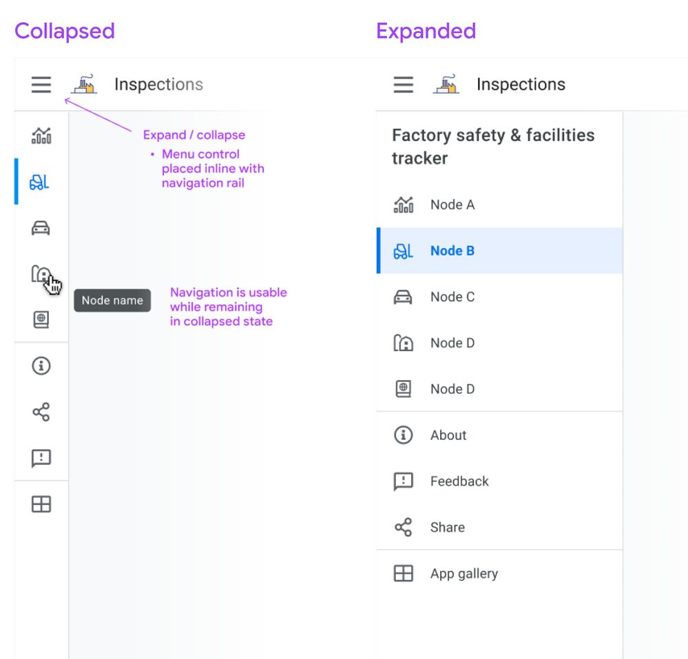
Besides being present at all times, we’d like you to be able to work with this in two modes: Collapsed or Expanded. Here’s a sketch:
Collapsed mode
When collapsed, you’ll see the icon associated with the view, and on hover you’ll see the view name in a tooltip. Collapsed means you can have more space dedicated to the content pane. Either mode is scrollable for apps with lots of views.
If you don’t show an app icon in your app bar, you’ll see the app icon (and the app name) when you expand the drawer, similar to what you see today on mobile.
Expanded mode
When expanded, it resembles the mobile navigation drawer you see today, except it occupies persistent space, i.e. the menu links are visible.
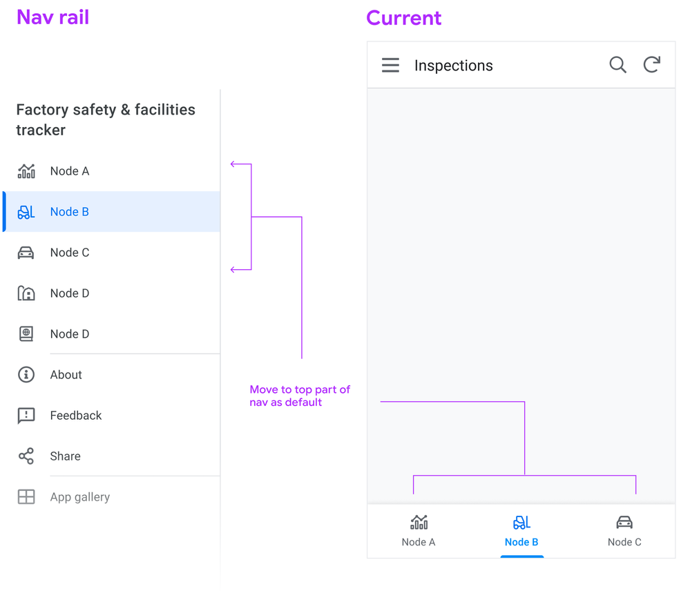
Moving the bottom app bar nodes into the navigation rail
Following a more standard desktop web app pattern, you won’t see the bottom app bar on desktop.
Tab nodes ⇒ Top of nav rail
This means we map the visible tabs on mobile to the top of the view list in the sidebar, putting them in the top position in the list:
Swapping menu and icon position
Another change we’re making is switching the position of the menu bars and the app logo (if you use one), so the menu control is directly aligned above the navigation links. Pressing the menu control toggles between Collapsed and Expanded states.
2. Detail view changes
We’re starting with detail views, as it’s one of the most important and potentially information dense, and currently it’s designed primarily for mobile.
We’re looking to use the available real estate afforded by desktop to break out the content into sections. These sections can be laid out across columns.
Let’s look at the basic structure:
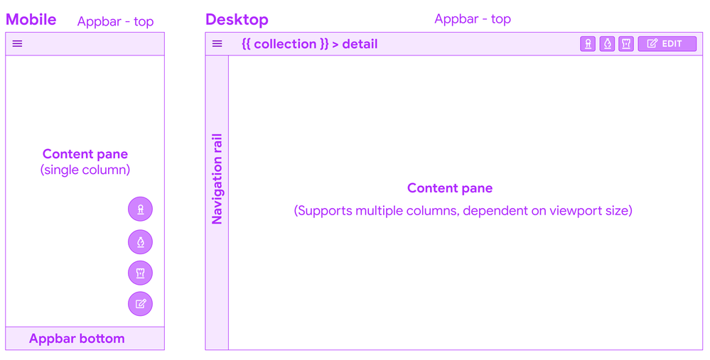
Appbar top - breadcrumbs
Starting from the top, you’ll see a a common pattern when you drill down into a detail from a collection: a (hierarchical) breadcrumb bar:

This means there’s one click up to the collection, and if a user lands in this view from a link, it’s clear what collection this instance belongs to.
Overlay buttons placement
The use of Overlay buttons (aka FAB: Material Floating Action Buttons) is a fairly standard mobile pattern. The core idea is that it’s for the ONE most important action, but AppSheet lets you add multiple.
Translated to the desktop, Material originally kept the floating overlays in the bottom right of the viewport, but after testing and research, transitioned to the top app bar, because of discoverability issues and content overlay. App creators we’ve interviewed have brought this issue to our attention.
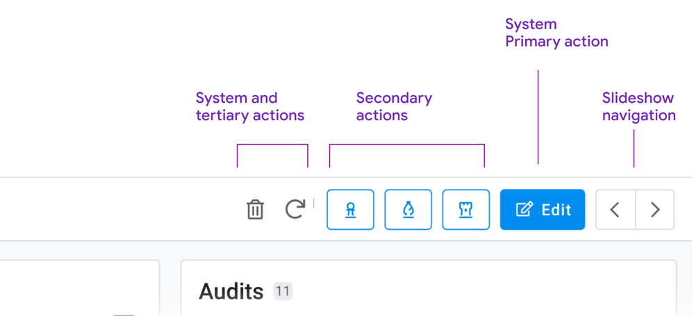
System action primary buttons will have a label
Right now, we’re starting with having the primary system action button, Edit appearing as a contained button with a label.
How to handle multiple overlay buttons?
The remaining overlay buttons take are displayed as secondary action buttons, and other system actions (delete, sync) remain as icon buttons, and all buttons will have tooltips as well:
Here’s a sketch of how we are structuring the top right of the app bar for Detail views:
Slideshow controls
For these, we’re moving to dedicated buttons for navigating sibling records. If you have to skim back and forth between records, the buttons are in a stable place, and close together. We’re also exploring (future) keyboard shortcuts to aid in sibling navigation: This can aid in quickly traversing records, and is effective for power users.
You may have seen this pattern before: We’re currently using it for detail views in dashboards:

Consolidating interaction patterns when possible is part of a larger push.
Content: Sections, columns, and flow
Right now, detail views form one long strip of mostly undifferentiated content.
We’re working on a way of grouping these into the following types of sections.
- Primary
- Secondary: Properties (columns and their values)
- Inline lists
These sections can be ordered, and sections can be arranged into columns.
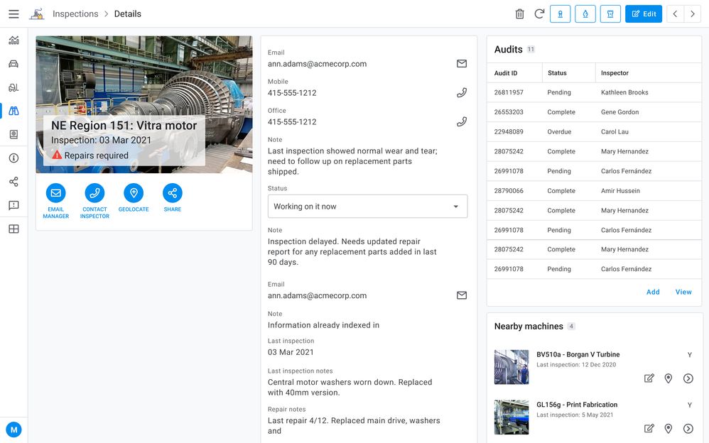
So a layout on a browser can form up to 3 columns, containing multiple sections.
Here’s an sketch of a detail view with 1. a primary section with an image and some overlay text, a medium amount of secondary properties, and 2 inline lists:
Primary section
Consider a ‘primary’ section (name may change for clarity) as including some of the following:
- Title (often the instance name from the label column)
- Any other headers
- An image
- Actions (Prominent Display actions as currently seen in mobile)
There are many permutations of headers, images, and both combined, currently in apps. There are combination of headers and images, just headers (up to 6), or the card layout.
Right now we’re giving any and all of these prominent placements in the upper left of the content pane when multicolumn layouts are in effect.
Together a primary section of content allows you to:
- See the instance and most important details (expressed as headers)
- Take relevant actions (Prominent display actions)
- View the image (when there is one)
Properties
Next are the remaining properties (columns) of the record. These can have tremendous variance: we have customer apps with anywhere from 5 - 70 plus properties represented in their detail views.
Tradeoffs: There will be some potentially large height differences in sections, simply due to how many properties a section contains.
Grouping properties
To start with these will default to a single section, and we want to empower you to break these into more groupings, and we’d like to allow you to use the SHOW type header as one means of doing so:
Ref lists
The third section type is inline views, such as ref lists. These form other individual sections.
3. Collection views
Next we have our collection views. Starting from the top:
Top app bar: Open search

Another common pattern is a visible search field. With large lists, a persistent field with a visible label provides a quick way to find items.
The other aspect is that the filter icon is visible, and can be accessed with a single click.
Split pane patterns: collection detail views
We notice that app creators are configuring interactive dashboards, setting up a table or similar collection, and adding a detail view. This is recreating the common collection - detail pattern (aka split pane or two-panel selector).
We’d like to allow app creators to configure a collection view to accommodate a split pane, no dashboard creation required. This will facilitate working in context, and avoiding jumping from collection to detail and back to collection. Here’s a concept sketch:
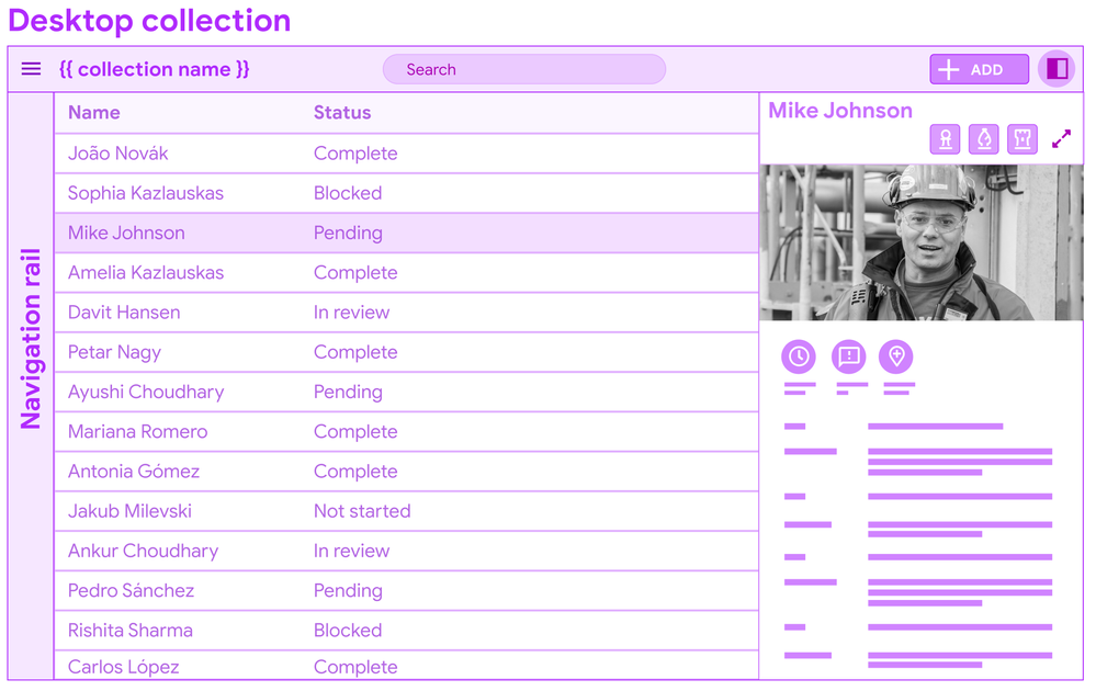
You’ll see this pattern in Gmail: users can invoke the split pane from an icon control, and a single click allows for viewing details.
I’m displaying a data table for the concept mock, but this pattern can apply to other forms of collections (cards).
In conclusion
It’s a long post, but we wanted to bundle this together to give you a heads up, and break down some of the core concepts and patterns. There’s a bunch of details we’ll dive into more in other posts.
We put out a call for desktop views and use cases earlier this year, and have gotten some excellent examples of dense data displays. We look forward to receiving more as we go forward.
Stay tuned for more specific details…There’s a lot of tuning to do, big and small.
- Labels:
-
UX
- Mark as New
- Bookmark
- Subscribe
- Mute
- Subscribe to RSS Feed
- Permalink
- Report Inappropriate Content
- Mark as New
- Bookmark
- Subscribe
- Mute
- Subscribe to RSS Feed
- Permalink
- Report Inappropriate Content
Do you mean, Appsheet Accept upload multiple files or images in the same time?
- Mark as New
- Bookmark
- Subscribe
- Mute
- Subscribe to RSS Feed
- Permalink
- Report Inappropriate Content
- Mark as New
- Bookmark
- Subscribe
- Mute
- Subscribe to RSS Feed
- Permalink
- Report Inappropriate Content
So close!
- Mark as New
- Bookmark
- Subscribe
- Mute
- Subscribe to RSS Feed
- Permalink
- Report Inappropriate Content
- Mark as New
- Bookmark
- Subscribe
- Mute
- Subscribe to RSS Feed
- Permalink
- Report Inappropriate Content
Looks like it will be very good.
My minor suggestion would be to provide variable width columns in table view, and/or wrapped text.
- Mark as New
- Bookmark
- Subscribe
- Mute
- Subscribe to RSS Feed
- Permalink
- Report Inappropriate Content
- Mark as New
- Bookmark
- Subscribe
- Mute
- Subscribe to RSS Feed
- Permalink
- Report Inappropriate Content
Are there Anynews today my brothers?
- Mark as New
- Bookmark
- Subscribe
- Mute
- Subscribe to RSS Feed
- Permalink
- Report Inappropriate Content
- Mark as New
- Bookmark
- Subscribe
- Mute
- Subscribe to RSS Feed
- Permalink
- Report Inappropriate Content
It depends
- Mark as New
- Bookmark
- Subscribe
- Mute
- Subscribe to RSS Feed
- Permalink
- Report Inappropriate Content
- Mark as New
- Bookmark
- Subscribe
- Mute
- Subscribe to RSS Feed
- Permalink
- Report Inappropriate Content
Any chance the long text textboxes are adjustable in size or will scale to a larger size than they are? Also, really looking forward to this preview. Would love to get my hands on it soon!
- Mark as New
- Bookmark
- Subscribe
- Mute
- Subscribe to RSS Feed
- Permalink
- Report Inappropriate Content
- Mark as New
- Bookmark
- Subscribe
- Mute
- Subscribe to RSS Feed
- Permalink
- Report Inappropriate Content
I'm waiting, I hope it available early
- Mark as New
- Bookmark
- Subscribe
- Mute
- Subscribe to RSS Feed
- Permalink
- Report Inappropriate Content
- Mark as New
- Bookmark
- Subscribe
- Mute
- Subscribe to RSS Feed
- Permalink
- Report Inappropriate Content
Thought I just mention that all the demos I have seen look great 🙂 Not that anyone on this thread needs more encouragement to be excited.
Release process wheels are still turning but team still expects it to be publicly available before end of week. Initial wave is a portion of free users. Paid users won't get updated until next week (standard ramped rollout to make sure changes get baking time before hitting paid production accounts).
Looking forward to hear what all of you think!
- Mark as New
- Bookmark
- Subscribe
- Mute
- Subscribe to RSS Feed
- Permalink
- Report Inappropriate Content
- Mark as New
- Bookmark
- Subscribe
- Mute
- Subscribe to RSS Feed
- Permalink
- Report Inappropriate Content
I can't wait for this!
🙂
- Mark as New
- Bookmark
- Subscribe
- Mute
- Subscribe to RSS Feed
- Permalink
- Report Inappropriate Content
- Mark as New
- Bookmark
- Subscribe
- Mute
- Subscribe to RSS Feed
- Permalink
- Report Inappropriate Content
After switching away from a custom PHP asset tracking system to App Sheet; I have been looking forward to adding back some of the UX elements on the information-rich panels
- Mark as New
- Bookmark
- Subscribe
- Mute
- Subscribe to RSS Feed
- Permalink
- Report Inappropriate Content
- Mark as New
- Bookmark
- Subscribe
- Mute
- Subscribe to RSS Feed
- Permalink
- Report Inappropriate Content
I think you will still need some workarounds to get that kind of richness you expect.
Dashboards will still be a crucial part of any information-driven app.
Check @Suvrutt_Gurjar's posts about he usage of dashboard views, svg and more
Create risk analysis matrix or any other matrix gr... - Google Cloud Community
Dashboarding Options With Card Views - Google Cloud Community
- Mark as New
- Bookmark
- Subscribe
- Mute
- Subscribe to RSS Feed
- Permalink
- Report Inappropriate Content
- Mark as New
- Bookmark
- Subscribe
- Mute
- Subscribe to RSS Feed
- Permalink
- Report Inappropriate Content
Hey everyone,
Quick update on this front. You probably saw AppSheet had an outage today, so we had to postpone releasing the new design into Preview. New ETA is on Tuesday morning (August 2nd).
- Mark as New
- Bookmark
- Subscribe
- Mute
- Subscribe to RSS Feed
- Permalink
- Report Inappropriate Content
- Mark as New
- Bookmark
- Subscribe
- Mute
- Subscribe to RSS Feed
- Permalink
- Report Inappropriate Content
Just curious if the plans mentioned in the Content: Sections, columns, and flow section above will also apply to Form views. It would be great if different sections (like a dashboard view) will be visible in the form as compared to having to browse through different tabs.
- Mark as New
- Bookmark
- Subscribe
- Mute
- Subscribe to RSS Feed
- Permalink
- Report Inappropriate Content
- Mark as New
- Bookmark
- Subscribe
- Mute
- Subscribe to RSS Feed
- Permalink
- Report Inappropriate Content
Morning, Just looking to see if we are still on for today?
- Mark as New
- Bookmark
- Subscribe
- Mute
- Subscribe to RSS Feed
- Permalink
- Report Inappropriate Content
- Mark as New
- Bookmark
- Subscribe
- Mute
- Subscribe to RSS Feed
- Permalink
- Report Inappropriate Content
I also can't wait for this and hoping I get the roll out today. Just in time for my new app release by end of the week.
- Mark as New
- Bookmark
- Subscribe
- Mute
- Subscribe to RSS Feed
- Permalink
- Report Inappropriate Content
- Mark as New
- Bookmark
- Subscribe
- Mute
- Subscribe to RSS Feed
- Permalink
- Report Inappropriate Content
If I refresh 11 more times will it show up?, lol. Cannot wait for this launch this morning! Excited!
- Mark as New
- Bookmark
- Subscribe
- Mute
- Subscribe to RSS Feed
- Permalink
- Report Inappropriate Content
- Mark as New
- Bookmark
- Subscribe
- Mute
- Subscribe to RSS Feed
- Permalink
- Report Inappropriate Content
Seems like it's already out there for all accounts but hidden.
I'd wait for @Arthur_Rallu to give more instructions
- Mark as New
- Bookmark
- Subscribe
- Mute
- Subscribe to RSS Feed
- Permalink
- Report Inappropriate Content
- Mark as New
- Bookmark
- Subscribe
- Mute
- Subscribe to RSS Feed
- Permalink
- Report Inappropriate Content
Has anyone seen any change in anything? Heard any news from anyone?
- Mark as New
- Bookmark
- Subscribe
- Mute
- Subscribe to RSS Feed
- Permalink
- Report Inappropriate Content
- Mark as New
- Bookmark
- Subscribe
- Mute
- Subscribe to RSS Feed
- Permalink
- Report Inappropriate Content
Im waiting
- Mark as New
- Bookmark
- Subscribe
- Mute
- Subscribe to RSS Feed
- Permalink
- Report Inappropriate Content
- Mark as New
- Bookmark
- Subscribe
- Mute
- Subscribe to RSS Feed
- Permalink
- Report Inappropriate Content
me 2
- Mark as New
- Bookmark
- Subscribe
- Mute
- Subscribe to RSS Feed
- Permalink
- Report Inappropriate Content
- Mark as New
- Bookmark
- Subscribe
- Mute
- Subscribe to RSS Feed
- Permalink
- Report Inappropriate Content
- Mark as New
- Bookmark
- Subscribe
- Mute
- Subscribe to RSS Feed
- Permalink
- Report Inappropriate Content
- Mark as New
- Bookmark
- Subscribe
- Mute
- Subscribe to RSS Feed
- Permalink
- Report Inappropriate Content
Hi everyone,
As @vYGY pointed above, we've started rolling out in Preview the new design for desktop users. See more at In Preview: New UI design for desktop users.
It's possible you don't see it yet as the rollout is progressive over a week or so. The Release Notes will update and let you know how far along the rollout is.
Thank you
- Mark as New
- Bookmark
- Subscribe
- Mute
- Subscribe to RSS Feed
- Permalink
- Report Inappropriate Content
- Mark as New
- Bookmark
- Subscribe
- Mute
- Subscribe to RSS Feed
- Permalink
- Report Inappropriate Content
How can edit by Form with Desktop mode?
Now I only edit by "Quick edit columns" in Detail .
- Mark as New
- Bookmark
- Subscribe
- Mute
- Subscribe to RSS Feed
- Permalink
- Report Inappropriate Content
- Mark as New
- Bookmark
- Subscribe
- Mute
- Subscribe to RSS Feed
- Permalink
- Report Inappropriate Content
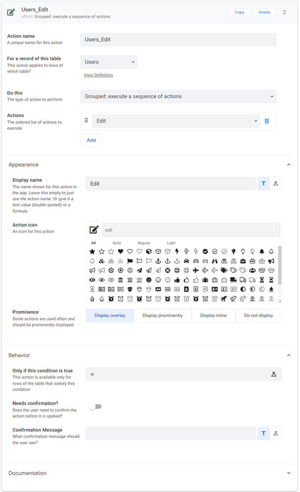
At the time of this post, the default behavior for the desktop edit buttons is inline-editing.
If you don't want that you can replace the default edit button with an action like this:
- Mark as New
- Bookmark
- Subscribe
- Mute
- Subscribe to RSS Feed
- Permalink
- Report Inappropriate Content
- Mark as New
- Bookmark
- Subscribe
- Mute
- Subscribe to RSS Feed
- Permalink
- Report Inappropriate Content
@Jonathon Thanks for your support
- Mark as New
- Bookmark
- Subscribe
- Mute
- Subscribe to RSS Feed
- Permalink
- Report Inappropriate Content
- Mark as New
- Bookmark
- Subscribe
- Mute
- Subscribe to RSS Feed
- Permalink
- Report Inappropriate Content
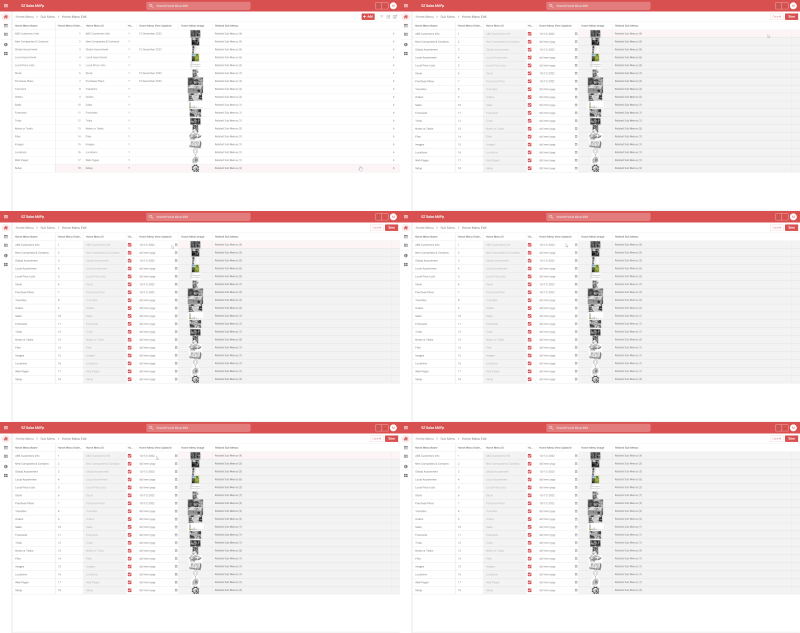
It appears when I edit the value on Desktop view mode
Frequency: Regularly
Error id: 413685
Stack: TypeError: n.recomputeInfluencedAttributes is not a function
at h (https://www.appsheet.com/assets/c22cb4f98c7423843422507223e7cd3292aca19a909f31303a0e615c0c097468:1:2...)
at https://www.appsheet.com/assets/c22cb4f98c7423843422507223e7cd3292aca19a909f31303a0e615c0c097468:1:2...
at Array.forEach (<anonymous>)
at g (https://www.appsheet.com/assets/c22cb4f98c7423843422507223e7cd3292aca19a909f31303a0e615c0c097468:1:2...)
at h (https://www.appsheet.com/assets/c22cb4f98c7423843422507223e7cd3292aca19a909f31303a0e615c0c097468:1:2...)
at e.value (https://www.appsheet.com/assets/c22cb4f98c7423843422507223e7cd3292aca19a909f31303a0e615c0c097468:1:2...)
at https://www.appsheet.com/assets/c22cb4f98c7423843422507223e7cd3292aca19a909f31303a0e615c0c097468:1:3...
at o (https://www.appsheet.com/assets/c22cb4f98c7423843422507223e7cd3292aca19a909f31303a0e615c0c097468:1:3...)
at Object.onUpdate (https://www.appsheet.com/assets/c22cb4f98c7423843422507223e7cd3292aca19a909f31303a0e615c0c097468:1:3...)
at e.value (https://www.appsheet.com/assets/c22cb4f98c7423843422507223e7cd3292aca19a909f31303a0e615c0c097468:1:3...)
at n.value (https://www.appsheet.com/assets/c22cb4f98c7423843422507223e7cd3292aca19a909f31303a0e615c0c097468:1:2...)
at r.onValueChange (https://www.appsheet.com/assets/c22cb4f98c7423843422507223e7cd3292aca19a909f31303a0e615c0c097468:1:1...)
at n.value (https://www.appsheet.com/assets/c22cb4f98c7423843422507223e7cd3292aca19a909f31303a0e615c0c097468:1:2...)
at https://www.appsheet.com/assets/c22cb4f98c7423843422507223e7cd3292aca19a909f31303a0e615c0c097468:1:1...
at ls (https://www.appsheet.com/assets/c22cb4f98c7423843422507223e7cd3292aca19a909f31303a0e615c0c097468:1:9...)
at Tl (https://www.appsheet.com/assets/c22cb4f98c7423843422507223e7cd3292aca19a909f31303a0e615c0c097468:1:9...)
- Mark as New
- Bookmark
- Subscribe
- Mute
- Subscribe to RSS Feed
- Permalink
- Report Inappropriate Content
- Mark as New
- Bookmark
- Subscribe
- Mute
- Subscribe to RSS Feed
- Permalink
- Report Inappropriate Content
Action: Go to another appsheet app (view) does not work in desktop mode. It works fine without desktop mode.
I have a column in a menu sheet that redirects both to views within the app and other apps)
- Mark as New
- Bookmark
- Subscribe
- Mute
- Subscribe to RSS Feed
- Permalink
- Report Inappropriate Content
- Mark as New
- Bookmark
- Subscribe
- Mute
- Subscribe to RSS Feed
- Permalink
- Report Inappropriate Content
Currently, New desktop UX is in preview. They (Appsheet) has the special URL to render new desktop ux. So when you set the new desktop mode is on, then you will see that your will be redireced to new URL, which is causing problem. Deeplink action not gonna work.
- Mark as New
- Bookmark
- Subscribe
- Mute
- Subscribe to RSS Feed
- Permalink
- Report Inappropriate Content
- Mark as New
- Bookmark
- Subscribe
- Mute
- Subscribe to RSS Feed
- Permalink
- Report Inappropriate Content
Thank you for the clarification on that deeplink action does not work.
I figured out a temporary solution:
"YOURAPPNAME#viewStack[0][identifier][Type]=Control&viewStack[0][identifier][Name]=YOURVIEW&appName=YOURAPPNAME"
- Mark as New
- Bookmark
- Subscribe
- Mute
- Subscribe to RSS Feed
- Permalink
- Report Inappropriate Content
- Mark as New
- Bookmark
- Subscribe
- Mute
- Subscribe to RSS Feed
- Permalink
- Report Inappropriate Content
I have noticed that the date picker in desktop preview and normal browsers on chrome require you to move your mouse somewhere in the middle of the cell until your mouse cursor changes. Most of my users have not realized that and intuitively try and click on the calendar icon to open up the date picker.
Is this by design?
Just seems the current implementation is not very intuitive, but I am not sure if the implementation is controlled by the browser and not by AppSheet.
I wonder if AppSheet can force the date picker upon selecting the calendar icon in the cell.
Not sure what Appsheet's thoughts are on this
See Gif below
- Mark as New
- Bookmark
- Subscribe
- Mute
- Subscribe to RSS Feed
- Permalink
- Report Inappropriate Content
- Mark as New
- Bookmark
- Subscribe
- Mute
- Subscribe to RSS Feed
- Permalink
- Report Inappropriate Content
Hello All,
- I am using Desktop mode, and I created a form with a page layout option as "Tabs". While adding a new record, it works absolutely fine but in the edit mode, "Tabs" view is gone and it shows all the columns like a normal form. Has anyone faced this issue?
- To use form view (Tab mode) I added a custom action and I redirected to take it to form view instead of edit view. It worked great but while saving, it gave primary key error (obviously) as the system was trying to add a new record. Is there a workaround for this?
- Mark as New
- Bookmark
- Subscribe
- Mute
- Subscribe to RSS Feed
- Permalink
- Report Inappropriate Content
- Mark as New
- Bookmark
- Subscribe
- Mute
- Subscribe to RSS Feed
- Permalink
- Report Inappropriate Content
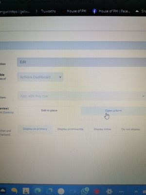
@JayG hi, check on the Edit action itself, there is option "edit in place/open a form".
Change this to edit in form and check..
- Mark as New
- Bookmark
- Subscribe
- Mute
- Subscribe to RSS Feed
- Permalink
- Report Inappropriate Content
- Mark as New
- Bookmark
- Subscribe
- Mute
- Subscribe to RSS Feed
- Permalink
- Report Inappropriate Content
@Denzil_Snyman - Thanks very much for you help! Works perfectly.
-
Account
3 -
Announcements
30 -
App Management
8 -
Automation
30 -
Data
31 -
Errors
17 -
Expressions
21 -
Integrations
24 -
Intelligence
5 -
Other
15 -
Resources
15 -
Security
5 -
Templates
13 -
Users
7 -
UX
34

 Twitter