- AppSheet
- Release Notes & Announcements
- Announcements
- Further usability improvements: simplifying naviga...
- Subscribe to RSS Feed
- Mark Topic as New
- Mark Topic as Read
- Float this Topic for Current User
- Bookmark
- Subscribe
- Mute
- Printer Friendly Page
- Mark as New
- Bookmark
- Subscribe
- Mute
- Subscribe to RSS Feed
- Permalink
- Report Inappropriate Content
- Mark as New
- Bookmark
- Subscribe
- Mute
- Subscribe to RSS Feed
- Permalink
- Report Inappropriate Content
Hello AppSheet Community,
One of the team’s goals is to make it easier for all app creators to build applications by bringing focus to the core concepts and tasks and by providing information and “shortcuts” in the relevant context. We rolled out some of these changes in October and shared this initial announcement.
We’re now excited to announce 2 new updates are starting to roll out today. They are follow-ups to the October changes.
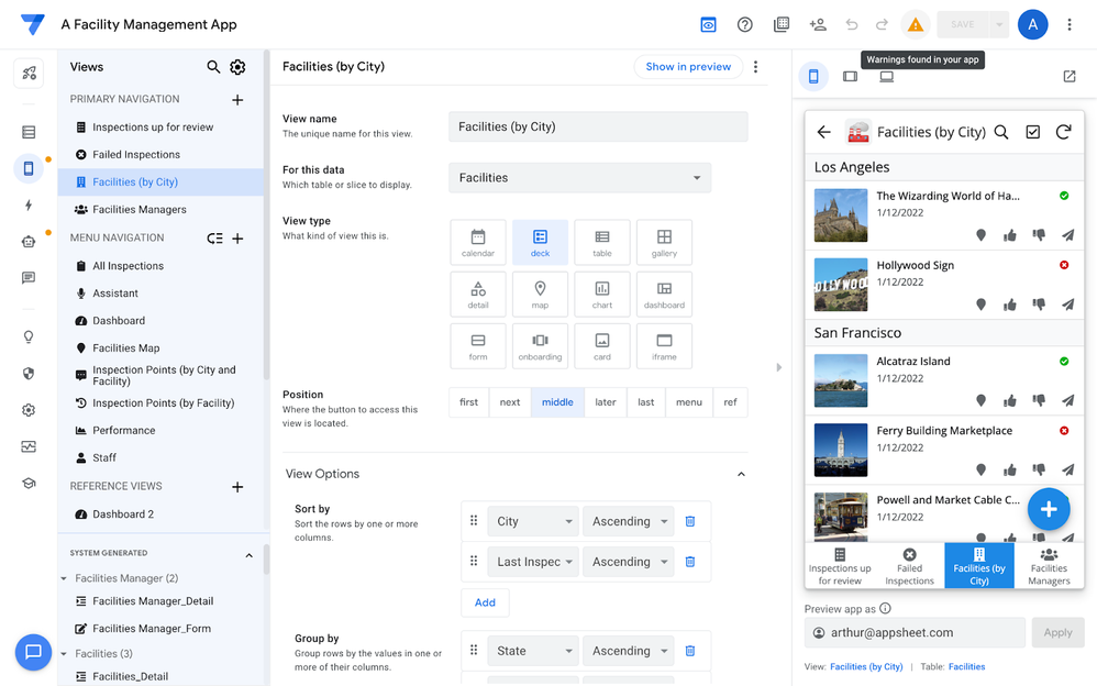
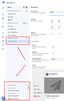
First, we’re introducing a secondary navigation that lets you see at a quick glance all your components - whether we’re talking about is your data, your views, format rules, actions and automation components. This should also let you access any individual component more quickly.
As part of this change, suggestions will be available for all components and will be more targeted based on the context you are in (e.g. which Table you are creating a Format Rule for). You’ll also notice that error and warning messages are now shown via a status icon that is always visible in the header.
Secondary navigation menu (left) and Error & Warning status in header bar (top right)
Second, in the same spirit as earlier changes and to be able to make a specific edit to your app without jumping into a different context, there are more direct links in your View component to the table, column or action that you want to check or edit. For example, when you are working on a Deck View, you should not need to click 3, 4 or even 5 times just to check the settings of a column or of an action. This should make more obvious what is possible, especially for users who are new to AppSheet, and make navigation throughout your app components faster.
GIF showing accessing relevant components quickly and editing them on the fly
The secondary navigation menu and its associated changes will be available to everyone. Similarly to the primary navigation menu rolled out in October, you can revert to the legacy navigation patterns if you’re facing an issue. Details are in the FAQ section below.
Let us know if you have any feedback.
Thank you
The AppSheet Team
FAQ
How do I opt in and out of the navigational changes?
App creators can currently opt-in and out of the navigation changes at will. The changes apply to the App Editor experience, independent of the app you are editing. You can opt in and out by clicking on this icon in the top navigation bar.
Is there some documentation?
Yes, we’re updating the relevant pages in our documentation. We’re also introducing a new page that summarizes the changes across the Editor. See Summary of improvements in the app editor (preview).
Where do I report issues and provide feedback?
Contact Support or directly in this thread.
Are you planning on maintaining the two navigation models?
Long term, no, we’re moving towards the new navigational model. For the next few months, we will support both navigation models as we make additional changes to how people navigate through the Editor. We want to work out the kinks before it becomes the only one.
When will the legacy navigational model be unavailable?
We don’t have a hard set date on this. That will depend on how fast we can work out the kinks in the new navigation.
Why don’t I see anything yet?
We’re rolling out these changes progressively and it might take a few days to a few weeks before you can see them in your own account.
I provided some feedback on the previous changes (from October). Are you taking it into account?
We did read the feedback provided by our community. We may not have addressed it yet - whether it’s making an update or it’s deciding not to make any changes.
- Mark as New
- Bookmark
- Subscribe
- Mute
- Subscribe to RSS Feed
- Permalink
- Report Inappropriate Content
- Mark as New
- Bookmark
- Subscribe
- Mute
- Subscribe to RSS Feed
- Permalink
- Report Inappropriate Content
Mostly, I really like these new updates. Actually, the more I look at it, I really, really, like them.
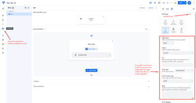
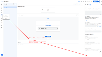
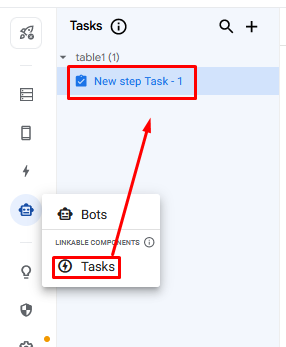
But here is one major downfall to me. I never like doing any work in the right side panel. I always open up my Tasks in the main center panel when I'm setting them up. I just can't focus on the "task" at hand in such a small view-pane, or something like that. But you have seemingly disabled this option completely, for any unlinked tasks.
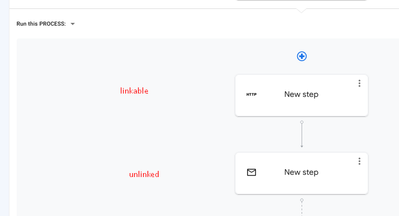
Even by creating 2 tasks, one linkable, one unlinked, I was hoping to expose the option to see the unlinked one in full view, but nope.
The option to view unlinked tasks seems to be completely missing from here now. 😞
-----
-----
-----
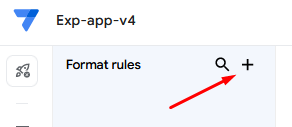
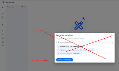
One other separate item. Can you please give the option to disable the suggestion pop-ups everytime you click to add an element (slice,view,action,bot,etc...). I just want it to add a new blank item and not be bothered by this pop-up.
- Mark as New
- Bookmark
- Subscribe
- Mute
- Subscribe to RSS Feed
- Permalink
- Report Inappropriate Content
- Mark as New
- Bookmark
- Subscribe
- Mute
- Subscribe to RSS Feed
- Permalink
- Report Inappropriate Content
I'm most thrilled about this:
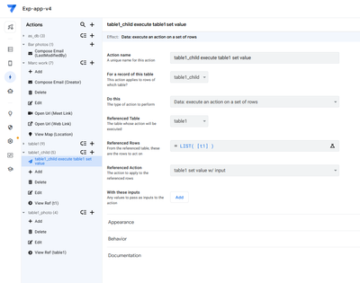
I'm always building complex groups of actions, but it's a huge pain to switch between them when you need to check a detail of another action, then come right back to the other one. This new left side panel with the actions listed per table, in collapsible sections... man that's going to improve my app editing efficiency by so much!
Same for the new table/columns view. Brilliant!
And separating system-generated views from manually-created reference views? Noice.
What kind of timeline are you envisioning for this to be rolled out to paid and/or Enterprise accounts?
- Mark as New
- Bookmark
- Subscribe
- Mute
- Subscribe to RSS Feed
- Permalink
- Report Inappropriate Content
- Mark as New
- Bookmark
- Subscribe
- Mute
- Subscribe to RSS Feed
- Permalink
- Report Inappropriate Content
Thanks Marc! I'm glad you like the changes. Paid accounts should be getting the changes before the Holidays, for Enterprise we're a bit more cautious as we want to give them time to adjust so I don't know exactly when we'll roll it out to them, but probably early in the new year. It's a big adjustment.
- Mark as New
- Bookmark
- Subscribe
- Mute
- Subscribe to RSS Feed
- Permalink
- Report Inappropriate Content
- Mark as New
- Bookmark
- Subscribe
- Mute
- Subscribe to RSS Feed
- Permalink
- Report Inappropriate Content
Is there any chance you would allow an Enterprise Account to opt in early at their own risk?
- Mark as New
- Bookmark
- Subscribe
- Mute
- Subscribe to RSS Feed
- Permalink
- Report Inappropriate Content
- Mark as New
- Bookmark
- Subscribe
- Mute
- Subscribe to RSS Feed
- Permalink
- Report Inappropriate Content
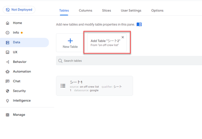
The useful feature to add table through "hint" is now missing on new editable layout... Any plan to revive it?
Or is there somewhere, I just missing something?
- Mark as New
- Bookmark
- Subscribe
- Mute
- Subscribe to RSS Feed
- Permalink
- Report Inappropriate Content
- Mark as New
- Bookmark
- Subscribe
- Mute
- Subscribe to RSS Feed
- Permalink
- Report Inappropriate Content
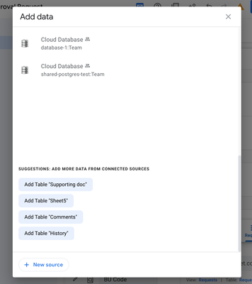
It's available from the "Add data" modal, at the bottom. The app creator may need to scroll down if they have a lot of data sources.
- Mark as New
- Bookmark
- Subscribe
- Mute
- Subscribe to RSS Feed
- Permalink
- Report Inappropriate Content
- Mark as New
- Bookmark
- Subscribe
- Mute
- Subscribe to RSS Feed
- Permalink
- Report Inappropriate Content
Ah!!!!! Thank you, I got it.
In the meantime, it is (was on the legacy editor) not really responsible sometime. After add new table to spreadsheet then we refresh the editor. If we are lucky, we could see new table as hint. Sometime we do not see new table after heavy re-load the browser to refresh the editor. I was not sure why we could see and not see the new table. This was also corrected?
- Mark as New
- Bookmark
- Subscribe
- Mute
- Subscribe to RSS Feed
- Permalink
- Report Inappropriate Content
- Mark as New
- Bookmark
- Subscribe
- Mute
- Subscribe to RSS Feed
- Permalink
- Report Inappropriate Content
This might have improved a little bit with recent changes. However, sometimes you don't see it immediately after adding a spreadsheet due to caching (which should usually resolve in 10-15 minutes).
However, I do take your feedback and will try to see if we can make this more efficient or add an option to force pull accessible sheets.
- Mark as New
- Bookmark
- Subscribe
- Mute
- Subscribe to RSS Feed
- Permalink
- Report Inappropriate Content
- Mark as New
- Bookmark
- Subscribe
- Mute
- Subscribe to RSS Feed
- Permalink
- Report Inappropriate Content
I discovered the new evolution before your post, I reported a bug on the other thread: can you have a look at it ?
- Mark as New
- Bookmark
- Subscribe
- Mute
- Subscribe to RSS Feed
- Permalink
- Report Inappropriate Content
- Mark as New
- Bookmark
- Subscribe
- Mute
- Subscribe to RSS Feed
- Permalink
- Report Inappropriate Content
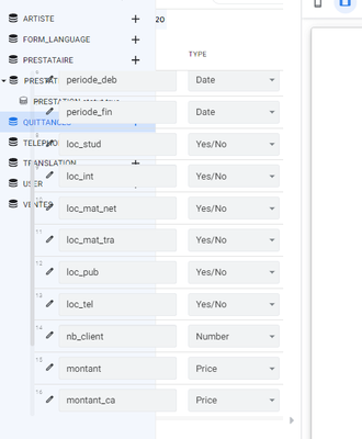
@Arthur_Rallu Some inconsistency in the app editor interface here 🙂
- Mark as New
- Bookmark
- Subscribe
- Mute
- Subscribe to RSS Feed
- Permalink
- Report Inappropriate Content
- Mark as New
- Bookmark
- Subscribe
- Mute
- Subscribe to RSS Feed
- Permalink
- Report Inappropriate Content
@Aurelien yes, we also see such as skelton type of UX sometimes.....Obviously either background color or z-index type of the issue in terms of CSS with AppSheet possibly.
- Mark as New
- Bookmark
- Subscribe
- Mute
- Subscribe to RSS Feed
- Permalink
- Report Inappropriate Content
- Mark as New
- Bookmark
- Subscribe
- Mute
- Subscribe to RSS Feed
- Permalink
- Report Inappropriate Content
Noted, thank you @Aurelien I will log it and see what's going on.
- Mark as New
- Bookmark
- Subscribe
- Mute
- Subscribe to RSS Feed
- Permalink
- Report Inappropriate Content
- Mark as New
- Bookmark
- Subscribe
- Mute
- Subscribe to RSS Feed
- Permalink
- Report Inappropriate Content
Hi @Arthur_Rallu
For screen sizes larger than FHD, a large white space is created between the main area and the emulator.
In addition, the column setting displays a horizontal scroll bar, and that white space is also not being utilized.
- Mark as New
- Bookmark
- Subscribe
- Mute
- Subscribe to RSS Feed
- Permalink
- Report Inappropriate Content
- Mark as New
- Bookmark
- Subscribe
- Mute
- Subscribe to RSS Feed
- Permalink
- Report Inappropriate Content
This should not happen, thank you for reporting Takuya.
- Mark as New
- Bookmark
- Subscribe
- Mute
- Subscribe to RSS Feed
- Permalink
- Report Inappropriate Content
- Mark as New
- Bookmark
- Subscribe
- Mute
- Subscribe to RSS Feed
- Permalink
- Report Inappropriate Content
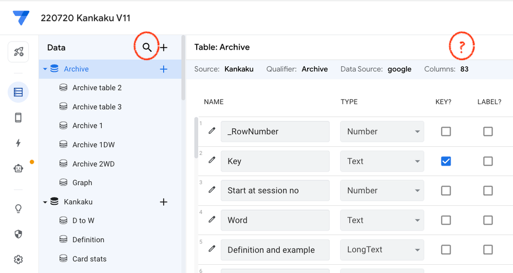
It looks to me like the search feature in Data has been significantly degraded. I used to be able to search for columns. Now I only seem to be able to search for names of tables. Obviously, since the tables are relatively few in number, the ability to search for a table is less important than the ability to search for a specific column name (some apps may have over 1000 columns!!). Am I missing something?
- Mark as New
- Bookmark
- Subscribe
- Mute
- Subscribe to RSS Feed
- Permalink
- Report Inappropriate Content
- Mark as New
- Bookmark
- Subscribe
- Mute
- Subscribe to RSS Feed
- Permalink
- Report Inappropriate Content
Fortunately, the legacy editing interface is still available. I just used it to find the column that prompted my comment.
- Mark as New
- Bookmark
- Subscribe
- Mute
- Subscribe to RSS Feed
- Permalink
- Report Inappropriate Content
- Mark as New
- Bookmark
- Subscribe
- Mute
- Subscribe to RSS Feed
- Permalink
- Report Inappropriate Content
Column search will be addressed soon, thank you for the comment Kirk.
- Mark as New
- Bookmark
- Subscribe
- Mute
- Subscribe to RSS Feed
- Permalink
- Report Inappropriate Content
- Mark as New
- Bookmark
- Subscribe
- Mute
- Subscribe to RSS Feed
- Permalink
- Report Inappropriate Content
Yeah you'll note that it actually will filter tables by tables that include the column - but isn't at present filtering the schema view itself (I missed that), we will address that.
- Mark as New
- Bookmark
- Subscribe
- Mute
- Subscribe to RSS Feed
- Permalink
- Report Inappropriate Content
- Mark as New
- Bookmark
- Subscribe
- Mute
- Subscribe to RSS Feed
- Permalink
- Report Inappropriate Content
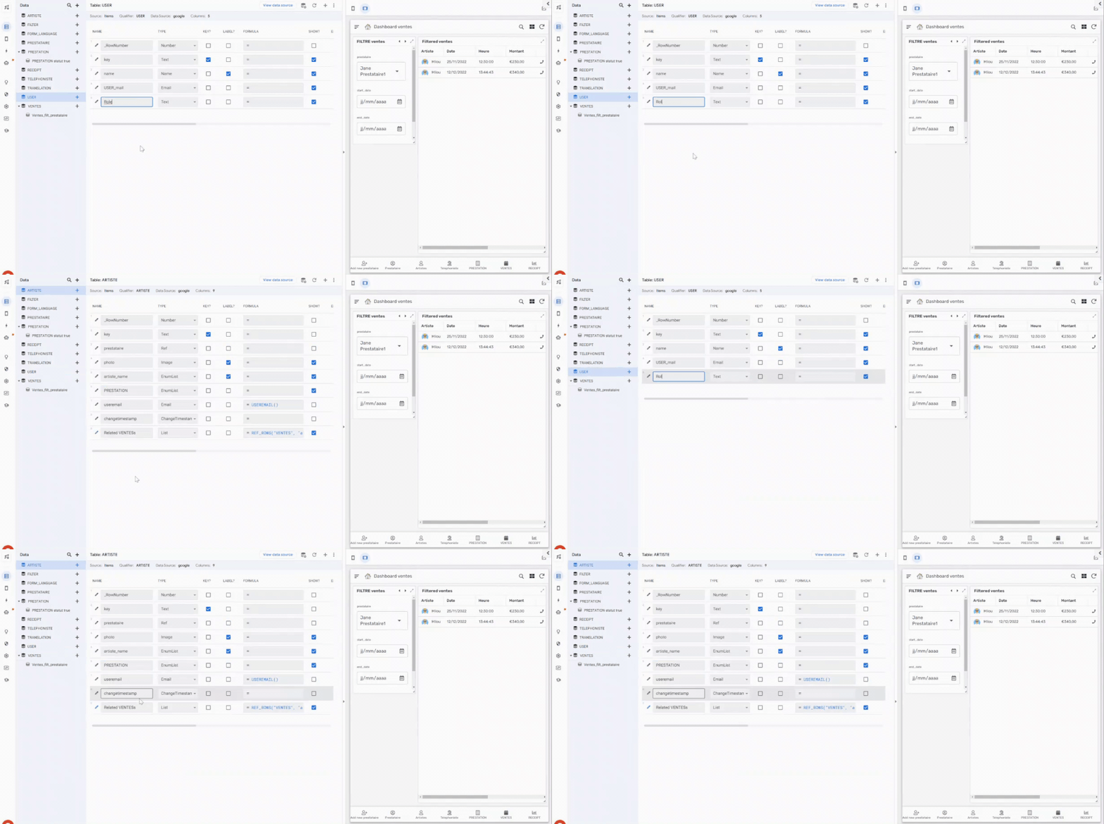
Hi @Arthur_Rallu @benhare @marizmelo
Here an additional behavior, sorry for reporting it that late:
As you see, when editing a column name and clicking out of the field, the creator gets back to the first table pane.
- Mark as New
- Bookmark
- Subscribe
- Mute
- Subscribe to RSS Feed
- Permalink
- Report Inappropriate Content
- Mark as New
- Bookmark
- Subscribe
- Mute
- Subscribe to RSS Feed
- Permalink
- Report Inappropriate Content
This is quick feedback out of my feelings.
Various exsiting "function" to set our apps up through the editor, the new layout / style is placing bunch of action icons.
For example, the table settings looks like this.
My concerns are the icon is not perfectly appealing to the app creator, expecially starter and intermediate ones. Presenting the available options and action by means of shaped action with texts, it will be more appealing and more intuitive from my point of view.
Also, three dots action icon is wrapping other available options items, but my thought was it could be difficult for beginners and intermediate app crators to found out what sort of options could be available for them, as they are "deeply nested" behind those three dot icons.
As I shared with the screenshot above, there are ample space available for the header where those action icons are placed, so better to show more actions as much as possble rather than nesting them behind such three dots icons.
- Mark as New
- Bookmark
- Subscribe
- Mute
- Subscribe to RSS Feed
- Permalink
- Report Inappropriate Content
- Mark as New
- Bookmark
- Subscribe
- Mute
- Subscribe to RSS Feed
- Permalink
- Report Inappropriate Content
Thank you Koichi.
We are in the process of understanding more about the priority of the icons/options at this moment, labels are definitely an option, we just might need to prioritize some options in favor of others, as we offer too many buttons right now. Will keep this in mind, thank you again.
- Mark as New
- Bookmark
- Subscribe
- Mute
- Subscribe to RSS Feed
- Permalink
- Report Inappropriate Content
- Mark as New
- Bookmark
- Subscribe
- Mute
- Subscribe to RSS Feed
- Permalink
- Report Inappropriate Content
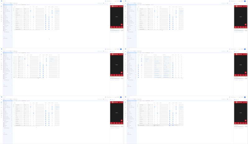
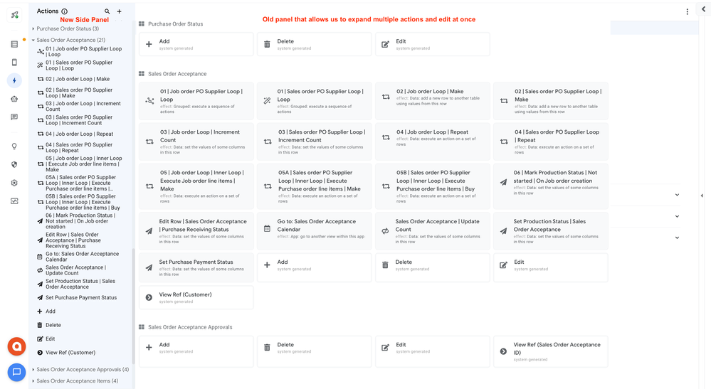
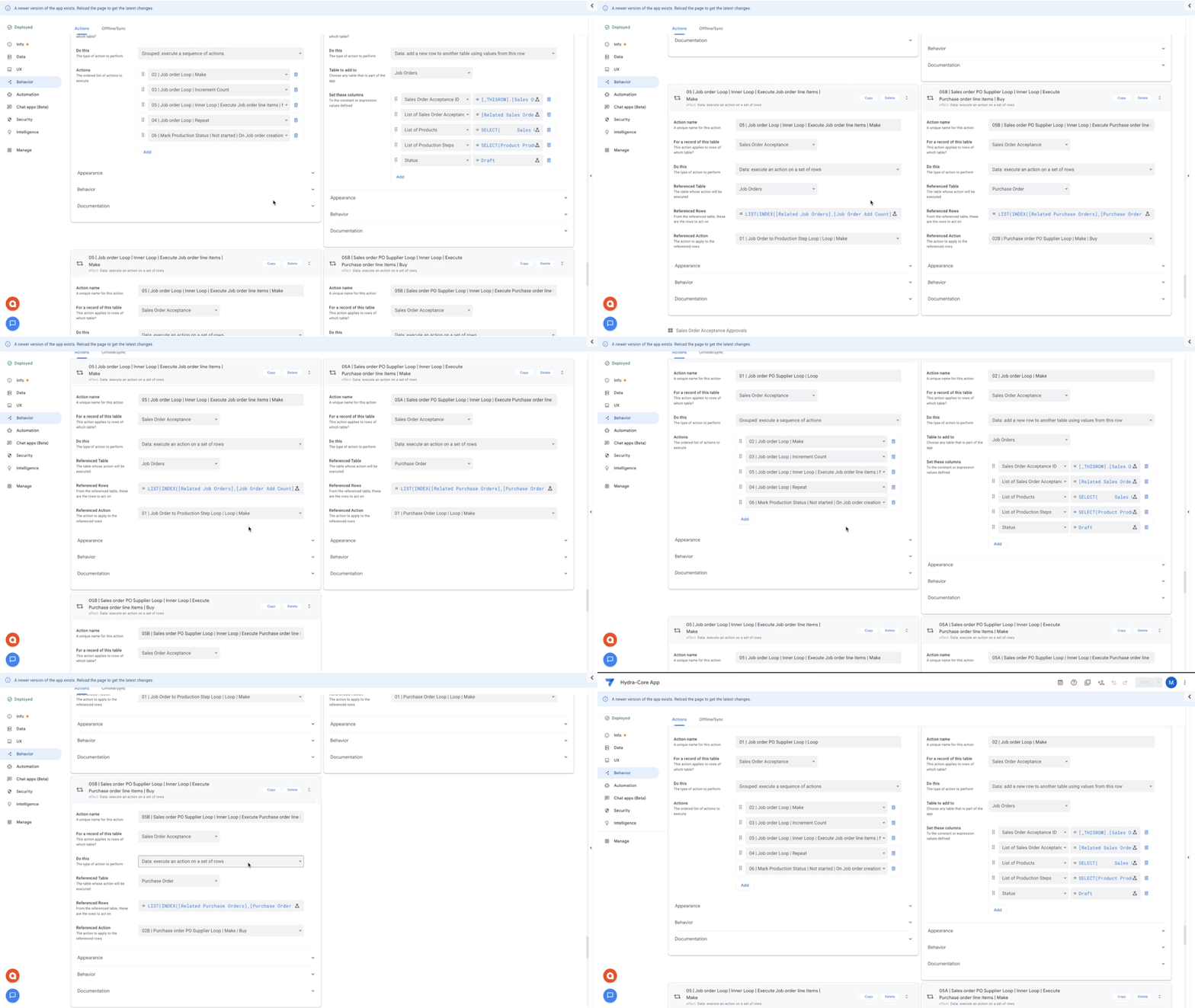
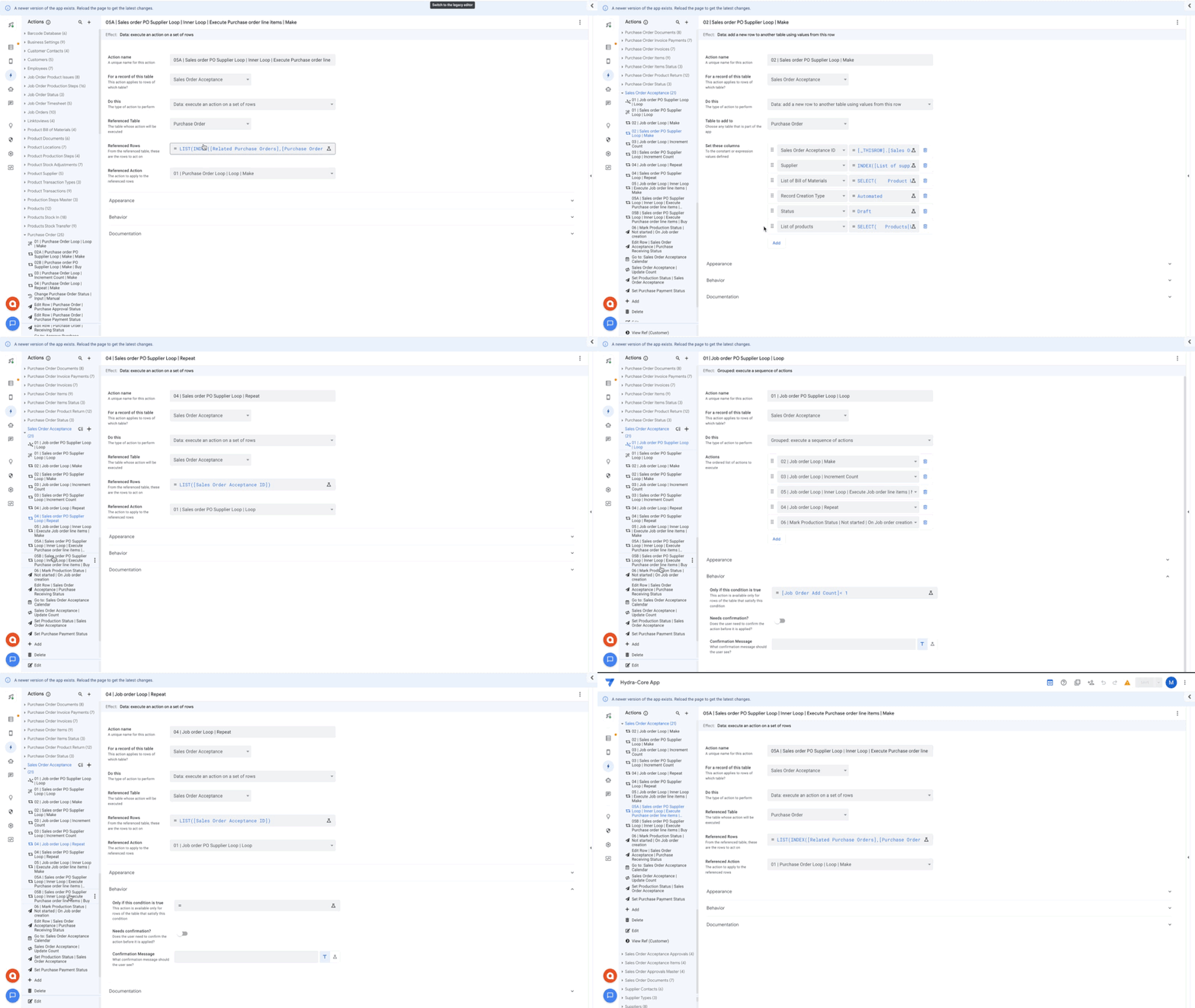
@Koichi_Tsuji is the new editor even possible to navigate and work properly especially with larger apps ? I find it very difficult to navigate between multiple actions. At times I expand atleast 5-6 action at once and work on all that together. Like this Easier, Faster, Better..
I am soo confused seeing my actions like this. Especially when I start editing these actions Each time I need to click on it and randomly click on wrong actions 75% of the time.
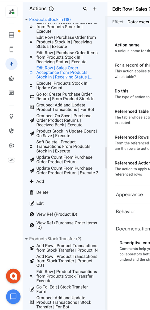
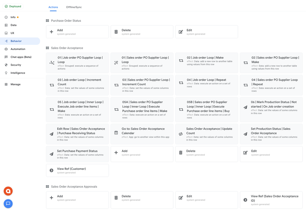
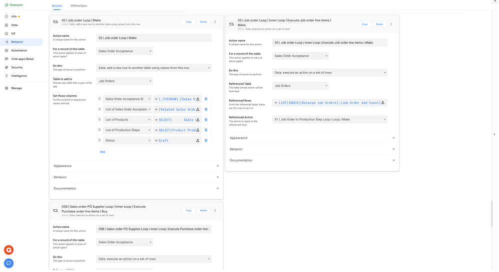
Look How neat and easier to work on existing Interface.
Expanded view- Easily able to check everything more like a dashboard and Its soo much faster
I am not sure who is behind all this Ideas that put editors into difficulties. I think the developers should develop larger app with 100s of action and understand how difficult new UI is. I hope they dont force new UI to all Users. We welcome changes that are useful but this looks very difficult for me to manage all my app (in case they force us to use new Editor)
- Mark as New
- Bookmark
- Subscribe
- Mute
- Subscribe to RSS Feed
- Permalink
- Report Inappropriate Content
- Mark as New
- Bookmark
- Subscribe
- Mute
- Subscribe to RSS Feed
- Permalink
- Report Inappropriate Content
When using the new UI, I also miss having simultaneous access to multiple items, such as actions, that I'm configuring analogously or whose configurations are interrelated.
- Mark as New
- Bookmark
- Subscribe
- Mute
- Subscribe to RSS Feed
- Permalink
- Report Inappropriate Content
- Mark as New
- Bookmark
- Subscribe
- Mute
- Subscribe to RSS Feed
- Permalink
- Report Inappropriate Content
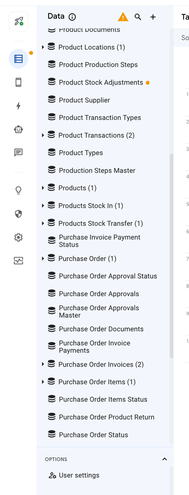
Looks like new UI is for simple use cases and small apps with just 5-10 tables maybe around 10 actions. Looks good for that use case. For an app with 100s of actions interrelated with each other in different tables. I work with atleast 5-10 tables at most of the times in expanded state. I keep switching tables and now I am spending 50% of my time finding those tables in list of NEW UI. What a pathetic situation.
New Editor can never be used. I hope they come up with better ideas to improve. Looks like a downgrade to me after using it for a while.
- Mark as New
- Bookmark
- Subscribe
- Mute
- Subscribe to RSS Feed
- Permalink
- Report Inappropriate Content
- Mark as New
- Bookmark
- Subscribe
- Mute
- Subscribe to RSS Feed
- Permalink
- Report Inappropriate Content
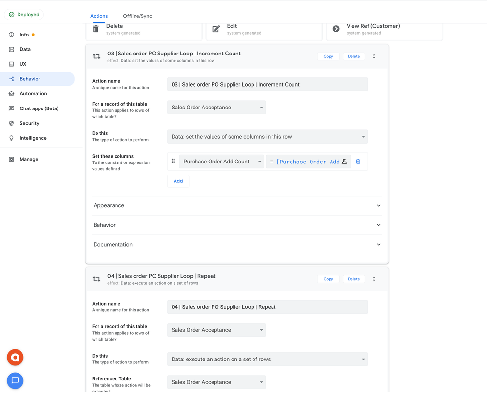
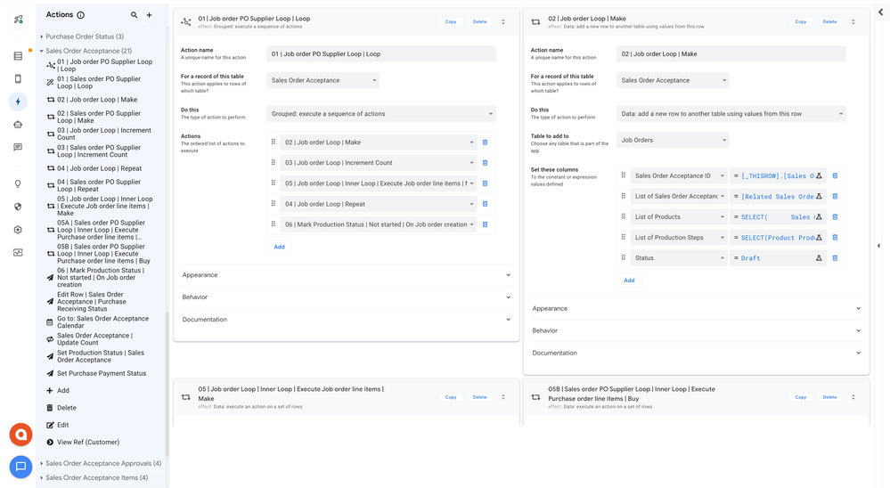
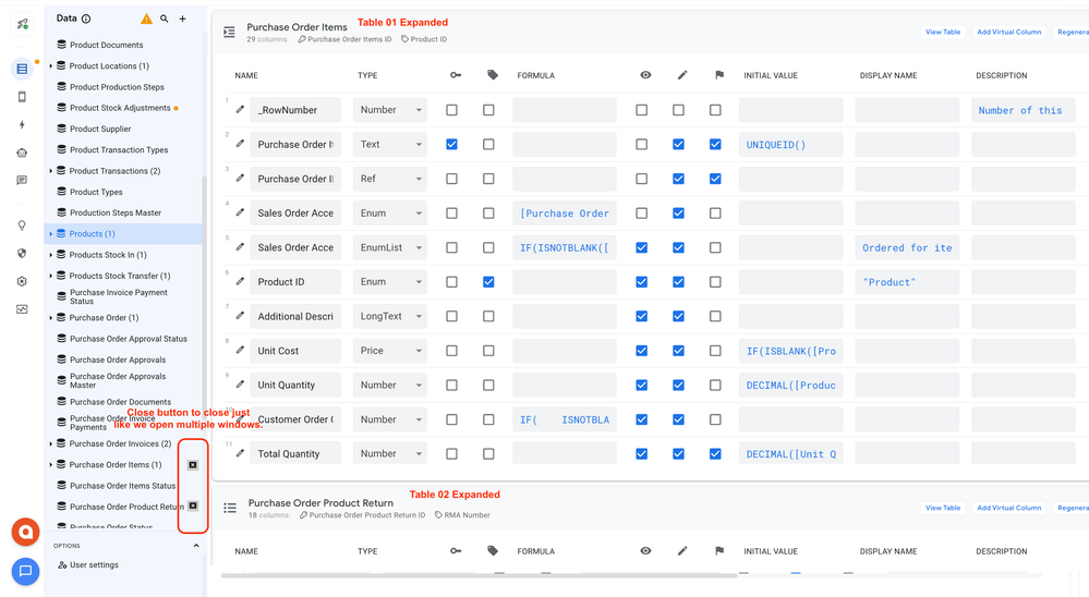
Something like this that allow multiple ACTIONS/TABLE in expanded view to edit. Very very difficult to switch between them each time especially you can see with many actions it becomes tedious.
- Mark as New
- Bookmark
- Subscribe
- Mute
- Subscribe to RSS Feed
- Permalink
- Report Inappropriate Content
- Mark as New
- Bookmark
- Subscribe
- Mute
- Subscribe to RSS Feed
- Permalink
- Report Inappropriate Content
So, I don't agree with your assertions here. In the legacy UI, the reason that the actions are next to each other in the second screen is that they are part of the same table and being sorted next to each other. They should be in that order in the new side navigation. If actions are far from each other, you have to scroll aimlessly through a giant list of actions looking for the one you want, which seems more cumbersome.
Alternatively, you could use the search functionality - which is present in both the old and new layout - to find what you want. The difference being that in the new layout you always have the search functionality available, whereas in the old layout you have to scroll back to the top of the page to get access to it.
Genuine question: is there a reason you aren't using the search to find what you want? Is it hard to see/do you not like opening it up/some other reason? I would think in an app with 100s of actions you would search for what you want, that's what I do in my large apps, but it would be good to understand how you build apps and what gaps there still are that prevent you from using that instead of scrolling.
I could see a situation where you've gotten everything all set up - your large number of actions that you're often jumping back and forth from are all open, and you scroll through your 100s of actions looking for the open ones to interact with. We should fix what's causing you to have to do that in the first place - I don't know what that might be, and maybe brainstorming on the why of that would be productive.
- Mark as New
- Bookmark
- Subscribe
- Mute
- Subscribe to RSS Feed
- Permalink
- Report Inappropriate Content
- Mark as New
- Bookmark
- Subscribe
- Mute
- Subscribe to RSS Feed
- Permalink
- Report Inappropriate Content
I am not sure If you use AppSheet to develop mid-size or large-size apps on your own. If not you have to start developing an app with many actions. This is NO WAY productive than old Editor UI (the one expanded view at a time in new UI).
I Need something that keeps full panel on the right expanded all the time to scroll between each action and compare.
I am not sure about how complex AppSheet apps you have developed. But in my opinion I don’t think this is helping me (except for small apps). The grouping on side panel is nice but expanding just ONE action at a time is bringing productivity by half.
Imagine 10+ action you are working in current moment and you telling me to remember names and search those actions each time then CLICK to see in panel. Then go back SEARCH next action. CLICK on action02 then make changes. Again same thing.
You might have improved how it looks but how it works became more difficult.
- Mark as New
- Bookmark
- Subscribe
- Mute
- Subscribe to RSS Feed
- Permalink
- Report Inappropriate Content
- Mark as New
- Bookmark
- Subscribe
- Mute
- Subscribe to RSS Feed
- Permalink
- Report Inappropriate Content
Old UI All actions expanded at one place. Checking all one by one. 5 actions all expanded. Soo Easy.
NEW UI Not even able to check existing actions properly. Clicking each one and forgetting which action I should check back. @benhare you gave us additional task for us to remember names and search for it if its another table. The unlimited extra CLICKS.
Any extra benefits of new side panel ? Yes it gives a neat look but working on it is cucumber-some because one expanded view at a time. Not helping ! 👎🏼
- Mark as New
- Bookmark
- Subscribe
- Mute
- Subscribe to RSS Feed
- Permalink
- Report Inappropriate Content
- Mark as New
- Bookmark
- Subscribe
- Mute
- Subscribe to RSS Feed
- Permalink
- Report Inappropriate Content
Thats why I show you screenshot with side panel. Right now it is cucumbersome
Old UI: Expand 10 Action at once> All opened> Scroll across> Start working on all action one by one.
New UI: CLICKO1 on Action01> Make changes >
CLICK02 on Action02
CLICK03 on Action03
Need to go back to Action01 (Forgot action name because of similar name and not expanded)
Start searching for Action01 in list of all actions.(Says this as Improvement) and Again Click04 to expand Action01
How many time I need to click and search through to find all these actions.
You all just gave me additional task to CLICK and SEARCH everytime which I never in my entire appsheet development years did. I always had it expanded. It stays expanded till my 10s or 20s of actions are setup. Click save and BOOM. Now Major time spend searching and clicking on wrong actions.
- Mark as New
- Bookmark
- Subscribe
- Mute
- Subscribe to RSS Feed
- Permalink
- Report Inappropriate Content
- Mark as New
- Bookmark
- Subscribe
- Mute
- Subscribe to RSS Feed
- Permalink
- Report Inappropriate Content
Expanding all action took 5 seconds. Scrolling between each took less than a second. New UI trying to find the action itself taking longer. Then Clicking. Then again going back. If I search every action has similar names and remembering all names to search is not easy. Your suggestions will not work @benhare. Look how frustrated and time consuming it is for a user finding an action instead of scrolling for less than 1sec.
- Mark as New
- Bookmark
- Subscribe
- Mute
- Subscribe to RSS Feed
- Permalink
- Report Inappropriate Content
- Mark as New
- Bookmark
- Subscribe
- Mute
- Subscribe to RSS Feed
- Permalink
- Report Inappropriate Content
@Rifad 's idea is a good one. Actions are and always have been cumbersome to navigate. Frequentently a set of actions in a process will span several Tables. To bounce back and forth between these is time consuming.
I would like to see two improvements:
1) Borrowing from @Rifad 's idea (or maybe this is what he intended), allow us to have open at the same time several actions from anywhere. Then we can easily scroll back and forth between the set of actions currently being worked on. Needless to say we would need a "close all" button.
2) Provide a navigation link (like that used on columns and slices in view) anywhere actions are referenced so we can quickly jump that specific action for implementation changes.
These two things would greatly improve our efficiency when implementing and changing actions.
- Mark as New
- Bookmark
- Subscribe
- Mute
- Subscribe to RSS Feed
- Permalink
- Report Inappropriate Content
- Mark as New
- Bookmark
- Subscribe
- Mute
- Subscribe to RSS Feed
- Permalink
- Report Inappropriate Content
@WillowMobileSys wrote:
Provide a navigation link (like that used on columns and slices in view) anywhere actions are referenced so we can quickly jump that specific action for implementation changes.
YES PLEASE!!!!!
- Mark as New
- Bookmark
- Subscribe
- Mute
- Subscribe to RSS Feed
- Permalink
- Report Inappropriate Content
- Mark as New
- Bookmark
- Subscribe
- Mute
- Subscribe to RSS Feed
- Permalink
- Report Inappropriate Content
@WillowMobileSys wrote:
1) Borrowing from @Rifad 's idea (or maybe this is what he intended), allow us to have open at the same time several actions from anywhere. Then we can easily scroll back and forth between the set of actions currently being worked on. Needless to say we would need a "close all" button.
You are right. The new editor benefits just editing one or two action/tables. then perfect ! Just look at the amount of tables with similar names and can Imagine the amount of actions this will have. Switching between each tables is impossible.
I am spending most of the time in new UI just to expand and SEARCH just like @benhare told. I never used search bar before while making changes to all these tables. It stays expanded and Boom ! Just an extra headache to search all the time.
- Mark as New
- Bookmark
- Subscribe
- Mute
- Subscribe to RSS Feed
- Permalink
- Report Inappropriate Content
- Mark as New
- Bookmark
- Subscribe
- Mute
- Subscribe to RSS Feed
- Permalink
- Report Inappropriate Content
Something like this @WillowMobileSys . So multiple tables are expanded and worked on it together. Close once done. There is absolutely zero scenario we work on one single table at a time. It is always MULTIPLE tables/actions at a time. Please understand new UI side panel single expanded view is DOWNGRADE. @benhare
- Mark as New
- Bookmark
- Subscribe
- Mute
- Subscribe to RSS Feed
- Permalink
- Report Inappropriate Content
- Mark as New
- Bookmark
- Subscribe
- Mute
- Subscribe to RSS Feed
- Permalink
- Report Inappropriate Content
On the other hand, I personally completely disagree with basically everything that Rifad just said. I think the new editor is a HUGE improvement in terms of working on many actions at the same time.
This feeling is no doubt influenced by the fact that I use the "tree style tabs" extension on my Firefox browser, which stacks all tabs vertically in the left side of the window, instead of horizontally across the top. So it's basically the same navigation style that I'm very much used to already. Could just be something that needs to get used to.
Perhaps there could be a "recently viewed" and/or "favorites" section on the left panel to alleviate the searching for actions issue.
- Mark as New
- Bookmark
- Subscribe
- Mute
- Subscribe to RSS Feed
- Permalink
- Report Inappropriate Content
- Mark as New
- Bookmark
- Subscribe
- Mute
- Subscribe to RSS Feed
- Permalink
- Report Inappropriate Content
I already told side panel is Nice. But expanded view for just one action/table at a time is not going to help. Switching, Comparing actions, Scroll between multiple actions is not possible anymore. I used it for almost two days. I have no reason to stick with new single expanded view panel when I can easily expand all required actions (old UI) across multiple tables and work like a charm. @Marc_Dillon
- Mark as New
- Bookmark
- Subscribe
- Mute
- Subscribe to RSS Feed
- Permalink
- Report Inappropriate Content
- Mark as New
- Bookmark
- Subscribe
- Mute
- Subscribe to RSS Feed
- Permalink
- Report Inappropriate Content
@Marc_Dillon wrote:
On the other hand, I personally completely disagree with basically everything that Rifad just said. I think the new editor is a HUGE improvement in terms of working on many actions at the same time.
HUGE improvement - agree 1000%.... But editing of Actions has taken a step backward. Where we used to be able to open multiple actions and scroll between them while making our updates, we now have to open/re-open to switch back and forth for updates.
So, I do agree with @Rifad that having an ability to select and open multiple actions into the editing panel, would be a BIG improvement in editing sets of related actions.
@Rifad 's comments switched from actions to tables. The only complaint I have for tables, and is actually a general complaint about the overall UI side panel, is to have the ability to "expand-all/collapse-all". I prefer collapsed for less scrolling and expanding only what I am working on.
- Mark as New
- Bookmark
- Subscribe
- Mute
- Subscribe to RSS Feed
- Permalink
- Report Inappropriate Content
- Mark as New
- Bookmark
- Subscribe
- Mute
- Subscribe to RSS Feed
- Permalink
- Report Inappropriate Content
@WillowMobileSys wrote:
switch back and forth for updates
Once expanded didn’t have this Find, Scroll, Click then going back to next action expanded was not existing in old UI. What benefits does this UI have ? Yes, Its grouped vertically looks nice. The moment you start using its very difficult to handle.
@WillowMobileSys wrote:
Rifad 's comments switched from actions to tables.
Most of the times in table I keep related tables expanded and related actions expanded until its saved. Now all I do is search for tables/actions 😞
@Rifad wrote:
Something like this will make it way more better than now to keep related actions/tables expanded.
For me personally there is zero use case just to edit only SINGLE Action/Table at once. Its always 99% of the time working on MULTIPLE tables/actions expanded.
- Mark as New
- Bookmark
- Subscribe
- Mute
- Subscribe to RSS Feed
- Permalink
- Report Inappropriate Content
- Mark as New
- Bookmark
- Subscribe
- Mute
- Subscribe to RSS Feed
- Permalink
- Report Inappropriate Content
A related issue is the Editor Setting to expand all views. I always keep that enabled, and it's a great efficiency in the legacy UI. I find that in the new UI it doesn't apply in several places. For example, when I open an action or a table's settings, all but its first section remain collapsed and I have to manually expand the other sections.
-
Account
3 -
Announcements
30 -
App Management
8 -
Automation
33 -
Data
32 -
Errors
17 -
Expressions
21 -
Integrations
25 -
Intelligence
6 -
Other
15 -
Resources
15 -
Security
5 -
Templates
13 -
Users
7 -
UX
34

 Twitter