- AppSheet
- :
- Release Notes & Announcements
- :
- Announcements
- :
- Re: In Preview: New UI design for desktop users
- Subscribe to RSS Feed
- Mark Topic as New
- Mark Topic as Read
- Float this Topic for Current User
- Bookmark
- Subscribe
- Mute
- Printer Friendly Page
- Mark as New
- Bookmark
- Subscribe
- Mute
- Subscribe to RSS Feed
- Permalink
- Report Inappropriate Content
- Mark as New
- Bookmark
- Subscribe
- Mute
- Subscribe to RSS Feed
- Permalink
- Report Inappropriate Content
Hey everyone,
We’re excited to announce we are now previewing our new visual design for applications that are accessed on desktop browsers.
Currently, your AppSheet applications tend to follow mobile design patterns even when your users have large screens and these patterns can be confusing to desktop users. The new design lets these desktop users navigate their apps more easily and access information in context, and provides an efficient way to create and update records without losing context. App creators can also present more information by leveraging the larger screens but still keep it organized.
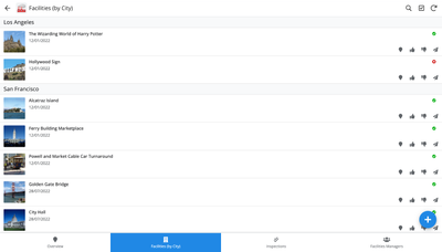
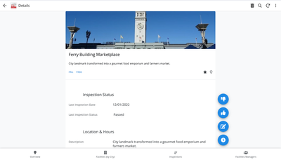
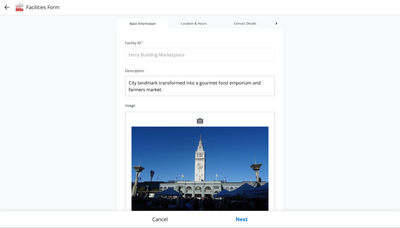
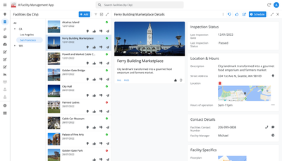
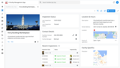
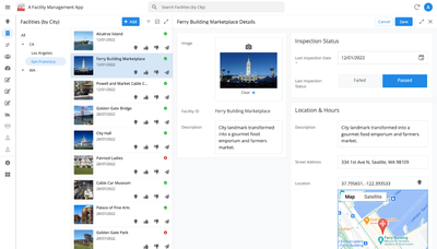
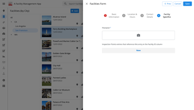
Here are some before and after images that better illustrate the design changes.
Legacy Design - Screenshot #1: Sifting through a collection of records grouped by City and State after selecting a State (Deck View)
Legacy Design - Screenshot #2: Looking at a specific record after selecting that record in the screen above (Detail View)
Legacy Design - Screenshot #3: Editing an existing record/Creating a new record (Form View)
New Design - Screenshot #1: Seeing your data in context (Deck View + Detail View)
New Design - Screenshot #2: Focusing on a specific record (Detail View)
New Design - Screenshot #3: Editing in place an existing record
New Design - Screenshot #4: Creating a new record (Form View)
What’s next? Well, this is still a work in progress. We’ve been gathering feedback from a number of design partners, including some of you in the AppSheet Community, and we know there is more to do before it can properly support all of your applications. At this stage, we feel that it would be good to let you play with the new design and to give you an opportunity to share your feedback - what you like, what doesn't work, what you think could use some improvements. This represents a significant change and your feedback will help us guide our next steps.
As this feature is in Preview, you may see visual changes in your apps as we work to improve the new desktop design in real-time. We don't recommend using the new desktop design in your production apps.
Thank you
The AppSheet Team
FAQ
How do I get access to this new desktop design?
We are currently slowly ramping this new experience over the next week or so, so you may not see this option in the editor immediately.
For each application, you can opt-in to use the new desktop design. You can toggle between the new and legacy desktop modes, as desired.
Follow these steps to enable the new design in your app:
- Open the app in the app editor
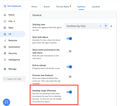
- Navigate to the UX > Options pane
- Enable the Desktop mode (Preview) option - see screenshot below
- Save the app in the Editor
All users of this application that access the app on a desktop browser will then see the new design after their next sync.
How do I configure the design of my app? I don’t see any new settings in the Editor!
There are minimal changes to the Editor for now. Mostly, the same settings are leveraged to specify the desktop and mobile designs. Let me give you an example.
Your apps have “primary views” and “menu views”. With the new desktop design, all of your views will be accessible from a side menu. That menu will list first the “primary views” and then the “secondary views”. In the future, we will adjust the configuration settings and in particular the language so that it makes sense for both mobile and desktop apps. For example, position values of "left most" and "right most" don't make sense for the new desktop design with its vertical menu structure.
We’ll be giving app creators more controls over some features that are currently set by default.
Is there some documentation or more information on what changed?
See Optimize the user experience using the new desktop design (Preview). We’ll update it over time.
Is there a list of functionalities that are known to not work with the new design?
Yes.
First, here is a list [as of July 31st] of (high-level) issues and requests that were reported to us and that still need fixes or assessments. Some of them are independent of the desktop mode, but we're still listing them here since people may want to know about them and so they don't need to report them unless it was reported for different app configurations :
| General theme | Issues |
| Form View |
|
| Navigation expressions: LINKTOROW(), LINKTOFORM(), etc |
|
| Format rules |
|
| Detail View UI |
- In some configurations, showing the wrong display names in a Detail tab - Edit-in-place in Dashboard view - Sync gets the app user out of Editing mode in a Detail View |
| General UI |
- Improvement requests on the subnav bar (e.g. larger text button, better responsiveness w.r.t. title, actions, text) - Clicking in grey area around onboarding view should not navigate the app in the background - Filtering on Dashboard - Tooltip for icon action buttons - Chart Views do not behave like other views |
| Localization of strings | Some strings are missing |
| CSV import/export |
|
| Other app functionalities |
- Missing Share, Feedback buttons - App Gallery behaving differently - Support of Amazon Cognito (missing account icon) - OCR not working on Desktop |
| Functionalities for app creators | “Preview as” is not available for the desktop emulator |
Second, here is a list of some issues and feature requests that we know we are not going to tackle, at least for now.
| Supporting multiple navigation actions in a grouped action |
This is not something that we support. The team very intentionally did not want to support this. App creators should not rely on it and it won’t work in desktop mode. |
| Multiple requests to improve the Table View UI |
We got requests to improve the Table View in general. The requests are valid, but that is out of scope for desktop mode. Changes we would be making would also impact the legacy UI and mobile apps. |
| LINKTOPARENTVIEW() not supported | For desktop users, there are better options to navigate back: the browser’s back button and the breadcrumbs. |
| Font size changes (via app settings) lead to layout issues | Generally, we recommend using the browser’s zoom which does a better job at resizing the app. |
| Background image |
See also Limitations and known issues.
How do I provide feedback?
Please share your feedback in this thread below this message!
- Mark as New
- Bookmark
- Subscribe
- Mute
- Subscribe to RSS Feed
- Permalink
- Report Inappropriate Content
- Mark as New
- Bookmark
- Subscribe
- Mute
- Subscribe to RSS Feed
- Permalink
- Report Inappropriate Content
@WillowMobileSys wrote:
HOWEVER, if a dedicated "ToolTip" property was added that we could control if it shown or not, then we could use these Hover items in a more meaningful way - either a Label on Hover OR more like real ToolTips - as an enhancement to the Label.
I I totally agree with you @WillowMobileSys
- Mark as New
- Bookmark
- Subscribe
- Mute
- Subscribe to RSS Feed
- Permalink
- Report Inappropriate Content
- Mark as New
- Bookmark
- Subscribe
- Mute
- Subscribe to RSS Feed
- Permalink
- Report Inappropriate Content
I really like the improvements in the new desktop design in preview.
Is there any idea when this will be formally released / ready for Production apps?
I saw there was a known issue with "Context" but I'm not sure if that's been fixed as my Views that use it seem to work fine.
My initial launch will be in a week or 2 from now so I'd like to plan accordingly either way.
- Mark as New
- Bookmark
- Subscribe
- Mute
- Subscribe to RSS Feed
- Permalink
- Report Inappropriate Content
- Mark as New
- Bookmark
- Subscribe
- Mute
- Subscribe to RSS Feed
- Permalink
- Report Inappropriate Content
Hi,
The following issue was fixed in the April 13, 2023 release notes:
| Item | Description |
| Bug | For desktop UI (preview), fixed an issue where the left and right arrows did not respect the filtering and sorting options selected for its parent collection view. |
- Mark as New
- Bookmark
- Subscribe
- Mute
- Subscribe to RSS Feed
- Permalink
- Report Inappropriate Content
- Mark as New
- Bookmark
- Subscribe
- Mute
- Subscribe to RSS Feed
- Permalink
- Report Inappropriate Content
Hello, i am facing a bug in dekstop view.
It apeared a few days ago. as it has been working properly for weeks.
I have an action with this formula:
LINKTOFILTEREDVIEW(
"LESSONS_Detail",
(AND(
[_THISROW].[Ongoing Classes_ID]=[Class],
[_THISROW].[Done Lessons from this Class]<=[Lesson Number M],
[_THISROW].[Class Teacher]=[Lesson teacher]
)
)
Im using to show a child row that has just been created.
it works on mobile, tablet and preview mode but it is not working the desktop mode.
Here is a loom video. https://www.loom.com/share/9a8533b668d44eee9582f8a3d97b09df
Thanks
- Mark as New
- Bookmark
- Subscribe
- Mute
- Subscribe to RSS Feed
- Permalink
- Report Inappropriate Content
- Mark as New
- Bookmark
- Subscribe
- Mute
- Subscribe to RSS Feed
- Permalink
- Report Inappropriate Content
LinkToFilteredView is currently not applying the filter correctly when linking to a detail view. We have identified the problem and a fix is in progress.
- Mark as New
- Bookmark
- Subscribe
- Mute
- Subscribe to RSS Feed
- Permalink
- Report Inappropriate Content
- Mark as New
- Bookmark
- Subscribe
- Mute
- Subscribe to RSS Feed
- Permalink
- Report Inappropriate Content
Hi @ODCP , this should be fixed now, can you check again and confirm? Here is a quick video showing it works for a test app that reproduces the basic filtering that you indicated in your original post:
- Mark as New
- Bookmark
- Subscribe
- Mute
- Subscribe to RSS Feed
- Permalink
- Report Inappropriate Content
- Mark as New
- Bookmark
- Subscribe
- Mute
- Subscribe to RSS Feed
- Permalink
- Report Inappropriate Content
I have "Accounts" and "Dollar transactions" tables. In dollar transaction table I should send dollars from an account which has sufficient fund in its e-account in Appsheet to another account.
In transaction table's "Dollar" column has this formula:
-----
IF(ISNOTBLANK([Sender_Account_ID]), if(in([_THISROW].[Transaction_ID], Transactions_Dollar[Transaction_ID]),
(LOOKUP([_THISROW].[Transaction_ID], "Transactions_Dollar", "Transaction_ID", "Dollar")+LOOKUP([_THISROW].[Sender_Account_ID], "Accounts", "Account_ID", "Currently_Have2"))>=[_THIS],
[_THIS]<=LOOKUP([_THISROW].[Sender_Account_ID], "Accounts", "Account_ID", "Currently_Have2")), true)
-----
It's working on mobile mode, but not working in desktop mode. This kind of problem happens with all other tables that has exact data validity.
I sent @Arthur_Rallu video recording too
- Mark as New
- Bookmark
- Subscribe
- Mute
- Subscribe to RSS Feed
- Permalink
- Report Inappropriate Content
- Mark as New
- Bookmark
- Subscribe
- Mute
- Subscribe to RSS Feed
- Permalink
- Report Inappropriate Content
Hi @Rakhimov_School , we are ramping a fix for this, once it's fully rolled out we'll confirm again and let you know. Thanks.
- Mark as New
- Bookmark
- Subscribe
- Mute
- Subscribe to RSS Feed
- Permalink
- Report Inappropriate Content
- Mark as New
- Bookmark
- Subscribe
- Mute
- Subscribe to RSS Feed
- Permalink
- Report Inappropriate Content
Hi @Rakhimov_School , this should be fixed now. Can you please test and confirm thanks.
- Mark as New
- Bookmark
- Subscribe
- Mute
- Subscribe to RSS Feed
- Permalink
- Report Inappropriate Content
- Mark as New
- Bookmark
- Subscribe
- Mute
- Subscribe to RSS Feed
- Permalink
- Report Inappropriate Content
Hi @Rakhimov_School , this should be fixed as of approx May 17. I also did a quick test of this validation in an app and it works as expected now:
1) If the transaction has a valid sender, and there is a corresponding Transactions_Dollar entry, the validation correctly ensures that the new transaction must be less than or equal to the sum amounts, and updates properly as the form is edited.
2) If the transaction has a valid sender, but no Transactions_Dollar entry, it just checks that the new transaction must be less than or equal to the sender's balance.
If you can confirm too in your own app, that would be great too, but this seems to be all good now.
- Mark as New
- Bookmark
- Subscribe
- Mute
- Subscribe to RSS Feed
- Permalink
- Report Inappropriate Content
- Mark as New
- Bookmark
- Subscribe
- Mute
- Subscribe to RSS Feed
- Permalink
- Report Inappropriate Content
Hello,
when I edit a child row that triggers an action when it is saved, the action does not run. I'm not sure if this has already been reported. I like the new Desktop view, but because of this bug, I have to switch back to the previous view. Please fix it 😞 🙏
- Mark as New
- Bookmark
- Subscribe
- Mute
- Subscribe to RSS Feed
- Permalink
- Report Inappropriate Content
- Mark as New
- Bookmark
- Subscribe
- Mute
- Subscribe to RSS Feed
- Permalink
- Report Inappropriate Content
One thing that changed in desktop was the introduction of an "edit in place" mode for detail views. This can be controlled by an option on the Edit action. Can you check whether the action is configured to use "edit in place"? If so, the form save event would not fire because it's actually the detail view rather than form view being edited. In that case changing the setting to "open a form" should resolve it.
- Mark as New
- Bookmark
- Subscribe
- Mute
- Subscribe to RSS Feed
- Permalink
- Report Inappropriate Content
- Mark as New
- Bookmark
- Subscribe
- Mute
- Subscribe to RSS Feed
- Permalink
- Report Inappropriate Content
It is working now!! 👏🙌 Thank you! 😀
- Mark as New
- Bookmark
- Subscribe
- Mute
- Subscribe to RSS Feed
- Permalink
- Report Inappropriate Content
- Mark as New
- Bookmark
- Subscribe
- Mute
- Subscribe to RSS Feed
- Permalink
- Report Inappropriate Content
Hi @Arthur_Rallu @Adam-google ,
I have a table view
on selection of any row in the table i land on the detailed view,
so i have created an action, "App : go to another view within the app" using a formula LINKTOFILTEREDVIEW
now this works fine on both Mobile and Tablet Mode But Not on Desktop View.
In Desktop view, irrespective of row i select, it opens the first record on the detailed view
Please check this and how do i solve it.
- Mark as New
- Bookmark
- Subscribe
- Mute
- Subscribe to RSS Feed
- Permalink
- Report Inappropriate Content
- Mark as New
- Bookmark
- Subscribe
- Mute
- Subscribe to RSS Feed
- Permalink
- Report Inappropriate Content
Hi @dilipnatarajan1 , thanks for the report, but I can't understand enough about the potential issues from the information provided in the previous message. That said, last week a fix was rolled out to LINKTOFILTEREDVIEW, see my reply with sample video here.
If you test this week (since the fix happened last week), do you still reproduce the problem? If so, can you start by sharing a video screencast that shows the issue being exhibited?
- Mark as New
- Bookmark
- Subscribe
- Mute
- Subscribe to RSS Feed
- Permalink
- Report Inappropriate Content
- Mark as New
- Bookmark
- Subscribe
- Mute
- Subscribe to RSS Feed
- Permalink
- Report Inappropriate Content
April 13 Release has thread forming around this..
https://www.googlecloudcommunity.com/gc/Release-Notes/April-13-2023/bc-p/544646#M1584
PatW - Staff responded they are looking into it for fix either today or tomorrow.
- Mark as New
- Bookmark
- Subscribe
- Mute
- Subscribe to RSS Feed
- Permalink
- Report Inappropriate Content
- Mark as New
- Bookmark
- Subscribe
- Mute
- Subscribe to RSS Feed
- Permalink
- Report Inappropriate Content
Hi,
The following updates were included in the April 20, 2023 release:
| Item | Description |
| Enhancement | For the desktop UI (preview), the drop-down performance is improved with respect to format rules. Previously, complex format rule conditions would cause visible lag for the user when a drop-down was opened. This has been fixed and performance should be on par with the mobile experience. |
| Bug | For the desktop UI (preview), fixed a bug where the emulator was not reflecting light or dark mode and theme color changes. |
| Bug | For desktop UI (preview), fixed a bug where form views accessed through menu or footer buttons would show an error if the user forced a sync. |
| Bug | For desktop UI (preview), fixed a bug where a form in progress could be cleared if a sync finished while the form was open. This fix will be rolled out gradually. It is deployed to 100% of free users and 10% of paid users. |
| Bug | For desktop UI (preview), fixed a bug where LinkToFilteredView() was not applying the filter correctly for detail views. |
| Bug | For desktop UI (preview), fixed a bug where primary actions were showing up when they should not in dashboard views. For example:
Before: 
After:  |
- Mark as New
- Bookmark
- Subscribe
- Mute
- Subscribe to RSS Feed
- Permalink
- Report Inappropriate Content
- Mark as New
- Bookmark
- Subscribe
- Mute
- Subscribe to RSS Feed
- Permalink
- Report Inappropriate Content
Hi @lizlynch , @Arthur_Rallu
The new update packed April 20th, 2023 has many problems with action:
1. Action set values to rows show error: Action Failed: Some columns: This entry is required although This action is unstable on the mobile app and on the last version.
2. I can not call Action Data Execute an action on event form or automation when I add or edit form in private form while I change this action the group sequences action runs stable.
Please fix these bugs asap.
- Mark as New
- Bookmark
- Subscribe
- Mute
- Subscribe to RSS Feed
- Permalink
- Report Inappropriate Content
- Mark as New
- Bookmark
- Subscribe
- Mute
- Subscribe to RSS Feed
- Permalink
- Report Inappropriate Content
Hi @hien_nguyen , thanks for the report, however I can't understand enough about the potential issues from the information provided in the previous message. For either of the issues you mentioned, can you share a video screencast clearly exhibiting the issue?
- Mark as New
- Bookmark
- Subscribe
- Mute
- Subscribe to RSS Feed
- Permalink
- Report Inappropriate Content
- Mark as New
- Bookmark
- Subscribe
- Mute
- Subscribe to RSS Feed
- Permalink
- Report Inappropriate Content


This problem meet with all my apps and all my account.
Please solve this bugs asap.
- Mark as New
- Bookmark
- Subscribe
- Mute
- Subscribe to RSS Feed
- Permalink
- Report Inappropriate Content
- Mark as New
- Bookmark
- Subscribe
- Mute
- Subscribe to RSS Feed
- Permalink
- Report Inappropriate Content
- Mark as New
- Bookmark
- Subscribe
- Mute
- Subscribe to RSS Feed
- Permalink
- Report Inappropriate Content
- Mark as New
- Bookmark
- Subscribe
- Mute
- Subscribe to RSS Feed
- Permalink
- Report Inappropriate Content

- Mark as New
- Bookmark
- Subscribe
- Mute
- Subscribe to RSS Feed
- Permalink
- Report Inappropriate Content
- Mark as New
- Bookmark
- Subscribe
- Mute
- Subscribe to RSS Feed
- Permalink
- Report Inappropriate Content
Hello, good evening, is it possible in the calendar view to remove the hours and not to appear divided and to look larger
- Mark as New
- Bookmark
- Subscribe
- Mute
- Subscribe to RSS Feed
- Permalink
- Report Inappropriate Content
- Mark as New
- Bookmark
- Subscribe
- Mute
- Subscribe to RSS Feed
- Permalink
- Report Inappropriate Content
Hi @MiguelQ90 , thanks for the question. I'm not aware of any settings to update the visual presentation of the calendar view in the way you inquired about (remove hours, look larger). Note that under Settings > Theme & Brand, you can increase the text size, which makes the text bigger in the Calendar view, but not the boxes, so I don't think that would help you.
That said, can you explain further why you are looking to make those changes. Specifically, which reason(s) best describe the need or goal:
1) Just visual/aesthetic updates , you prefer the view to look a certain way
2) This is demonstrably related to efficiency or productivity -- things like: making it easier to click or tap targets like buttons, prevent misclicks/mistaps of the wrong thing, usage in an adverse environment (e.g., low light or very bright light, etc), etc.
3) Some other reason, please explain further.
Thanks in advance.
- Mark as New
- Bookmark
- Subscribe
- Mute
- Subscribe to RSS Feed
- Permalink
- Report Inappropriate Content
- Mark as New
- Bookmark
- Subscribe
- Mute
- Subscribe to RSS Feed
- Permalink
- Report Inappropriate Content
Hi, @Peter-Google @Arthur_Rallu @lizlynch @amyplin  thanks for answering, I work in a precast concrete plant, I am in the planning area, we need to do a planning of elements per day, each element has a name, and we need to see the entire space in the calendar view, and it is important to manage to hide the time area when it is not being used or the field is empty.
1) In the first instance it would be something visual, and in the second instance it would be the possibility of dragging events between dates as it is done with Google Calendar. And thus give dynamism to the calendar that we currently have.
2) If with this improvement there would be more work space and efficiency in the calendar that we currently have, I send you an example image.
3) I think that for many who use the calendar for these things it would be very beneficial and the function of dragging between dates in the calendar.
Thanks in advance
- Mark as New
- Bookmark
- Subscribe
- Mute
- Subscribe to RSS Feed
- Permalink
- Report Inappropriate Content
- Mark as New
- Bookmark
- Subscribe
- Mute
- Subscribe to RSS Feed
- Permalink
- Report Inappropriate Content
It's the nature of the calendar view, a limited and somewhat abandoned view, like others (Onboarding for example)
- Mark as New
- Bookmark
- Subscribe
- Mute
- Subscribe to RSS Feed
- Permalink
- Report Inappropriate Content
- Mark as New
- Bookmark
- Subscribe
- Mute
- Subscribe to RSS Feed
- Permalink
- Report Inappropriate Content
User experience (UX) is extremely important in any app, including no-code app development platforms like AppSheet. Improving interaction and how users perceive an application is crucial to ensure satisfaction and success.
A good UX in AppSheet means that users can easily navigate apps, find what they're looking for, and perform the tasks they need to do efficiently. It also means that the app feels intuitive and easy to use, and users don't get frustrated or confused while using it.
A bad UX can lead to a high abandonment rate, which means that users will not use the app again or might even leave negative feedback about it. Furthermore, a bad UX can also result in lower productivity and efficiency for users, which will directly affect the effectiveness of the application.
I am still going to continue reinforcing the importance of this type of changes that would help the community, the calendar view should be improved.
- Mark as New
- Bookmark
- Subscribe
- Mute
- Subscribe to RSS Feed
- Permalink
- Report Inappropriate Content
- Mark as New
- Bookmark
- Subscribe
- Mute
- Subscribe to RSS Feed
- Permalink
- Report Inappropriate Content
@MiguelQ90 wrote:
User experience (UX) is extremely important in any app, including no-code app development platforms like AppSheet.
Agreed! But which User Experience from whose perspective?
Have you looked at integrating with Google Calendar? Many users already have Calendars in Google so it makes much more sense to use a tool they already know and use than to create yet another place to look at a schedule.
Yes, I am aware other users prefer other Calendar tools. So we should push AppSheet to make integration into these other platforms available and easier.
I think that integrating with all these other services is how we truly build GREAT apps rather than a one-stop shop with features that support only half of the collectively needed functions.
- Mark as New
- Bookmark
- Subscribe
- Mute
- Subscribe to RSS Feed
- Permalink
- Report Inappropriate Content
- Mark as New
- Bookmark
- Subscribe
- Mute
- Subscribe to RSS Feed
- Permalink
- Report Inappropriate Content
Hello friend @WillowMobileSys , I speak Spanish so everything is translated, so I apologize if there is something that is not understood in the best way, I always see these things from the perspective of the people who are going to use the application, the need to not get into various applications and having everything on the same platform like Appsheet seems very useful to me and Google calendar does not offer me that advantage for the application that I am developing.
From my point of view, I like the calendar view. The only detail would be to deactivate the area or space of the hours when it is not being used, because it is visually lost space, in which we could see more of the things we are planning.
To explain the context a bit, I am planning an element that I have to manufacture during the week, each element has a name and a few cubic meters, the planning is not subject to the hour, only to the day. I work with Google Sheets where I have all the data from which I can later analyze the day-to-day manufacturing of our plant with Looker Studio and get good graphics.
I like the Google environment, although I am not a programmer, I can participate in the evolution of this great tool and I really like the integration that can be achieved with the different collaborative tools that make it up.
Thank you @Peter-Google @Arthur_Rallu
- Mark as New
- Bookmark
- Subscribe
- Mute
- Subscribe to RSS Feed
- Permalink
- Report Inappropriate Content
- Mark as New
- Bookmark
- Subscribe
- Mute
- Subscribe to RSS Feed
- Permalink
- Report Inappropriate Content
I understand. You prefer the one-stop shop idea. Many do. I mainly just wanted to be sure you are aware there are alternatives and that Integrations open up your app to so many more possibilities than can ever be achieved by AppSheet. Good luck with your app and hope to see in the Community!
- Mark as New
- Bookmark
- Subscribe
- Mute
- Subscribe to RSS Feed
- Permalink
- Report Inappropriate Content
- Mark as New
- Bookmark
- Subscribe
- Mute
- Subscribe to RSS Feed
- Permalink
- Report Inappropriate Content
Hi @MiguelQ90 , apologies for the delayed reply. What you are describing, the idea of visually organizing and planning work, is handled today by many AppSheet creators using a "Kanban" pattern via dashboard and card views. Have you tried this pattern yourself? There is a template app you can copy/clone to try yourself: https://www.appsheet.com/templates/Track-projects-and-related-tasks-in-a-kanban-dashboard?appGuidStr...
While you can't drag and drop cards right now, you can still organize cards into groups (today, planned, tomorrow, etc), and click on cards to perform various actions, and the actions can move cards around between the groups (e.g., actions can be run against different tables, not just the current table).
I appreciate the feedback you gave below, it is very thoughtful. I want to understand if this Kanban style experience meets your needs better than what the Calendar view offers. For example, you could sort cards by time in a group, similar to a Calendar. Thanks.
- Mark as New
- Bookmark
- Subscribe
- Mute
- Subscribe to RSS Feed
- Permalink
- Report Inappropriate Content
- Mark as New
- Bookmark
- Subscribe
- Mute
- Subscribe to RSS Feed
- Permalink
- Report Inappropriate Content
Hello @Peter-Google , the proposal you make looks good, but we need to look at the monthly, weekly and daily planning, the calendar view does an excellent job, we can see the summary of the elements, which are planned in white, manufactured in green, replanned in color orange.
I have really made an effort to make appsheet a solution for a company that has to plan 32 elements per day and 160 per week and be able to generate traceability in manufacturing.
The calendar view has these possibilities on its own, in the application that we are generating, but it has the small problem of the hours space that is not being used and that could be disabled if values are not added to the hour field.
That's why I need your help and that of the google team
- Mark as New
- Bookmark
- Subscribe
- Mute
- Subscribe to RSS Feed
- Permalink
- Report Inappropriate Content
- Mark as New
- Bookmark
- Subscribe
- Mute
- Subscribe to RSS Feed
- Permalink
- Report Inappropriate Content
Hola @Peter-Googlepasando por aquí a ver si pudo revisar la opinión que le di sobre la vista Kanban y su utilidad, deje un comentario sobre si se puede habilitar o deshabilitar de la vita calendario las horas para poder ver mas elementos planificados en ese dia y si en un futuro se pudiera habilitar la opción de arrastrar como se hace en google calendar
- Mark as New
- Bookmark
- Subscribe
- Mute
- Subscribe to RSS Feed
- Permalink
- Report Inappropriate Content
- Mark as New
- Bookmark
- Subscribe
- Mute
- Subscribe to RSS Feed
- Permalink
- Report Inappropriate Content
Hi @MiguelQ90 , sorry for the delay, those are very interesting suggestions, but to be direct, I don't think we'll be making those changes in the near future (next few weeks to months). The engineering team has a lot of priorities right now, including finishing up the new Desktop experience. I'm very interested to keep making the product better, but we have to work in priority order.
Note that priority decisions are made by the coordination of multiple people, so things could always change, but this is my understanding of things now.
Sorry if that doesn't help you now, but that is the way things are now. I know a few other Community members have said they'd like enhancements to Calendar View, so it's been noted.
Translation below of the previous message: ...stopping by to see if you could review the opinion that I gave you about the Kanban view and its usefulness, leave a comment about whether you can enable or disable the hours in the vita calendar to be able to see more items planned on that day and if in a In the future, the drag option could be enabled as it is done in Google Calendar.
- Mark as New
- Bookmark
- Subscribe
- Mute
- Subscribe to RSS Feed
- Permalink
- Report Inappropriate Content
- Mark as New
- Bookmark
- Subscribe
- Mute
- Subscribe to RSS Feed
- Permalink
- Report Inappropriate Content
Hi,
In desktop view quick edit table once I enter new data, it cannot be seen on the screen (as if no data is entered) however when I save I observe that it is written to the database. I tested this with different Apps and observe the same issue. Is there a solution for this?
Thank you in advance for your help.
- Mark as New
- Bookmark
- Subscribe
- Mute
- Subscribe to RSS Feed
- Permalink
- Report Inappropriate Content
- Mark as New
- Bookmark
- Subscribe
- Mute
- Subscribe to RSS Feed
- Permalink
- Report Inappropriate Content
@birikim wrote:
once I enter new data, it cannot be seen on the screen (as if no data is entered)
I'm not clear on what you mean here. Are you saying that you enter/change a value and the new value is not visible inside of the editable table? You can only see the new value in the resulting table AFTER you have tapped Save?
- Mark as New
- Bookmark
- Subscribe
- Mute
- Subscribe to RSS Feed
- Permalink
- Report Inappropriate Content
- Mark as New
- Bookmark
- Subscribe
- Mute
- Subscribe to RSS Feed
- Permalink
- Report Inappropriate Content
That's exactly what I try to explain. During the data entry phase users need to double check before save but can only see the previous value at that phase.
- Mark as New
- Bookmark
- Subscribe
- Mute
- Subscribe to RSS Feed
- Permalink
- Report Inappropriate Content
- Mark as New
- Bookmark
- Subscribe
- Mute
- Subscribe to RSS Feed
- Permalink
- Report Inappropriate Content
Hi @birikim, thanks for your report. I believe you are referring to quick edit in table view, not quick edit in detail view, is that correct?
If so, I just tried it out using the new Desktop UI (not the legacy Desktop UI), and a basically configured app works fine for me, please see this video demonstration:
If you are still able to repro the issue yourself, can you share a video of a screencast that shows you reproducing the issue, and can you also describe any app settings you are using (e.g., expressions, valid_if or show_if, etc) that might be affecting the behavior? Thanks.
- Mark as New
- Bookmark
- Subscribe
- Mute
- Subscribe to RSS Feed
- Permalink
- Report Inappropriate Content
- Mark as New
- Bookmark
- Subscribe
- Mute
- Subscribe to RSS Feed
- Permalink
- Report Inappropriate Content
- Mark as New
- Bookmark
- Subscribe
- Mute
- Subscribe to RSS Feed
- Permalink
- Report Inappropriate Content
- Mark as New
- Bookmark
- Subscribe
- Mute
- Subscribe to RSS Feed
- Permalink
- Report Inappropriate Content
Hi @birikim
Based on your video and the test by @Peter-Google , my first impression is that you have some "Reset on edit" expression set that is re-Initializing the column value anytime you make a change. Check the "Reset on edit" property in that column. See image below.
Here are some additional questions/details needed:
- The first column in the editable table is also editable. Does it behave the same way?
- You had previously stated, and confirmed, that the values you enter into the editable Table ARE recorded and can be seen AFTER tapping on Save. You didn't show this in the video and is an important detail to confirm.
-
Account
3 -
Announcements
30 -
App Management
8 -
Automation
31 -
Data
32 -
Errors
17 -
Expressions
21 -
Integrations
25 -
Intelligence
5 -
Other
15 -
Resources
15 -
Security
5 -
Templates
13 -
Users
7 -
UX
34

 Twitter