- AppSheet
- Release Notes & Announcements
- Announcements
- Re: In Preview: New UI design for desktop users
- Subscribe to RSS Feed
- Mark Topic as New
- Mark Topic as Read
- Float this Topic for Current User
- Bookmark
- Subscribe
- Mute
- Printer Friendly Page
- Mark as New
- Bookmark
- Subscribe
- Mute
- Subscribe to RSS Feed
- Permalink
- Report Inappropriate Content
- Mark as New
- Bookmark
- Subscribe
- Mute
- Subscribe to RSS Feed
- Permalink
- Report Inappropriate Content
Hey everyone,
We’re excited to announce we are now previewing our new visual design for applications that are accessed on desktop browsers.
Currently, your AppSheet applications tend to follow mobile design patterns even when your users have large screens and these patterns can be confusing to desktop users. The new design lets these desktop users navigate their apps more easily and access information in context, and provides an efficient way to create and update records without losing context. App creators can also present more information by leveraging the larger screens but still keep it organized.
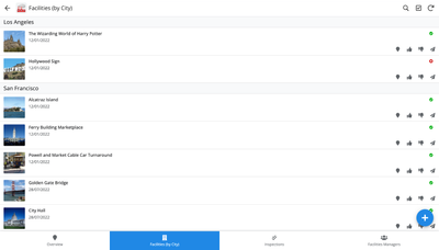
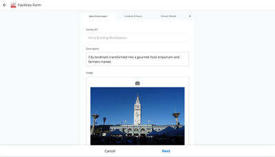
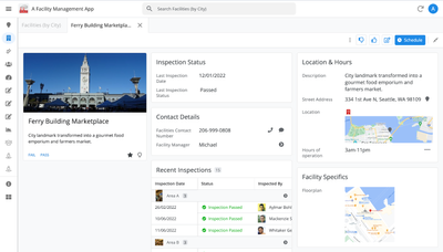
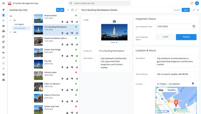
Here are some before and after images that better illustrate the design changes.
Legacy Design - Screenshot #1: Sifting through a collection of records grouped by City and State after selecting a State (Deck View)
Legacy Design - Screenshot #2: Looking at a specific record after selecting that record in the screen above (Detail View)
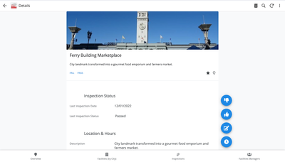
Legacy Design - Screenshot #3: Editing an existing record/Creating a new record (Form View)
New Design - Screenshot #1: Seeing your data in context (Deck View + Detail View)
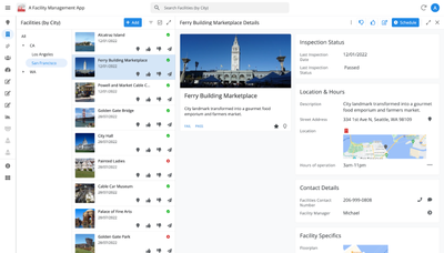
New Design - Screenshot #2: Focusing on a specific record (Detail View)
New Design - Screenshot #3: Editing in place an existing record
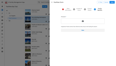
New Design - Screenshot #4: Creating a new record (Form View)
What’s next? Well, this is still a work in progress. We’ve been gathering feedback from a number of design partners, including some of you in the AppSheet Community, and we know there is more to do before it can properly support all of your applications. At this stage, we feel that it would be good to let you play with the new design and to give you an opportunity to share your feedback - what you like, what doesn't work, what you think could use some improvements. This represents a significant change and your feedback will help us guide our next steps.
As this feature is in Preview, you may see visual changes in your apps as we work to improve the new desktop design in real-time. We don't recommend using the new desktop design in your production apps.
Thank you
The AppSheet Team
FAQ
How do I get access to this new desktop design?
We are currently slowly ramping this new experience over the next week or so, so you may not see this option in the editor immediately.
For each application, you can opt-in to use the new desktop design. You can toggle between the new and legacy desktop modes, as desired.
Follow these steps to enable the new design in your app:
- Open the app in the app editor
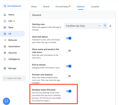
- Navigate to the UX > Options pane
- Enable the Desktop mode (Preview) option - see screenshot below
- Save the app in the Editor
All users of this application that access the app on a desktop browser will then see the new design after their next sync.
How do I configure the design of my app? I don’t see any new settings in the Editor!
There are minimal changes to the Editor for now. Mostly, the same settings are leveraged to specify the desktop and mobile designs. Let me give you an example.
Your apps have “primary views” and “menu views”. With the new desktop design, all of your views will be accessible from a side menu. That menu will list first the “primary views” and then the “secondary views”. In the future, we will adjust the configuration settings and in particular the language so that it makes sense for both mobile and desktop apps. For example, position values of "left most" and "right most" don't make sense for the new desktop design with its vertical menu structure.
We’ll be giving app creators more controls over some features that are currently set by default.
Is there some documentation or more information on what changed?
See Optimize the user experience using the new desktop design (Preview). We’ll update it over time.
Is there a list of functionalities that are known to not work with the new design?
Yes.
First, here is a list [as of July 31st] of (high-level) issues and requests that were reported to us and that still need fixes or assessments. Some of them are independent of the desktop mode, but we're still listing them here since people may want to know about them and so they don't need to report them unless it was reported for different app configurations :
| General theme | Issues |
| Form View |
|
| Navigation expressions: LINKTOROW(), LINKTOFORM(), etc |
|
| Format rules |
|
| Detail View UI |
- In some configurations, showing the wrong display names in a Detail tab - Edit-in-place in Dashboard view - Sync gets the app user out of Editing mode in a Detail View |
| General UI |
- Improvement requests on the subnav bar (e.g. larger text button, better responsiveness w.r.t. title, actions, text) - Clicking in grey area around onboarding view should not navigate the app in the background - Filtering on Dashboard - Tooltip for icon action buttons - Chart Views do not behave like other views |
| Localization of strings | Some strings are missing |
| CSV import/export |
|
| Other app functionalities |
- Missing Share, Feedback buttons - App Gallery behaving differently - Support of Amazon Cognito (missing account icon) - OCR not working on Desktop |
| Functionalities for app creators | “Preview as” is not available for the desktop emulator |
Second, here is a list of some issues and feature requests that we know we are not going to tackle, at least for now.
| Supporting multiple navigation actions in a grouped action |
This is not something that we support. The team very intentionally did not want to support this. App creators should not rely on it and it won’t work in desktop mode. |
| Multiple requests to improve the Table View UI |
We got requests to improve the Table View in general. The requests are valid, but that is out of scope for desktop mode. Changes we would be making would also impact the legacy UI and mobile apps. |
| LINKTOPARENTVIEW() not supported | For desktop users, there are better options to navigate back: the browser’s back button and the breadcrumbs. |
| Font size changes (via app settings) lead to layout issues | Generally, we recommend using the browser’s zoom which does a better job at resizing the app. |
| Background image |
See also Limitations and known issues.
How do I provide feedback?
Please share your feedback in this thread below this message!
- Mark as New
- Bookmark
- Subscribe
- Mute
- Subscribe to RSS Feed
- Permalink
- Report Inappropriate Content
- Mark as New
- Bookmark
- Subscribe
- Mute
- Subscribe to RSS Feed
- Permalink
- Report Inappropriate Content
Hi @Arthur_Rallu
It seems the calendar date picker is no longer available in quick edit on the desktop preview view.
It used to be that hovering your mouse somewhere over the middle of the cell you want to edit would change the normal mouse icon to a hand icon to indicate a pop up was going to happen once clicked, following which that would open the calendar date picker.
Now this does not happen at all.
Probably a good idea to review how this works in general, as even how it used to work was not very user friendly.
- Mark as New
- Bookmark
- Subscribe
- Mute
- Subscribe to RSS Feed
- Permalink
- Report Inappropriate Content
- Mark as New
- Bookmark
- Subscribe
- Mute
- Subscribe to RSS Feed
- Permalink
- Report Inappropriate Content
And it seems like the calendar picker for iOS Mac is not working properly in new UI desktop either. Not possible to pick a date.
- Mark as New
- Bookmark
- Subscribe
- Mute
- Subscribe to RSS Feed
- Permalink
- Report Inappropriate Content
- Mark as New
- Bookmark
- Subscribe
- Mute
- Subscribe to RSS Feed
- Permalink
- Report Inappropriate Content
For others who are reading your post....Which browser are you using on your Mac?
Wait!! You said iOS MAC and the "UI Desktop". I assume you mean your desktop iMac or Macbook? If so then the question above applies. Otherwise, please clarify!
- Mark as New
- Bookmark
- Subscribe
- Mute
- Subscribe to RSS Feed
- Permalink
- Report Inappropriate Content
- Mark as New
- Bookmark
- Subscribe
- Mute
- Subscribe to RSS Feed
- Permalink
- Report Inappropriate Content
Sorry. Yes the Desktop for MAC. macOS. Not sure which version. I just saw it on a customers Mac.
- Mark as New
- Bookmark
- Subscribe
- Mute
- Subscribe to RSS Feed
- Permalink
- Report Inappropriate Content
- Mark as New
- Bookmark
- Subscribe
- Mute
- Subscribe to RSS Feed
- Permalink
- Report Inappropriate Content
HI @Skip2MiLu , @KON_TROLL , @WillowMobileSys , last week there a bug with date pickers in tables when editing using Quick Edit mode. The bug has been fixed. I just tested on both new Desktop UI, as well as on Android, and the Date Picker pops up and works as expected.
- Mark as New
- Bookmark
- Subscribe
- Mute
- Subscribe to RSS Feed
- Permalink
- Report Inappropriate Content
- Mark as New
- Bookmark
- Subscribe
- Mute
- Subscribe to RSS Feed
- Permalink
- Report Inappropriate Content
Thank you @Peter-Google I had already notice and gave my thanks for a quick fix directly on the release note thread. Keep up the good work.
- Mark as New
- Bookmark
- Subscribe
- Mute
- Subscribe to RSS Feed
- Permalink
- Report Inappropriate Content
- Mark as New
- Bookmark
- Subscribe
- Mute
- Subscribe to RSS Feed
- Permalink
- Report Inappropriate Content
@Arthur_Rallu & @lizlynch
I seem to have found a bug on the legacy mobile view, whereas the desktop preview is actually not experiencing the bug. Usually, it is the other way around.
Take a look at the below pictures comparing how Appsheet lists grouping of Enumlist types fields with no values.
Desktop preview correctly indicates "(empty)" when grouping records that have no values in a Enumlist column type.
However, the mobile / legacy environment does not show "(empty)" and therefore I not able to "drill-down" into records with no values in the Enumlist column type.
Can you please fix this?
Desktop View - Correct
Mobile / Legacy View - Incorrect
- Mark as New
- Bookmark
- Subscribe
- Mute
- Subscribe to RSS Feed
- Permalink
- Report Inappropriate Content
- Mark as New
- Bookmark
- Subscribe
- Mute
- Subscribe to RSS Feed
- Permalink
- Report Inappropriate Content
I might of spoke to soon regarding the Desktop View.
Take a look at example of how Appsheet handles grouping of an enumlist field and how it handles records of no value for that enumlist field.
I not sure what would be considered "accurate" in this scenario, but it does seem like the correct user experience should not be able to return any records if there is no value for that enumlist field. 🤔
I not sure what everyone else thoughts are?
- Mark as New
- Bookmark
- Subscribe
- Mute
- Subscribe to RSS Feed
- Permalink
- Report Inappropriate Content
- Mark as New
- Bookmark
- Subscribe
- Mute
- Subscribe to RSS Feed
- Permalink
- Report Inappropriate Content
Hi @Skip2MiLu , thanks for raising this. I've queued this topic to be discussed internally, when I have something more on this I'll reply back.
- Mark as New
- Bookmark
- Subscribe
- Mute
- Subscribe to RSS Feed
- Permalink
- Report Inappropriate Content
- Mark as New
- Bookmark
- Subscribe
- Mute
- Subscribe to RSS Feed
- Permalink
- Report Inappropriate Content
Hi @Peter-Google
Here another post that might be helpful with regards to reviewing how Enumlist column types that are managed in Appsheet.
Let me know if there have been any discussions regarding anything yet?
https://www.googlecloudcommunity.com/gc/forums/v5/forumtopicpage.inlinemessagereplyeditor.form.form....
- Mark as New
- Bookmark
- Subscribe
- Mute
- Subscribe to RSS Feed
- Permalink
- Report Inappropriate Content
- Mark as New
- Bookmark
- Subscribe
- Mute
- Subscribe to RSS Feed
- Permalink
- Report Inappropriate Content
Hey it looks like there may be a bug surfacing in your app. The "(empty)" in Desktop UI is replacing the empty string that you see in Legacy Mobile. Can you send me a direct message with your app details and enable support for your apps so I can take a look?

- Mark as New
- Bookmark
- Subscribe
- Mute
- Subscribe to RSS Feed
- Permalink
- Report Inappropriate Content
- Mark as New
- Bookmark
- Subscribe
- Mute
- Subscribe to RSS Feed
- Permalink
- Report Inappropriate Content
Hi @Skip2MiLu , just following up on Amy's reply from ~3 weeks ago. We need some more information to reproduce this issue. If you can send @amyplin a private message, that would be great.
- Mark as New
- Bookmark
- Subscribe
- Mute
- Subscribe to RSS Feed
- Permalink
- Report Inappropriate Content
- Mark as New
- Bookmark
- Subscribe
- Mute
- Subscribe to RSS Feed
- Permalink
- Report Inappropriate Content
@Arthur_Rallu & @lizlynch
Also, there another thing that desktop view does better than the legacy mobile view does.
The Desktop view always syncs in the background. There does not seem to be an option to sync in the foreground in the Desktop view which will force a user to wait for the sync screen to complete before he can use the app.
However, triggering the sync button on the mobile / legacy view always triggers a foreground sync forcing the user to wait until the sync is complete before using the app.
I have spent so much time asking every user to rather swipe down to rather sync in background so they do not need to wait to use the app mobile environment in instead of the sync button than syncs in the foreground. However a thumb downward swipe to sync in the background is not a intuitive for user to realize.
Can Appsheet consider adjusting the sync button to have the same experience as the desktop view so that sync is always in the background, or at the very least add a toggle in the setting section of the app editor to give the user the choice of the desired sync experience.
Also take note on below picture.
- Mark as New
- Bookmark
- Subscribe
- Mute
- Subscribe to RSS Feed
- Permalink
- Report Inappropriate Content
- Mark as New
- Bookmark
- Subscribe
- Mute
- Subscribe to RSS Feed
- Permalink
- Report Inappropriate Content
Thanks @Skip2MiLu for this feedback and interest in continuing to refine the sync experience.
- Mark as New
- Bookmark
- Subscribe
- Mute
- Subscribe to RSS Feed
- Permalink
- Report Inappropriate Content
- Mark as New
- Bookmark
- Subscribe
- Mute
- Subscribe to RSS Feed
- Permalink
- Report Inappropriate Content
@Arthur_Rallu Using a Formula to change the Display name of an action does not evaluate if that action is placed onto a Deck View action bar?
I have an action set to Display prominently with a Display name formula of
IF([AbandonGoal],"Reinstate Goal","Abandon Goal")
On a Deck view, the formula output is always "Abandon Goal" on the tooltip hover, whereas on a Detail view in a prominent position the tooltip and the Action Display name correctly changes depending on the TRUE/FALSE condition of [AbandonGoal]
By the way, it would be so cool if you could use similar expressions to affect the Action icon in a future update 😁
- Mark as New
- Bookmark
- Subscribe
- Mute
- Subscribe to RSS Feed
- Permalink
- Report Inappropriate Content
- Mark as New
- Bookmark
- Subscribe
- Mute
- Subscribe to RSS Feed
- Permalink
- Report Inappropriate Content
Hi @scott192 , thanks for the report. I'll ask someone to look into this internally. That said, offhand do you know is this desktop, mobile or both? (I haven't tried it myself).
I'll also make a note of the icon expression request for internal discussion.
- Mark as New
- Bookmark
- Subscribe
- Mute
- Subscribe to RSS Feed
- Permalink
- Report Inappropriate Content
- Mark as New
- Bookmark
- Subscribe
- Mute
- Subscribe to RSS Feed
- Permalink
- Report Inappropriate Content
Hi Peter,
I don't use mobile. The bug shows up in the Editor display as well as Full Screen Desktop.
Hope that helps.
- Mark as New
- Bookmark
- Subscribe
- Mute
- Subscribe to RSS Feed
- Permalink
- Report Inappropriate Content
- Mark as New
- Bookmark
- Subscribe
- Mute
- Subscribe to RSS Feed
- Permalink
- Report Inappropriate Content
Hi @scott192 , apologies for the late reply, but this should have been fixed as of mid-November. Thanks.
- Mark as New
- Bookmark
- Subscribe
- Mute
- Subscribe to RSS Feed
- Permalink
- Report Inappropriate Content
- Mark as New
- Bookmark
- Subscribe
- Mute
- Subscribe to RSS Feed
- Permalink
- Report Inappropriate Content
A dropdown for a enum list (base type=ref) behaves differently in desktop preview. Under the non-desktop version it allows users to search/filter after results are shown can click Select All and Done. These latter options do not show in desktop preview mode. The older behavior is desired because it allowed users to chdeck all filtered rows at once whereas the new version does not all that (no Select All).
Old version (after filter, Select All and Done show properly):
New version (does not show Select All or Done at bottom)
- Mark as New
- Bookmark
- Subscribe
- Mute
- Subscribe to RSS Feed
- Permalink
- Report Inappropriate Content
- Mark as New
- Bookmark
- Subscribe
- Mute
- Subscribe to RSS Feed
- Permalink
- Report Inappropriate Content
Have you tried waiting to see if the UI self-corrects?
I have noticed some odd UI behavior as well over the past week or so with UI components be "truncated". I have found that if I wait for 30 seconds or so (sometimes less) the UI will correct and return to normal.
Nonetheless, it is still a bug, but gives support extra information to track down the issue.
I have also seen delays in Format Rules getting applied, taking up to couple of minutes.
- Mark as New
- Bookmark
- Subscribe
- Mute
- Subscribe to RSS Feed
- Permalink
- Report Inappropriate Content
- Mark as New
- Bookmark
- Subscribe
- Mute
- Subscribe to RSS Feed
- Permalink
- Report Inappropriate Content
Hi @WillowMobileSys , thanks for mentioning the delays issue. It's not clear the scope of this (if anyone else is seeing this please let us know, and better yet if anyone can make a video or screencast of it happening that would be great). For now I've made a note of it on the internal ticket regarding the save all and done buttons, and go from there.
- Mark as New
- Bookmark
- Subscribe
- Mute
- Subscribe to RSS Feed
- Permalink
- Report Inappropriate Content
- Mark as New
- Bookmark
- Subscribe
- Mute
- Subscribe to RSS Feed
- Permalink
- Report Inappropriate Content
Hi @armstrob88 , thanks for reporting this. I'll queue this up to be looked at internally and to see if we can reproduce the issue with select all and done not showing up.
- Mark as New
- Bookmark
- Subscribe
- Mute
- Subscribe to RSS Feed
- Permalink
- Report Inappropriate Content
- Mark as New
- Bookmark
- Subscribe
- Mute
- Subscribe to RSS Feed
- Permalink
- Report Inappropriate Content
Hello,
I see that "Select All" is missing and we can create a ticket for that to get fixed. As for the "Done" button, clicking away from the dropdown (closing the dropdown) should be the equivalent behavior - let me know if you're experiencing something different!
- Mark as New
- Bookmark
- Subscribe
- Mute
- Subscribe to RSS Feed
- Permalink
- Report Inappropriate Content
- Mark as New
- Bookmark
- Subscribe
- Mute
- Subscribe to RSS Feed
- Permalink
- Report Inappropriate Content
Thanks, the Select All is critical. As for the Done button, if the dropdown is non-modal then it should work as you described, closing the dropdown and applying the selections.
- Mark as New
- Bookmark
- Subscribe
- Mute
- Subscribe to RSS Feed
- Permalink
- Report Inappropriate Content
- Mark as New
- Bookmark
- Subscribe
- Mute
- Subscribe to RSS Feed
- Permalink
- Report Inappropriate Content
Thanks again @armstrob88 and @amyplin , select all should now be available, here's a link to the release notes thread.
- Mark as New
- Bookmark
- Subscribe
- Mute
- Subscribe to RSS Feed
- Permalink
- Report Inappropriate Content
- Mark as New
- Bookmark
- Subscribe
- Mute
- Subscribe to RSS Feed
- Permalink
- Report Inappropriate Content
critical.
Bruce Armstrong
HSMC Volunteer
- Mark as New
- Bookmark
- Subscribe
- Mute
- Subscribe to RSS Feed
- Permalink
- Report Inappropriate Content
- Mark as New
- Bookmark
- Subscribe
- Mute
- Subscribe to RSS Feed
- Permalink
- Report Inappropriate Content
I have to report that my bug report regarding the Select All does not appear to be working.
Shown in the snippet below, I types 'vol' to filter the list, which it did. However, I could not click the Select All at that point.
The Select All does work if not filter is applied.
I un-deployed my app, selected Desktop mode, then re-deployed to make sure I had the latest version.
Thanks.
- Mark as New
- Bookmark
- Subscribe
- Mute
- Subscribe to RSS Feed
- Permalink
- Report Inappropriate Content
- Mark as New
- Bookmark
- Subscribe
- Mute
- Subscribe to RSS Feed
- Permalink
- Report Inappropriate Content
Hi @armstrob88 , apologies for the delay, sorry that it isn't clickable in the case you mentioned, I've queued this up again to be discussed with eng to see what the gap is. We'll reach out if we need more info.
- Mark as New
- Bookmark
- Subscribe
- Mute
- Subscribe to RSS Feed
- Permalink
- Report Inappropriate Content
- Mark as New
- Bookmark
- Subscribe
- Mute
- Subscribe to RSS Feed
- Permalink
- Report Inappropriate Content
Hi @armstrob88 , our engineers tried to replicate this issue themselves but were unable to do so (select all worked for them). I'll ping you in private message to go more details, thanks.
- Mark as New
- Bookmark
- Subscribe
- Mute
- Subscribe to RSS Feed
- Permalink
- Report Inappropriate Content
- Mark as New
- Bookmark
- Subscribe
- Mute
- Subscribe to RSS Feed
- Permalink
- Report Inappropriate Content
@Peter-Google Hi, I can confirm that I have the same issue occur as armstrob88 in one of my apps with select all when searched in filter
- Mark as New
- Bookmark
- Subscribe
- Mute
- Subscribe to RSS Feed
- Permalink
- Report Inappropriate Content
- Mark as New
- Bookmark
- Subscribe
- Mute
- Subscribe to RSS Feed
- Permalink
- Report Inappropriate Content
@Arthur_Rallu
I not sure if missing something, but it seems Column Description Expressions do not work properly or how I expected them to work.
Maybe I not setting this up correctly?
Take a look at the expression below as well as Gif to show the user experience.
- Mark as New
- Bookmark
- Subscribe
- Mute
- Subscribe to RSS Feed
- Permalink
- Report Inappropriate Content
- Mark as New
- Bookmark
- Subscribe
- Mute
- Subscribe to RSS Feed
- Permalink
- Report Inappropriate Content
The issue with the Description Label not updating dynamically has been a long standing issue for which I have reported to Support twice (years ago).
The issue is the Description label expression does not trigger UNTIL the user taps into the field.
As a work around, when I need this functionality, a label that changes based on context in OTHER fields, I implement it in the Display property.
- Mark as New
- Bookmark
- Subscribe
- Mute
- Subscribe to RSS Feed
- Permalink
- Report Inappropriate Content
- Mark as New
- Bookmark
- Subscribe
- Mute
- Subscribe to RSS Feed
- Permalink
- Report Inappropriate Content
Thanks @Skip2MiLu for reporting this, I've queued this up internally to have an engineer take a look and see if they can reproduce.
@WillowMobileSys thanks for your reply as well, however, when you said "The issue is the Description label expression does not trigger UNTIL the user taps into the field.", In this case, are you saying that if the Note/Task field got tapped into (it wasn't in the repro video), then you'd see the description update? (I have not had time to try myself).
- Mark as New
- Bookmark
- Subscribe
- Mute
- Subscribe to RSS Feed
- Permalink
- Report Inappropriate Content
- Mark as New
- Bookmark
- Subscribe
- Mute
- Subscribe to RSS Feed
- Permalink
- Report Inappropriate Content
Hi @Skip2MiLu , circling back on this, in late Nov or early Dec, the issue of "Description expression now correctly updates if a column it depends on has changed." should have been fixed. See also @scott192 's suggestion. If you are still seeing an issue, could you post more info, and if you see it fixed, let us know too. Thanks.
- Mark as New
- Bookmark
- Subscribe
- Mute
- Subscribe to RSS Feed
- Permalink
- Report Inappropriate Content
- Mark as New
- Bookmark
- Subscribe
- Mute
- Subscribe to RSS Feed
- Permalink
- Report Inappropriate Content
Could you maybe swap out your fieldname [Guidelines] and replace it with [_THIS]
SWITCH([_THIS], etc etc)
- Mark as New
- Bookmark
- Subscribe
- Mute
- Subscribe to RSS Feed
- Permalink
- Report Inappropriate Content
- Mark as New
- Bookmark
- Subscribe
- Mute
- Subscribe to RSS Feed
- Permalink
- Report Inappropriate Content
Hello @Arthur_Rallu could we please have some option to control the width of input forms or atleast an option to have a full screen view ?
When it comes to inputting important data its very cruicial and you can notice 60% of the area is wasted for nothing. Please have a look into this. Even though new desktop UI is an upgrade this minor part feels like a downgrade to me if its not controllable.
- Mark as New
- Bookmark
- Subscribe
- Mute
- Subscribe to RSS Feed
- Permalink
- Report Inappropriate Content
- Mark as New
- Bookmark
- Subscribe
- Mute
- Subscribe to RSS Feed
- Permalink
- Report Inappropriate Content
Thanks @Rifad for bringing this topic up. Before I pass it on internally, I just want to get some clarification. There are a few possible reasons why more space for the form view could be useful. I'd like to list some that come to mind, and can you let me know which ones you are thinking about most (feel free to suggest others, just give them unique numbers 🙂 )
1) The issue is with the form being on the right hand side vs more centered. Aka, perhaps the width isn't the issue, but the left-right-center positioning. Aka, if you spend a lot of time in forms, you want to be looking more towards the center of your screen, so having it to the right is a less ergonomic experience. This raises the question if you want the form to be an overlay or just want it fullscreen. Eg even as an overlay, more width means it's "more to the center".
2) More horizontal space for fields. If you have longer field names or values, or longer text entry in some fields, then having more horizontal space is nice b/c less things get cut off, you can more easily grok the whole value, etc.
3) Not promising anything, but you can reason out loud, if you have more horizontal space, you could show more form pages/tabs on screen at a time, or similarly, the decision about how to segment forms into pages varies in mobile vs desktop b/c of the form factor difference.
- Mark as New
- Bookmark
- Subscribe
- Mute
- Subscribe to RSS Feed
- Permalink
- Report Inappropriate Content
- Mark as New
- Bookmark
- Subscribe
- Mute
- Subscribe to RSS Feed
- Permalink
- Report Inappropriate Content
Hey again @Peter-Google
@Peter-Google wrote:
1) The issue is with the form being on the right hand side vs more centered. Aka, perhaps the width isn't the issue, but the left-right-center positioning. Aka, if you spend a lot of time in forms, you want to be looking more towards the center of your screen, so having it to the right is a less ergonomic experience. This raises the question if you want the form to be an overlay or just want it fullscreen. Eg even as an overlay, more width means it's "more to the center".
I'm on board with the idea of enhancing the overlay, and I'd like to share my thoughts visually for better clarity.
AppSheet's Overlay form is quite useful in various situations. However, one area where it could benefit from improvement is in providing more prominence for data entry. To illustrate this point, let me offer a comparison to demonstrate how we could enhance it. While the final implementation might not mirror this example precisely, breaking the form into multiple sections could be a valuable enhancement for us. Here is the difference it would make.
The current linear format of AppSheet is primarily designed for straightforward data entry, as depicted below. However, it can be challenging to manage complex data entry processes within this framework.
I would like to propose something along the lines of the example below, but within the existing overlay form structure.
For a comprehensive reference, I recommend checking out ClickUp. They provide an excellent example of the overlay form view, which resembles a detailed view and offers a higher level of prominence for the data entry. You'll find that the form closely resembles the AppSheet expression editor form, positioned right in the center but with a subtle overlay.
@Peter-Google wrote:
3) Not promising anything, but you can reason out loud, if you have more horizontal space, you could show more form pages/tabs on screen at a time, or similarly, the decision about how to segment forms into pages varies in mobile vs desktop b/c of the form factor difference.
Combining points 3 and 1 would be a gaaame-changer.
Wishing you a fantastic day ahead! Cheers!
- Mark as New
- Bookmark
- Subscribe
- Mute
- Subscribe to RSS Feed
- Permalink
- Report Inappropriate Content
- Mark as New
- Bookmark
- Subscribe
- Mute
- Subscribe to RSS Feed
- Permalink
- Report Inappropriate Content
@Peter-Google here is comments and genuine feedback from users/clients about form view.
1.
2.
3.
Maybe we need a form with multiple tabs in fullscreen just like multicolumn detail layout.
Unfortunately we do not have an option to control width or even an option to go full screen forms if needed. Nothing fancy just business/enterprise app requirements.
Thanks in advance.
- Mark as New
- Bookmark
- Subscribe
- Mute
- Subscribe to RSS Feed
- Permalink
- Report Inappropriate Content
- Mark as New
- Bookmark
- Subscribe
- Mute
- Subscribe to RSS Feed
- Permalink
- Report Inappropriate Content
I would like the multicolumn form.
-
Account
3 -
Announcements
30 -
App Management
8 -
Automation
33 -
Data
33 -
Errors
17 -
Expressions
21 -
Integrations
25 -
Intelligence
6 -
Other
15 -
Resources
15 -
Security
5 -
Templates
13 -
Users
7 -
UX
34

 Twitter