- AppSheet
- AppSheet Forum
- AppSheet Q&A
- Align text
- Subscribe to RSS Feed
- Mark Topic as New
- Mark Topic as Read
- Float this Topic for Current User
- Bookmark
- Subscribe
- Mute
- Printer Friendly Page
- Mark as New
- Bookmark
- Subscribe
- Mute
- Subscribe to RSS Feed
- Permalink
- Report Inappropriate Content
- Mark as New
- Bookmark
- Subscribe
- Mute
- Subscribe to RSS Feed
- Permalink
- Report Inappropriate Content
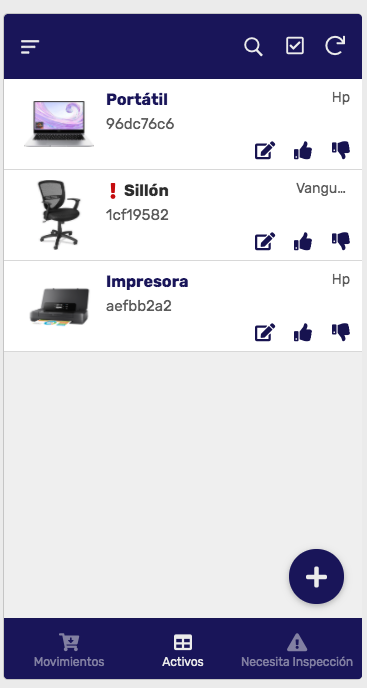
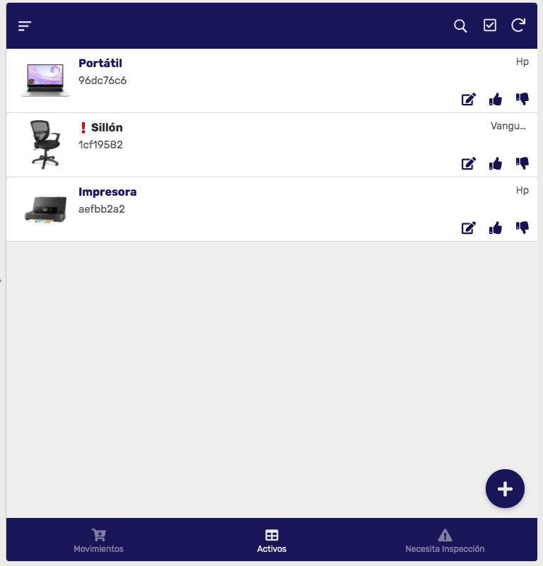
Hi!, I have a deck view with Primary, Secondary and Summary column, but it truncate the text, logic. (image 1) But when I see it in a wider screen Iwould expect to see the full text but it keeps align the text to the right and truncate it (image 2). Even if I use tablet or desktop screen.
Is there a way to fix it? align the text to the right, so when I see in bigger screen see all the info?
Thanks


- Labels:
-
UX
- Mark as New
- Bookmark
- Subscribe
- Mute
- Subscribe to RSS Feed
- Permalink
- Report Inappropriate Content
- Mark as New
- Bookmark
- Subscribe
- Mute
- Subscribe to RSS Feed
- Permalink
- Report Inappropriate Content
That location of the deck view has a hardcoded size limit regardless of screen size. The only thing you can do to fit more characters there would be to either make your font smaller or choose a more condensed system font.
- Mark as New
- Bookmark
- Subscribe
- Mute
- Subscribe to RSS Feed
- Permalink
- Report Inappropriate Content
- Mark as New
- Bookmark
- Subscribe
- Mute
- Subscribe to RSS Feed
- Permalink
- Report Inappropriate Content
Thanks, I know it is designed mobile first, but I think this is not as responsive as the AS team says, because it is exactly the same content that you see in any device.
Hope they can fix it! : )
- Mark as New
- Bookmark
- Subscribe
- Mute
- Subscribe to RSS Feed
- Permalink
- Report Inappropriate Content
- Mark as New
- Bookmark
- Subscribe
- Mute
- Subscribe to RSS Feed
- Permalink
- Report Inappropriate Content
If tablets and desktop screens are going to be a regular way for users to access this app, I would consider switch to Card view instead of Deck. My reasoning: The Deck clearly works (in general) for you on the smaller screen based off the information you have visible. On the wider screens the Deck view has a lot of whitespace, which is fine if you were throwing a chart or inline view in it. Cards can stay compact regardless of screen size. And most of the Card text spots don’t have any character limits that I’m aware of.
-
Account
1,865 -
App Management
4,152 -
Automation
11,572 -
Bug
1,585 -
Data
10,865 -
Errors
6,556 -
Expressions
13,082 -
Integrations
1,977 -
Intelligence
697 -
Introductions
118 -
Other
3,400 -
Resources
683 -
Security
935 -
Templates
1,543 -
Users
1,822 -
UX
9,828
- « Previous
- Next »
| User | Count |
|---|---|
| 19 | |
| 10 | |
| 7 | |
| 5 | |
| 5 |

 Twitter