- AppSheet
- AppSheet Forum
- AppSheet Q&A
- Chart View - X Axis label problem
- Subscribe to RSS Feed
- Mark Topic as New
- Mark Topic as Read
- Float this Topic for Current User
- Bookmark
- Subscribe
- Mute
- Printer Friendly Page
- Mark as New
- Bookmark
- Subscribe
- Mute
- Subscribe to RSS Feed
- Permalink
- Report Inappropriate Content
- Mark as New
- Bookmark
- Subscribe
- Mute
- Subscribe to RSS Feed
- Permalink
- Report Inappropriate Content
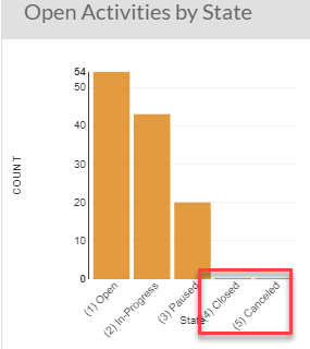
So I have a slice with a filter condition that returns just records that have a [State] of Open, In-Progress, or Paused. This means Closed or Cancelled records are not displayed.
Unfortunately, when I create a Chart View, the x axis includes [State] labels for Closed and Cancelled, even if the record count is zero. Any way around this?
- Labels:
-
UX
- Mark as New
- Bookmark
- Subscribe
- Mute
- Subscribe to RSS Feed
- Permalink
- Report Inappropriate Content
- Mark as New
- Bookmark
- Subscribe
- Mute
- Subscribe to RSS Feed
- Permalink
- Report Inappropriate Content
State is an Enum with defined values?
- Mark as New
- Bookmark
- Subscribe
- Mute
- Subscribe to RSS Feed
- Permalink
- Report Inappropriate Content
- Mark as New
- Bookmark
- Subscribe
- Mute
- Subscribe to RSS Feed
- Permalink
- Report Inappropriate Content
Yes [State] is an enum with 5 defined values. The slice the graph is pulling from only allows records from 3 of the 5 values, so 2 chart columns will always be blank (and look odd).
- Mark as New
- Bookmark
- Subscribe
- Mute
- Subscribe to RSS Feed
- Permalink
- Report Inappropriate Content
- Mark as New
- Bookmark
- Subscribe
- Mute
- Subscribe to RSS Feed
- Permalink
- Report Inappropriate Content
I suspect there is no fix to this from your end; I imagine it’s inherent in how graphs handle defined Enum values and cannot be changed.
- Mark as New
- Bookmark
- Subscribe
- Mute
- Subscribe to RSS Feed
- Permalink
- Report Inappropriate Content
- Mark as New
- Bookmark
- Subscribe
- Mute
- Subscribe to RSS Feed
- Permalink
- Report Inappropriate Content
I was afraid of that. Unfortunate. Chart formatting needs some real improvement as it’s a bit crude right now…
Thanks for the response @Steve!
-
Account
1,861 -
App Management
4,143 -
Automation
11,555 -
Bug
1,578 -
Data
10,852 -
Errors
6,551 -
Expressions
13,068 -
Integrations
1,972 -
Intelligence
691 -
Introductions
117 -
Other
3,396 -
Resources
682 -
Security
933 -
Templates
1,541 -
Users
1,819 -
UX
9,820
- « Previous
- Next »
| User | Count |
|---|---|
| 15 | |
| 11 | |
| 10 | |
| 8 | |
| 3 |

 Twitter