- AppSheet
- AppSheet Forum
- AppSheet Q&A
- Re: Chart with right column
- Subscribe to RSS Feed
- Mark Topic as New
- Mark Topic as Read
- Float this Topic for Current User
- Bookmark
- Subscribe
- Mute
- Printer Friendly Page
- Mark as New
- Bookmark
- Subscribe
- Mute
- Subscribe to RSS Feed
- Permalink
- Report Inappropriate Content
- Mark as New
- Bookmark
- Subscribe
- Mute
- Subscribe to RSS Feed
- Permalink
- Report Inappropriate Content
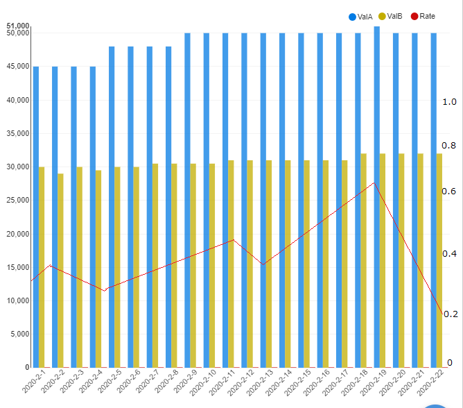
Hi, how can I create a chart like this with right column with one of my data columns showing Rate (the red line)? Thanks!

My data looks like
| Date | ValA | ValB | Rate |
|---|---|---|---|
| 2020-02-01 | 45000 | 30000 | 0.05 |
| 2020-02-02 | 45000 | 29000 | 0.09 |
| 2020-02-03 | 45000 | 30000 | 0.13 |
| 2020-02-04 | 45000 | 29500 | 0.17 |
| 2020-02-05 | 48000 | 30000 | 0.21 |
| 2020-02-06 | 48000 | 30000 | 0.25 |
| 2020-02-07 | 48000 | 30500 | 0.29 |
- Labels:
-
UX
- Mark as New
- Bookmark
- Subscribe
- Mute
- Subscribe to RSS Feed
- Permalink
- Report Inappropriate Content
- Mark as New
- Bookmark
- Subscribe
- Mute
- Subscribe to RSS Feed
- Permalink
- Report Inappropriate Content
I do not believe what you are asking for is possible at the moment.
There are some charts that allow for a Trendline but I do not think there is an option for a right-most column.
I would recommend searching the Feature Requests to see if there is something already submitted and if so add your comments and image. This will renew interest in the Feature and bubble it to the top where it can get more attention.
If no Feature is found then I would encourage you to open one!
- Mark as New
- Bookmark
- Subscribe
- Mute
- Subscribe to RSS Feed
- Permalink
- Report Inappropriate Content
- Mark as New
- Bookmark
- Subscribe
- Mute
- Subscribe to RSS Feed
- Permalink
- Report Inappropriate Content
Thanks John.
- Mark as New
- Bookmark
- Subscribe
- Mute
- Subscribe to RSS Feed
- Permalink
- Report Inappropriate Content
- Mark as New
- Bookmark
- Subscribe
- Mute
- Subscribe to RSS Feed
- Permalink
- Report Inappropriate Content
I believe you want dual axis type of new features. Yes, it would be surely useful to have.
Copying to “chart specialist” in Appsheet teams
- Mark as New
- Bookmark
- Subscribe
- Mute
- Subscribe to RSS Feed
- Permalink
- Report Inappropriate Content
- Mark as New
- Bookmark
- Subscribe
- Mute
- Subscribe to RSS Feed
- Permalink
- Report Inappropriate Content
I’ve been using charts that “allow” for a trendline, but I can never get the trendline to display on the chart.
- Mark as New
- Bookmark
- Subscribe
- Mute
- Subscribe to RSS Feed
- Permalink
- Report Inappropriate Content
- Mark as New
- Bookmark
- Subscribe
- Mute
- Subscribe to RSS Feed
- Permalink
- Report Inappropriate Content
Yes that’s true we don’t have dual axis feature at this moment. Though you could use other web services to generate such a chart and then show it as an image in your app.
- Mark as New
- Bookmark
- Subscribe
- Mute
- Subscribe to RSS Feed
- Permalink
- Report Inappropriate Content
- Mark as New
- Bookmark
- Subscribe
- Mute
- Subscribe to RSS Feed
- Permalink
- Report Inappropriate Content
Thanks Aleksi!
- Mark as New
- Bookmark
- Subscribe
- Mute
- Subscribe to RSS Feed
- Permalink
- Report Inappropriate Content
- Mark as New
- Bookmark
- Subscribe
- Mute
- Subscribe to RSS Feed
- Permalink
- Report Inappropriate Content
You’re welcome
-
Account
1,865 -
App Management
4,154 -
Automation
11,573 -
Bug
1,585 -
Data
10,869 -
Errors
6,559 -
Expressions
13,084 -
Integrations
1,979 -
Intelligence
697 -
Introductions
118 -
Other
3,404 -
Resources
683 -
Security
935 -
Templates
1,543 -
Users
1,822 -
UX
9,828
- « Previous
- Next »
| User | Count |
|---|---|
| 19 | |
| 8 | |
| 8 | |
| 6 | |
| 5 |

 Twitter