- AppSheet
- AppSheet Forum
- AppSheet Q&A
- Creating Stacked Histogram Chart - not row/col ser...
- Subscribe to RSS Feed
- Mark Topic as New
- Mark Topic as Read
- Float this Topic for Current User
- Bookmark
- Subscribe
- Mute
- Printer Friendly Page
- Mark as New
- Bookmark
- Subscribe
- Mute
- Subscribe to RSS Feed
- Permalink
- Report Inappropriate Content
- Mark as New
- Bookmark
- Subscribe
- Mute
- Subscribe to RSS Feed
- Permalink
- Report Inappropriate Content
Hello Community!
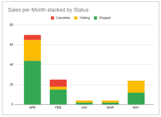
I am struggling with Chart UX Tools trying to create a very specific kind of chart: a stacked histogram (created using Google Sheets)
Context
I have an App for registering sales. The App has a Sales table. Each sale has a Ref column for…
- Agent: Team member in charge of the sale
- Status: Wether the sale has been shipped, cancelled, or is waiting to be confirmed.
- Region
And a simple Enum Column for - Month
Im trying to build an interactive dashboard view where the user can pick a Region and/or an Agent, and see the amount of sales per month, by status.
I’ve succesfully managed to build a combination of aggregate histogram (for Total Sales by Month) + pie chart (for Total Sales by Status)… And also splitting up the Sales table into different status-slices to create 4 different histograms with month columns (Total Sales, Cancelled Sales, Shipped Sales…)
You can see a sample APP here.
But as you can imagine… the experience and insights any user could make from any of those two combinations is not the same as depicted in the chart created using Google Sheets.
Is there currently a way to create such charts? Should I start a feauture request instead?
I’ve considered creating a slice of the Sales table based on “user input form based filters”, but taking into account the amount of filters I’d like to include, the UX would turn out to be quite unsatisfactory.
Thank you!
- Labels:
-
UX
- Mark as New
- Bookmark
- Subscribe
- Mute
- Subscribe to RSS Feed
- Permalink
- Report Inappropriate Content
- Mark as New
- Bookmark
- Subscribe
- Mute
- Subscribe to RSS Feed
- Permalink
- Report Inappropriate Content
Did you ever work this out? Looks like it's not possible but would add a lot of value to my apps.
- Mark as New
- Bookmark
- Subscribe
- Mute
- Subscribe to RSS Feed
- Permalink
- Report Inappropriate Content
- Mark as New
- Bookmark
- Subscribe
- Mute
- Subscribe to RSS Feed
- Permalink
- Report Inappropriate Content
I am really keen on this and think Appsheet has the capability to add extra field (with columns) to a histogram and would be so useful for many implementations
- Mark as New
- Bookmark
- Subscribe
- Mute
- Subscribe to RSS Feed
- Permalink
- Report Inappropriate Content
- Mark as New
- Bookmark
- Subscribe
- Mute
- Subscribe to RSS Feed
- Permalink
- Report Inappropriate Content
Explore QuickChart.
-
Account
1,855 -
Affiliate Program
1 -
App Management
4,123 -
AppSheet
1 -
Automation
11,527 -
Best Practice
1 -
Bug
1,560 -
Cloud Deploy
1 -
core
1 -
Data
10,827 -
Errors
6,520 -
Expressions
13,042 -
free
1 -
General Miscellaneous
1 -
image and text
1 -
Integration
1 -
Integrations
1,964 -
Intelligence
688 -
Introductions
116 -
Learning Hub
1 -
Other
3,378 -
Panel
1 -
Photos
1 -
plans
1 -
Resources
681 -
Security
930 -
subscription
1 -
Templates
1,536 -
Users
1,816 -
UX
9,810
- « Previous
- Next »
| User | Count |
|---|---|
| 18 | |
| 15 | |
| 10 | |
| 7 | |
| 4 |

 Twitter