- AppSheet
- AppSheet Forum
- AppSheet Q&A
- How hide a Dashboard view when no selection has be...
- Subscribe to RSS Feed
- Mark Topic as New
- Mark Topic as Read
- Float this Topic for Current User
- Bookmark
- Subscribe
- Mute
- Printer Friendly Page
- Mark as New
- Bookmark
- Subscribe
- Mute
- Subscribe to RSS Feed
- Permalink
- Report Inappropriate Content
- Mark as New
- Bookmark
- Subscribe
- Mute
- Subscribe to RSS Feed
- Permalink
- Report Inappropriate Content
Hello all,
I have a dashboard with charts that works ok when a selection is made on the first view making no selection however shows useless data in the pie chart.
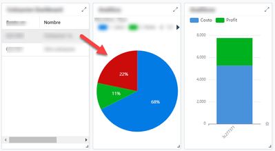
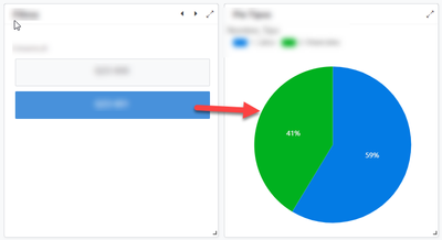
For example when the first record is selected it shows the data for that first record Ok
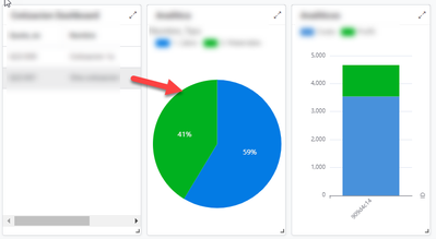
The same with the second record
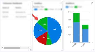
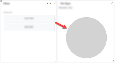
But if I deselect both, (as when the app opens for the first time) then it gets all the values in the table from where the charts are getting its data
it makes reading the Pie chart useless since the data doesnt make any sense.
I guess I need to either pre-select one of the options in the first view or hide the chart views when no selection is made, but I have no idea how to do either. Any help is appreciated.
Solved! Go to Solution.
- Mark as New
- Bookmark
- Subscribe
- Mute
- Subscribe to RSS Feed
- Permalink
- Report Inappropriate Content
- Mark as New
- Bookmark
- Subscribe
- Mute
- Subscribe to RSS Feed
- Permalink
- Report Inappropriate Content
Thanks @MultiTech for your suggestion.
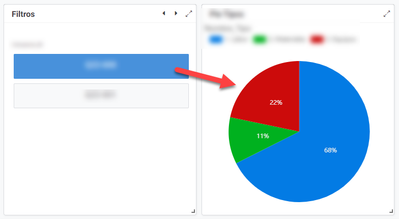
This is what I ended up doing to implement what you called an "Enhanced Dashboard":
1. I created a new table called Filter with a column to hold the ID of the entity I required to filter by Order_ID
2. Added that table data and configured the Order_ID column to be an Enum of type Ref pointing to Orders data.
3. Created a new UX view of type Detail that shows only the column I want for the Filter data, in my case Order_ID.
4. Made Order_ID column a quick edit column in the Filter view
5. For the pie chart data, I created a slice with the row filter condition:
[Order_ID] = Index(
  Select(
    Filter[Order_ID],true
  ),1
)
6. Created the Pie Chart View pointing to the slice created in step 5 above
7. Added the Filter UX View to the Dashboard and the Pie Chart View
This is a good enough solution since at least now I have sensible data shown on the Pie chart. If no selection is made the Pie chart does not show any data at all which is better than the default behavior of the Interactive Dashboard.
- Mark as New
- Bookmark
- Subscribe
- Mute
- Subscribe to RSS Feed
- Permalink
- Report Inappropriate Content
- Mark as New
- Bookmark
- Subscribe
- Mute
- Subscribe to RSS Feed
- Permalink
- Report Inappropriate Content
Noice! With this sort of setup in place, you now can detect when there is NO filter value.
- IsNotBlank(Index(Filter[value], 1)
- Use that for the show if of your pie chart view
Also FYI: since you've only got one record in that table (assuming it's only one record), you don't have to do all the SELECT() stuff - you can just do a short-hand table call
- table[column]
- Mark as New
- Bookmark
- Subscribe
- Mute
- Subscribe to RSS Feed
- Permalink
- Report Inappropriate Content
- Mark as New
- Bookmark
- Subscribe
- Mute
- Subscribe to RSS Feed
- Permalink
- Report Inappropriate Content
When using the native "interactive dashboard" - you can't do what you're wanting.
The mechanism - by default - shows ALL the data from the table until a selection is made.
The alternative is to create your own enhanced dashboard system:
- Mark as New
- Bookmark
- Subscribe
- Mute
- Subscribe to RSS Feed
- Permalink
- Report Inappropriate Content
- Mark as New
- Bookmark
- Subscribe
- Mute
- Subscribe to RSS Feed
- Permalink
- Report Inappropriate Content
Thanks @MultiTech for your suggestion.
This is what I ended up doing to implement what you called an "Enhanced Dashboard":
1. I created a new table called Filter with a column to hold the ID of the entity I required to filter by Order_ID
2. Added that table data and configured the Order_ID column to be an Enum of type Ref pointing to Orders data.
3. Created a new UX view of type Detail that shows only the column I want for the Filter data, in my case Order_ID.
4. Made Order_ID column a quick edit column in the Filter view
5. For the pie chart data, I created a slice with the row filter condition:
[Order_ID] = Index(
  Select(
    Filter[Order_ID],true
  ),1
)
6. Created the Pie Chart View pointing to the slice created in step 5 above
7. Added the Filter UX View to the Dashboard and the Pie Chart View
This is a good enough solution since at least now I have sensible data shown on the Pie chart. If no selection is made the Pie chart does not show any data at all which is better than the default behavior of the Interactive Dashboard.
- Mark as New
- Bookmark
- Subscribe
- Mute
- Subscribe to RSS Feed
- Permalink
- Report Inappropriate Content
- Mark as New
- Bookmark
- Subscribe
- Mute
- Subscribe to RSS Feed
- Permalink
- Report Inappropriate Content
Noice! With this sort of setup in place, you now can detect when there is NO filter value.
- IsNotBlank(Index(Filter[value], 1)
- Use that for the show if of your pie chart view
Also FYI: since you've only got one record in that table (assuming it's only one record), you don't have to do all the SELECT() stuff - you can just do a short-hand table call
- table[column]
-
Account
1,876 -
App Management
4,212 -
Automation
11,638 -
Bug
1,635 -
Data
10,943 -
Errors
6,627 -
Expressions
13,152 -
Integrations
1,996 -
Intelligence
705 -
Introductions
119 -
Login
1 -
Other
3,434 -
Resources
691 -
Security
940 -
Templates
1,554 -
Users
1,833 -
UX
9,874
- « Previous
- Next »
| User | Count |
|---|---|
| 23 | |
| 15 | |
| 4 | |
| 3 | |
| 3 |

 Twitter