- AppSheet
- AppSheet Forum
- AppSheet Q&A
- How to build S-Curve charts
- Subscribe to RSS Feed
- Mark Topic as New
- Mark Topic as Read
- Float this Topic for Current User
- Bookmark
- Subscribe
- Mute
- Printer Friendly Page
- Mark as New
- Bookmark
- Subscribe
- Mute
- Subscribe to RSS Feed
- Permalink
- Report Inappropriate Content
- Mark as New
- Bookmark
- Subscribe
- Mute
- Subscribe to RSS Feed
- Permalink
- Report Inappropriate Content
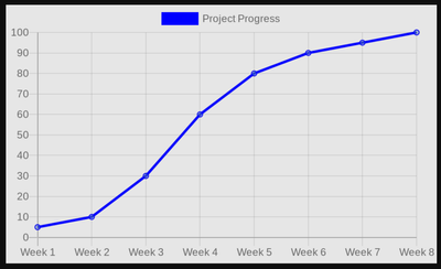
Hi, how do you build an S-Curve chart in AppSheet?
I have to track multiple projects and would like to build an app that can portray its S Curve of individual projects.
The issue is that the charts capability is very limited whereby I cant control the x and y axis.
Has anyone ever tried to solve this issue before?
Thank you.
- Mark as New
- Bookmark
- Subscribe
- Mute
- Subscribe to RSS Feed
- Permalink
- Report Inappropriate Content
- Mark as New
- Bookmark
- Subscribe
- Mute
- Subscribe to RSS Feed
- Permalink
- Report Inappropriate Content
People have used Quickchart among others to produce graphs not natively supported in AppSheet.
https://www.googlecloudcommunity.com/gc/AppSheet-Q-A/Quickchart-syntax/m-p/338292
- Mark as New
- Bookmark
- Subscribe
- Mute
- Subscribe to RSS Feed
- Permalink
- Report Inappropriate Content
- Mark as New
- Bookmark
- Subscribe
- Mute
- Subscribe to RSS Feed
- Permalink
- Report Inappropriate Content
Hi, is the chart viewable in the AppSheet app itself?
- Mark as New
- Bookmark
- Subscribe
- Mute
- Subscribe to RSS Feed
- Permalink
- Report Inappropriate Content
- Mark as New
- Bookmark
- Subscribe
- Mute
- Subscribe to RSS Feed
- Permalink
- Report Inappropriate Content
Yes, because the response is an image.
- Mark as New
- Bookmark
- Subscribe
- Mute
- Subscribe to RSS Feed
- Permalink
- Report Inappropriate Content
- Mark as New
- Bookmark
- Subscribe
- Mute
- Subscribe to RSS Feed
- Permalink
- Report Inappropriate Content
You might find the following video helpful
- Mark as New
- Bookmark
- Subscribe
- Mute
- Subscribe to RSS Feed
- Permalink
- Report Inappropriate Content
- Mark as New
- Bookmark
- Subscribe
- Mute
- Subscribe to RSS Feed
- Permalink
- Report Inappropriate Content
Hi MultiTech,
Tq for this. At a first glance, it looks complicated for a no-code guy like me haha. But i will try nonetheless. Looks interesting to tinker about.
Just wanna ask if you've done it before? Maybe a simpler tutorial is available somewhere too?
And also, am wondering can I superimpose multiple charts in a single chart as well? Cause we need to track Original Planned Timeline, Actual Timeline & Revised Timeline. So we are seeing at least 3 different plots within the same chart.
Thank you guys for helping me!
-
Account
1,872 -
App Management
4,196 -
Automation
11,623 -
Bug
1,627 -
Data
10,933 -
Errors
6,616 -
Expressions
13,134 -
Integrations
1,994 -
Intelligence
704 -
Introductions
119 -
Login
1 -
Other
3,428 -
Resources
691 -
Security
939 -
Templates
1,554 -
Users
1,832 -
UX
9,869
- « Previous
- Next »
| User | Count |
|---|---|
| 17 | |
| 7 | |
| 6 | |
| 5 | |
| 3 |

 Twitter