- Looker & Looker Studio
- Looker Forums
- Exploring & Curating Data
- As close as you can get to a Bullet Graph with Loo...
- Subscribe to RSS Feed
- Mark Topic as New
- Mark Topic as Read
- Float this Topic for Current User
- Bookmark
- Subscribe
- Mute
- Printer Friendly Page
- Mark as New
- Bookmark
- Subscribe
- Mute
- Subscribe to RSS Feed
- Permalink
- Report Inappropriate Content
- Mark as New
- Bookmark
- Subscribe
- Mute
- Subscribe to RSS Feed
- Permalink
- Report Inappropriate Content
Hello there Looker community!
I’ve been building bullet-like graphs for quite a lot of clients so I thought I’d share the knowledge here! The goal is to be able to display an actual number versus a target and a pace. It usually is used with revenue/sales numbers.
This is the end goal:

Prerequisite
- An actual number for a given month which should be a measure that will be defined as
${target}in this tutorial - A target number for a given month that can be built in a measure or a table calculation
${sales}in this tutorial
Modeling the data
You are going to build 5 Table Calculations:
-
Expected Pace
code for copy:
(${target}/extract_days(add_days(-1, date(extract_years(add_months(1, now())), extract_months(add_months(1, now())), 1))))*extract_days(now())
This gives us the expected revenue/sales where we should be at for the current day of the current month in a $ amount).
That field won’t be used in our visualization.
- % of Target

(excuse the red dot, for the sake of the example, I’ve renamed the
sales measure)
code for copy:
${sales}/${target}
This gives us the current percentage of completion towards our target (percentage)
That field will be used in our visualization.
- Pace
There we’ll start referencing the above calculations

(excuse the red dot, for the sake of the example, I’ve renamed the
sales measure)
code for copy:
(${sales}-${expected_pace})/${expected_pace}
This gives us a the percentage value of where we stand compared to the Pace. If that value is negative we’re behind, if the value is positive then we’re ahead!
That field won’t be used in our visualization.
- Expected Pace Percentage

code for copy:
if(((${expected_pace}/${target})-${of_target}) > 0, ((${expected_pace}/${target})-${of_target}), null)
This gives us the percentage needed to match the pace compared the actual sales or a null value if we’re ahead of the pace.
That field will be used in our visualization.
- Remaining
And finally:

code for copy:
if(${pace}<0, 1-(${expected_pace_percentage}+${of_target}),if(1-${of_target}<0,null,1-${of_target}))
This gives us the percentage remaining to match the target based on the pace (if our sales are behind it) or the sales (if they are ahead of the pace).
That field will be used in our visualization.
Once everything is set you should have something like that:

Building the visualization
Now that we have our data, let’s start visualizing it!
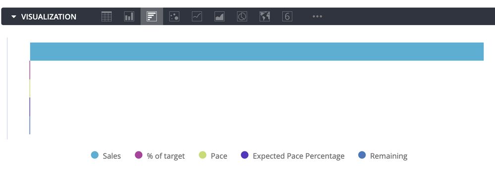
If you select the bar chart, you should have something that will look like this:

That is obviously not good, so let’s start hiding series.

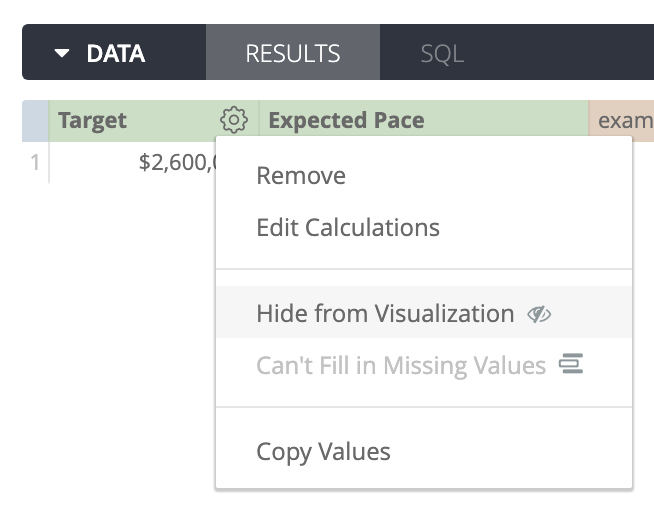
-> In the data panel, hide all the fields but those three Table Calculations:
- % of Target
- Expected Pace Percentage
- Remaining
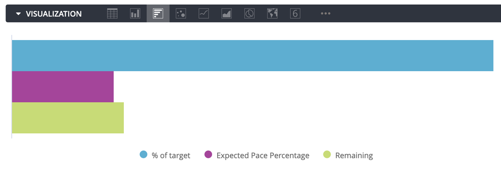
You should now have this:

Now let’s stack the series and display the value labels:

Now we’re getting there!
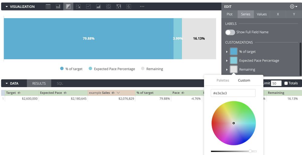
So now let"s change the series color so that we have a smoother transition between our current and our pace:

Almost there!
Now we want to hide the value labels for the Expected Pace Percentage and Remaining. Looker doesn’t have that feature, so we’ll bypass it by…
…changing the font colors with the corresponding colors of the series!
And while we’re at it, let’s increase the font size!

Well there we ar…
Wait… I can see that the value label for our “Expected Pace Percentage” is overlapping and we can see it… Hmm being the analytics professional that we are, we can’t allow that.
Again, Looker does not offer the feature to hide labels so let’s use the good old value format trick!
In the Value Format input that string:
#.00%[>0.10];#%[<0.10];[<0.06]
This will hide value below 6% and display values between 6% and 10% without decimals.

Now final touch!
Let’s change the series labels to match our original screenshot back at the beginning:

There you go!!
I Hope that’ll help someone!
- Labels:
-
tablecalcs
-
Visualizations
-
access grant
4 -
actionhub
9 -
Actions
14 -
Admin
4 -
alert
29 -
Analytics
2 -
Analytics Block
57 -
API
12 -
bar
10 -
bestpractice
4 -
BigQuery
8 -
blocks
1 -
boards
4 -
Bug
168 -
cache
2 -
case
2 -
chart
17 -
cohort
1 -
connection
5 -
connection database
1 -
content access
1 -
content-validator
2 -
count
6 -
custom dimension
9 -
custom field
19 -
custom measure
8 -
customdimension
9 -
Dashboards
925 -
Data
5 -
Data Sources
4 -
data tab
4 -
Database
5 -
datagroup
2 -
date-formatting
14 -
dates
18 -
derivedtable
1 -
develop
1 -
development
3 -
dimension
17 -
done
8 -
download
19 -
downloading
9 -
drill-down
1 -
drilling
30 -
dynamic
1 -
embed
10 -
Errors
13 -
etl
1 -
explore
84 -
Explores
273 -
extends
1 -
feature-requests
10 -
filed
3 -
Filter
245 -
Filtering
194 -
folders
4 -
formatting
19 -
git
2 -
Google Data Studio
1 -
Google Sheets
2 -
googlesheets
7 -
graph
9 -
group by
6 -
html
12 -
i__looker
1 -
imported project
2 -
Integrations
4 -
javascript
2 -
join
2 -
json
3 -
label
4 -
line chart
17 -
link
5 -
links
3 -
liquid
22 -
Looker
6 -
Looker Studio Pro
79 -
LookerStudio
7 -
LookML
169 -
lookml dashboard
15 -
looks
293 -
manage projects
1 -
map
30 -
map_layer
5 -
Marketplace
4 -
measure
4 -
Memorystore for Memcached
1 -
merge
14 -
model
3 -
modeling
2 -
multiple select
1 -
ndt
1 -
parameter
11 -
pdf
8 -
pdt
8 -
Performance
7 -
periodoverperiod
5 -
permission management
1 -
persistence
1 -
pivot
21 -
postgresql
1 -
python
2 -
pythonsdk
2 -
Query
3 -
quickstart
4 -
ReactJS
1 -
redshift
4 -
release
16 -
rendering
8 -
Reporting
10 -
schedule
51 -
schedule delivery
5 -
sdk
1 -
Security
4 -
sharing
2 -
singlevalue
16 -
snowflake
3 -
SQL
24 -
SSO
1 -
stacked chart
10 -
System Activity
5 -
table chart
16 -
tablecalcs
144 -
Tile
12 -
time
8 -
time zone
3 -
totals
13 -
Training
1 -
Ui
19 -
usage
4 -
user access management
3 -
user management
3 -
user-attributes
6 -
value_format
4 -
view
4 -
Views
4 -
Visualizations
558 -
watch
1 -
webhook
2
- « Previous
- Next »

 Twitter