- Looker & Looker Studio
- Looker Forums
- Exploring & Curating Data
- Is there a way to limit the X Axis Range
- Subscribe to RSS Feed
- Mark Topic as New
- Mark Topic as Read
- Float this Topic for Current User
- Bookmark
- Subscribe
- Mute
- Printer Friendly Page
- Mark as New
- Bookmark
- Subscribe
- Mute
- Subscribe to RSS Feed
- Permalink
- Report Inappropriate Content
- Mark as New
- Bookmark
- Subscribe
- Mute
- Subscribe to RSS Feed
- Permalink
- Report Inappropriate Content
I currently have 30 minute time slots, ranging from 08:00 to 20:00.
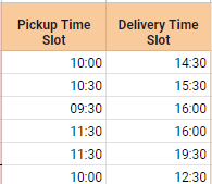
My data set is a series of rows that countain information of when a collection and the respective delivery happened within these time slots.
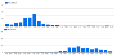
I would like to display this information in a bar chart, representing the ammount of times a pickup or delivery occured in that time slot.
My first question is if it would be possible to only represent this using just 1 chart and being able to distinguish them by color, similar. From my understanding this seems to be impossible, which leads me to my second approach/problem:
I thought of creating 2 separate charts, one regarding the pickup time slots and the other representing the delivery time slots, and the stack them on top of each other. However, I am not able to limit the X Axis range and one chart is starting at 08:00, while the other is starting at 07:00 (no idea why, since it is impossible for that time slot to have any records)
They both have a 24 bar limit. Also, there are over 40 records for the 20:00 time slot, but looker for some reason prefers to display the empty 07:00 time slot instead of the 20:00 .
Solved! Go to Solution.
- Mark as New
- Bookmark
- Subscribe
- Mute
- Subscribe to RSS Feed
- Permalink
- Report Inappropriate Content
- Mark as New
- Bookmark
- Subscribe
- Mute
- Subscribe to RSS Feed
- Permalink
- Report Inappropriate Content
So, I'm not sure how to fix the X-axis issue. But, I think I can help you get this into a single chart!
This is a little involved, so bear with me. We're basically going to create a base table of time slots, and then join your data to it twice - once on pickup time and once on delivery time. Then the two counts from these two "tables" will be the pickup and delivery counts you're looking for.
Step 1: Create a new Base Slots data source that has all possible slots for pickup or delivery. I just put some slots down in Google Sheets and connected that.
Step 2: Blend the original data source to the base slots data source twice. The way I did it was starting from the original data source as "pickups", then right joining that to the base slots on pickup slot == base slot. Then, I left joined the original data source, this time as "deliveries", on base slot == delivery slot.
Step 3: Create a bar chart with the base slots as the dimension, and both record counts as the metrics. One record count will represent pickups, and the other deliveries.
I hope this helps! Sorry it's kind of long and convoluted!
- Mark as New
- Bookmark
- Subscribe
- Mute
- Subscribe to RSS Feed
- Permalink
- Report Inappropriate Content
- Mark as New
- Bookmark
- Subscribe
- Mute
- Subscribe to RSS Feed
- Permalink
- Report Inappropriate Content
So, I'm not sure how to fix the X-axis issue. But, I think I can help you get this into a single chart!
This is a little involved, so bear with me. We're basically going to create a base table of time slots, and then join your data to it twice - once on pickup time and once on delivery time. Then the two counts from these two "tables" will be the pickup and delivery counts you're looking for.
Step 1: Create a new Base Slots data source that has all possible slots for pickup or delivery. I just put some slots down in Google Sheets and connected that.
Step 2: Blend the original data source to the base slots data source twice. The way I did it was starting from the original data source as "pickups", then right joining that to the base slots on pickup slot == base slot. Then, I left joined the original data source, this time as "deliveries", on base slot == delivery slot.
Step 3: Create a bar chart with the base slots as the dimension, and both record counts as the metrics. One record count will represent pickups, and the other deliveries.
I hope this helps! Sorry it's kind of long and convoluted!
-
access grant
4 -
actionhub
9 -
Actions
14 -
Admin
4 -
alert
29 -
Analytics
2 -
Analytics Block
56 -
API
12 -
bar
10 -
bestpractice
4 -
BigQuery
8 -
blocks
1 -
boards
4 -
Bug
168 -
cache
2 -
case
2 -
chart
17 -
cohort
1 -
connection
5 -
connection database
1 -
content access
1 -
content-validator
2 -
count
6 -
custom dimension
9 -
custom field
19 -
custom measure
8 -
customdimension
9 -
Dashboards
925 -
Data
5 -
Data Sources
4 -
data tab
4 -
Database
5 -
datagroup
2 -
date-formatting
14 -
dates
18 -
derivedtable
1 -
develop
1 -
development
3 -
dimension
17 -
done
8 -
download
19 -
downloading
9 -
drill-down
1 -
drilling
30 -
dynamic
1 -
embed
10 -
Errors
13 -
etl
1 -
explore
84 -
Explores
271 -
extends
1 -
feature-requests
10 -
filed
3 -
Filter
245 -
Filtering
193 -
folders
4 -
formatting
19 -
git
2 -
Google Data Studio
1 -
Google Sheets
2 -
googlesheets
7 -
graph
9 -
group by
6 -
html
12 -
i__looker
1 -
imported project
2 -
Integrations
4 -
javascript
2 -
join
2 -
json
3 -
label
4 -
line chart
17 -
link
5 -
links
3 -
liquid
22 -
Looker
6 -
Looker Studio Pro
78 -
LookerStudio
7 -
LookML
169 -
lookml dashboard
15 -
looks
292 -
manage projects
1 -
map
30 -
map_layer
5 -
Marketplace
4 -
measure
4 -
Memorystore for Memcached
1 -
merge
14 -
model
3 -
modeling
2 -
multiple select
1 -
ndt
1 -
parameter
11 -
pdf
8 -
pdt
8 -
Performance
7 -
periodoverperiod
5 -
permission management
1 -
persistence
1 -
pivot
21 -
postgresql
1 -
python
2 -
pythonsdk
2 -
Query
3 -
quickstart
4 -
ReactJS
1 -
redshift
4 -
release
16 -
rendering
8 -
Reporting
10 -
schedule
51 -
schedule delivery
5 -
sdk
1 -
Security
4 -
sharing
2 -
singlevalue
16 -
snowflake
3 -
SQL
24 -
SSO
1 -
stacked chart
10 -
System Activity
5 -
table chart
16 -
tablecalcs
144 -
Tile
12 -
time
8 -
time zone
3 -
totals
13 -
Training
1 -
Ui
19 -
usage
4 -
user access management
3 -
user management
3 -
user-attributes
6 -
value_format
4 -
view
4 -
Views
4 -
Visualizations
558 -
watch
1 -
webhook
2
- « Previous
- Next »

 Twitter


