- Looker
- Looker Forums
- Exploring & Curating Data
- Measure vs. Measure Scatterplots (3.28+)
- Subscribe to RSS Feed
- Mark Topic as New
- Mark Topic as Read
- Float this Topic for Current User
- Bookmark
- Subscribe
- Mute
- Printer Friendly Page
- Mark as New
- Bookmark
- Subscribe
- Mute
- Subscribe to RSS Feed
- Permalink
- Report Inappropriate Content
- Mark as New
- Bookmark
- Subscribe
- Mute
- Subscribe to RSS Feed
- Permalink
- Report Inappropriate Content
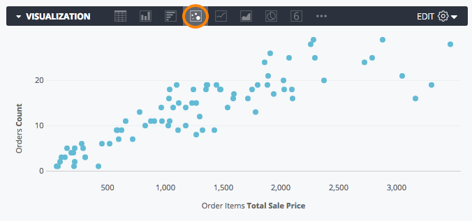
As of version 3.28, you can now plot measure vs. measure scatterplots. This can be done by hiding the dimension(s) in the data table from the visualization.
For example, say you have this data table:
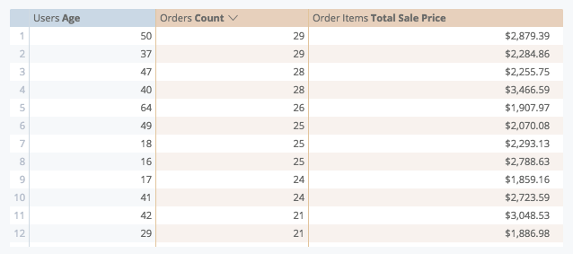
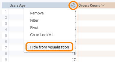
In order to chart Orders Count vs. Order Items Total Sale Price, you will want to hide Users Age from the visualization by selecting Hide from Visualization from that column’s gear dropdown:
After selecting scatter from the chart icon options, you should see a chart like this!
- Mark as New
- Bookmark
- Subscribe
- Mute
- Subscribe to RSS Feed
- Permalink
- Report Inappropriate Content
- Mark as New
- Bookmark
- Subscribe
- Mute
- Subscribe to RSS Feed
- Permalink
- Report Inappropriate Content
@rachel_johnson I am also still having the same issues depicted above. I’ve chatted in to support and provided simply 2 measures and 1 dimension and asked them to create what I’m requesting. They were unable to and stated it isn’t possible to do what I’m asking. Pivoting does not solve my issue - it simply creates what Milan is showing above.
- Mark as New
- Bookmark
- Subscribe
- Mute
- Subscribe to RSS Feed
- Permalink
- Report Inappropriate Content
- Mark as New
- Bookmark
- Subscribe
- Mute
- Subscribe to RSS Feed
- Permalink
- Report Inappropriate Content
@Milan_Veverka @dan_geneczko This feature is not currently available but I will definitely go ahead and pass on some feedback to our product team.
- Mark as New
- Bookmark
- Subscribe
- Mute
- Subscribe to RSS Feed
- Permalink
- Report Inappropriate Content
- Mark as New
- Bookmark
- Subscribe
- Mute
- Subscribe to RSS Feed
- Permalink
- Report Inappropriate Content
Thanks @adina_katz. Maybe a custom viz? Anyone? 🙂
- Mark as New
- Bookmark
- Subscribe
- Mute
- Subscribe to RSS Feed
- Permalink
- Report Inappropriate Content
- Mark as New
- Bookmark
- Subscribe
- Mute
- Subscribe to RSS Feed
- Permalink
- Report Inappropriate Content
Hey guys,
Adding onto the requests here - when viewing a measure x measure pivoted by dimension, it would be great if we were able to show the labels for a dimension without having to hover over each circle. Is this possible in any way / in the works?
- Mark as New
- Bookmark
- Subscribe
- Mute
- Subscribe to RSS Feed
- Permalink
- Report Inappropriate Content
- Mark as New
- Bookmark
- Subscribe
- Mute
- Subscribe to RSS Feed
- Permalink
- Report Inappropriate Content
Thanks for your feedback, Brandyn! I’ve passed it along to our product team 🙂
- Mark as New
- Bookmark
- Subscribe
- Mute
- Subscribe to RSS Feed
- Permalink
- Report Inappropriate Content
- Mark as New
- Bookmark
- Subscribe
- Mute
- Subscribe to RSS Feed
- Permalink
- Report Inappropriate Content
The custom viz from vega-lite supports this feature (and much more): https://github.com/groodlooker/vega-lite
- Mark as New
- Bookmark
- Subscribe
- Mute
- Subscribe to RSS Feed
- Permalink
- Report Inappropriate Content
- Mark as New
- Bookmark
- Subscribe
- Mute
- Subscribe to RSS Feed
- Permalink
- Report Inappropriate Content
2 posts were split to a new topic: Tooltip from hidden field in Visualizations
- Mark as New
- Bookmark
- Subscribe
- Mute
- Subscribe to RSS Feed
- Permalink
- Report Inappropriate Content
- Mark as New
- Bookmark
- Subscribe
- Mute
- Subscribe to RSS Feed
- Permalink
- Report Inappropriate Content
A post was split to a new topic: Vega-lite not working
- Mark as New
- Bookmark
- Subscribe
- Mute
- Subscribe to RSS Feed
- Permalink
- Report Inappropriate Content
- Mark as New
- Bookmark
- Subscribe
- Mute
- Subscribe to RSS Feed
- Permalink
- Report Inappropriate Content
Hi, I have a hack that might help here. But please note the code is a bit ugly… Here is what I think you are trying to get to, measure by measure pivoted on a dimension.
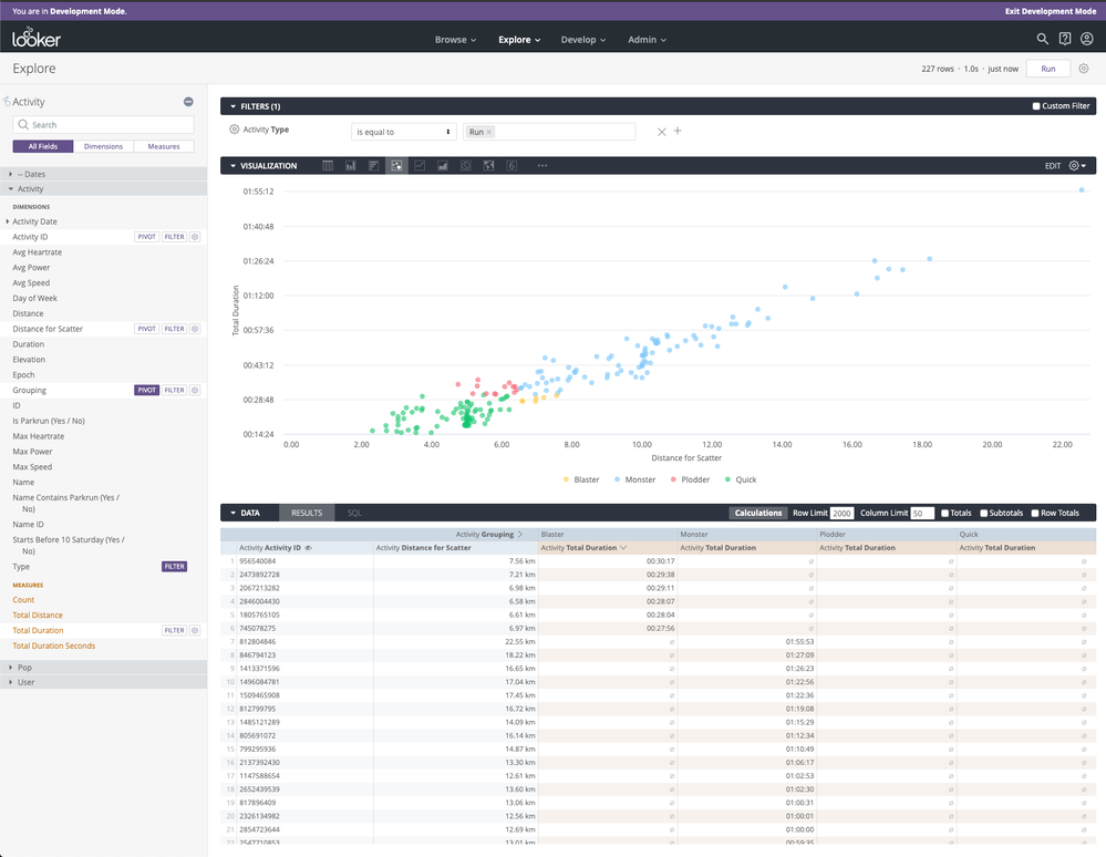
Basically the problem is that you need to plot a measure on a dimension in a scatter graph if you are pivoting. So this dataset I am using here has a grouping, distance and a duration for each id. I want to plot distance by duration pivoted on grouping.
The solution requires me simply to plot distance (as a dimension) by duration (as a measure, sum is fine). However when doing this, we run into the problem that the distance could have duplications. To get around this, I have a new dimension called distance_for_scatter, where I simply add 0.0000001*row_number which will guarantee that the distances will ALWAYS be unique. (obviously add enough zeros!). Then you can change the value_format_name to something less horrific like decimal_2, and it plots nicely!
dimension: distance_for_scatter {
type: number
sql: ${distance} + (0.000001 * ${row_number}) ;;
value_format_name: decimal_2
html: {{rendered_value}} km ;;
}
If you don’t have a row_number dimension, you can change the sql_table_name to a derived table with something like:
SELECT *, ROW_NUMBER() OVER() as row_number FROM tablename
and then have row_number as a dimension, type number.
dimension: row_number {
type: number
sql: ${TABLE}.row_number ;;
}
Oh and change the minimum Y value to 0.00001
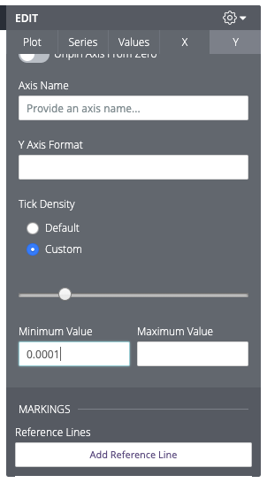
Mais voila 🙂
- Mark as New
- Bookmark
- Subscribe
- Mute
- Subscribe to RSS Feed
- Permalink
- Report Inappropriate Content
- Mark as New
- Bookmark
- Subscribe
- Mute
- Subscribe to RSS Feed
- Permalink
- Report Inappropriate Content
Interesting solution but as you say - grim. We are still waiting since '15 for a default viz option for the dimensional field to be rendered as a colour on a measure-by-measure scatter plot. Is there an opposition at Looker to this? It’s common in statistical programming language packages ® to visualise data like this - think ggplot2.
I get this request from users very often - esp. from employees who previously used Tableau, as it was possible by default there. It’s a shame, because it is a beautiful way to visualise data (that is subjective of course).
- Mark as New
- Bookmark
- Subscribe
- Mute
- Subscribe to RSS Feed
- Permalink
- Report Inappropriate Content
- Mark as New
- Bookmark
- Subscribe
- Mute
- Subscribe to RSS Feed
- Permalink
- Report Inappropriate Content
4 years and this feature is still not there - extremely disappointed! This is so easy to do with any other tool (e.g. Tableau, R)!
- Mark as New
- Bookmark
- Subscribe
- Mute
- Subscribe to RSS Feed
- Permalink
- Report Inappropriate Content
- Mark as New
- Bookmark
- Subscribe
- Mute
- Subscribe to RSS Feed
- Permalink
- Report Inappropriate Content
+1 would really like to have this feature. Users keep downloading data and using excel instead and I’d like to keep them in Looker instead.
- Mark as New
- Bookmark
- Subscribe
- Mute
- Subscribe to RSS Feed
- Permalink
- Report Inappropriate Content
- Mark as New
- Bookmark
- Subscribe
- Mute
- Subscribe to RSS Feed
- Permalink
- Report Inappropriate Content
all the +1s. Two things we shoulds have in 2020
- a space station on the moon
- a scatter plot in Looker that actually works
- Mark as New
- Bookmark
- Subscribe
- Mute
- Subscribe to RSS Feed
- Permalink
- Report Inappropriate Content
- Mark as New
- Bookmark
- Subscribe
- Mute
- Subscribe to RSS Feed
- Permalink
- Report Inappropriate Content
Looker moonbase is coming soon, probably Q4 but don’t quote me on it. Yes, it will be purple.
Re: scatter plots, I admit that I have lost the plot of this thread a little bit. It’s 53 posts strong and stretches back to 2015, with Looker 3.28 😱 . I’m confident that we have made lots of improvements in that time, and there is the ability to do measure vs. measure scatterplots, so I’d like to baseline set to make sure I’m making the right recommendations to Product.
Is this:
the ask that you are all after, @Abhijit_Roy, @Ben_White, and @Katrina_Palen? As much context on what exactly you’d like to be able to do would be super helpful.
- Mark as New
- Bookmark
- Subscribe
- Mute
- Subscribe to RSS Feed
- Permalink
- Report Inappropriate Content
- Mark as New
- Bookmark
- Subscribe
- Mute
- Subscribe to RSS Feed
- Permalink
- Report Inappropriate Content
The issue being raised is that when displaying a measure x measure scatter plot, there is still no option to colour the data points by a dimension.
Being able to interpret the result this way is very useful, as it may be that one group (home owner / renter) is dominating the healthy top right area, and another the less healthy bottom left. This shows an example:
https://images.app.goo.gl/yvsrQynqqVLSJoS26
This is such a basic requirement for analysis, it would be great if this could be solved soon @izzymiller 🙏
- Mark as New
- Bookmark
- Subscribe
- Mute
- Subscribe to RSS Feed
- Permalink
- Report Inappropriate Content
- Mark as New
- Bookmark
- Subscribe
- Mute
- Subscribe to RSS Feed
- Permalink
- Report Inappropriate Content
I didn’t quite get the notification on your @ , apologies for not responding sooner, but yes, essentially the image shared by @Jamie_Matlock is simply the spec I’m looking for, nothing more than that (for now 🙂 )
- Mark as New
- Bookmark
- Subscribe
- Mute
- Subscribe to RSS Feed
- Permalink
- Report Inappropriate Content
- Mark as New
- Bookmark
- Subscribe
- Mute
- Subscribe to RSS Feed
- Permalink
- Report Inappropriate Content
just joined looker community to add my +1 ??♀️
- Mark as New
- Bookmark
- Subscribe
- Mute
- Subscribe to RSS Feed
- Permalink
- Report Inappropriate Content
- Mark as New
- Bookmark
- Subscribe
- Mute
- Subscribe to RSS Feed
- Permalink
- Report Inappropriate Content
….Just found a way to do this using the VEGA customization scatter. It’s not perfect though because it still won’t let me pivot - just lets me add more dimensions which means I have to pull in rows that I don’t want:

- Mark as New
- Bookmark
- Subscribe
- Mute
- Subscribe to RSS Feed
- Permalink
- Report Inappropriate Content
- Mark as New
- Bookmark
- Subscribe
- Mute
- Subscribe to RSS Feed
- Permalink
- Report Inappropriate Content
+1 to this! It’s important to be able to group points by colour or shape on a measure by measure scatterplot.
To clarify the ask, this is what we’re after https://www.youtube.com/watch?v=DetQavLqfdg 🙂
- Mark as New
- Bookmark
- Subscribe
- Mute
- Subscribe to RSS Feed
- Permalink
- Report Inappropriate Content
- Mark as New
- Bookmark
- Subscribe
- Mute
- Subscribe to RSS Feed
- Permalink
- Report Inappropriate Content
+1 @izzymiller , Hows this one coming around ? I (and probably others) have so much to show via scatterplots, but are unable to show it due to the lack of Dimension application.
setting up a measure v measure scatterplot is cool and all, but useless as of now since I cant show which dimensional value each plotpoint represents.
- Mark as New
- Bookmark
- Subscribe
- Mute
- Subscribe to RSS Feed
- Permalink
- Report Inappropriate Content
- Mark as New
- Bookmark
- Subscribe
- Mute
- Subscribe to RSS Feed
- Permalink
- Report Inappropriate Content
I’m also very curious about this.
Measure x measure scatter with dimensions is shown in Looker’s documentation here.
It’s the first image in the Grid Layout section:
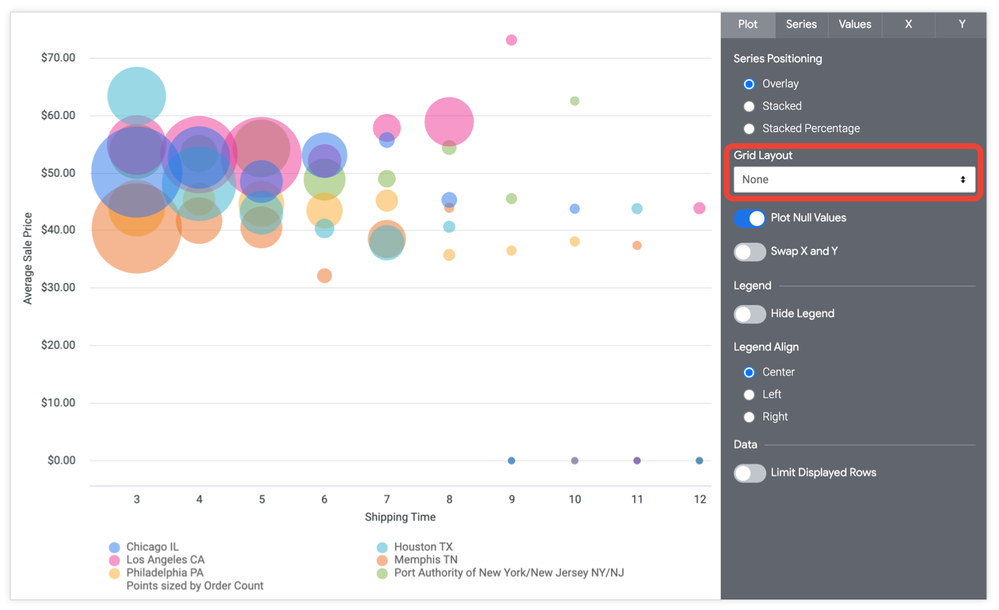
@izzymiller could you share how this was built? Thanks!
- Mark as New
- Bookmark
- Subscribe
- Mute
- Subscribe to RSS Feed
- Permalink
- Report Inappropriate Content
- Mark as New
- Bookmark
- Subscribe
- Mute
- Subscribe to RSS Feed
- Permalink
- Report Inappropriate Content
- Mark as New
- Bookmark
- Subscribe
- Mute
- Subscribe to RSS Feed
- Permalink
- Report Inappropriate Content
- Mark as New
- Bookmark
- Subscribe
- Mute
- Subscribe to RSS Feed
- Permalink
- Report Inappropriate Content
+1 to request this feature request. Support relayed to me that it’s currently not possible. The reply before this one shows only a single measure in the data set, not 2.
- Mark as New
- Bookmark
- Subscribe
- Mute
- Subscribe to RSS Feed
- Permalink
- Report Inappropriate Content
- Mark as New
- Bookmark
- Subscribe
- Mute
- Subscribe to RSS Feed
- Permalink
- Report Inappropriate Content
Running into a problem with measure vs. measure scatterplots - whenever filters are adjusted so that only one row returns, the visualization breaks and returns two points, one for each measure, both evaluated against the same axis (As opposed to one point measured against both the x- and y- axes.
Anyone else run into this and figure out a work around?
- Mark as New
- Bookmark
- Subscribe
- Mute
- Subscribe to RSS Feed
- Permalink
- Report Inappropriate Content
- Mark as New
- Bookmark
- Subscribe
- Mute
- Subscribe to RSS Feed
- Permalink
- Report Inappropriate Content
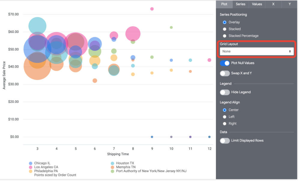
FYI @AA_Sacco or anyone who has run into the same problem, I have been able to do this by converting the x-axis measure to a dimension in a new derived table while carrying the y-axis and name dimensions. Then in the explore of the derived table, pivoting on the name dimension that names each dot, so that the names come up as a legend. We can also size the dots in the visualisation options using the x axis dimension as long as you have the dimension declared as a type number. That should build the chart like the one in the doc.
PS: don’t forget to bind filter from the derived table to the source table
- Mark as New
- Bookmark
- Subscribe
- Mute
- Subscribe to RSS Feed
- Permalink
- Report Inappropriate Content
- Mark as New
- Bookmark
- Subscribe
- Mute
- Subscribe to RSS Feed
- Permalink
- Report Inappropriate Content
Just stumbled upon this thread after not finding an easy way to create a simple scatterplot. Baffled as to why it has to be so complicated in 2021.
- Mark as New
- Bookmark
- Subscribe
- Mute
- Subscribe to RSS Feed
- Permalink
- Report Inappropriate Content
- Mark as New
- Bookmark
- Subscribe
- Mute
- Subscribe to RSS Feed
- Permalink
- Report Inappropriate Content
+1 on this feature request. I’ve run a k-means model using BigQuery and I’d like to plot 2 measures as a scatter plot and color them by the predicted clusters.
- Mark as New
- Bookmark
- Subscribe
- Mute
- Subscribe to RSS Feed
- Permalink
- Report Inappropriate Content
- Mark as New
- Bookmark
- Subscribe
- Mute
- Subscribe to RSS Feed
- Permalink
- Report Inappropriate Content
Totally ridiculous that the labels aren’t shown in tooltips.
- Mark as New
- Bookmark
- Subscribe
- Mute
- Subscribe to RSS Feed
- Permalink
- Report Inappropriate Content
- Mark as New
- Bookmark
- Subscribe
- Mute
- Subscribe to RSS Feed
- Permalink
- Report Inappropriate Content
+1 to this. Cannot believe Looker has Sunburst Sankeys etc but a level1 basic feature like coloring bubbles by label is not done.
- Mark as New
- Bookmark
- Subscribe
- Mute
- Subscribe to RSS Feed
- Permalink
- Report Inappropriate Content
- Mark as New
- Bookmark
- Subscribe
- Mute
- Subscribe to RSS Feed
- Permalink
- Report Inappropriate Content
Upvote. Need to be able to have the label display the values of a hidden dimension. (without complicated lookml workaround)
- Mark as New
- Bookmark
- Subscribe
- Mute
- Subscribe to RSS Feed
- Permalink
- Report Inappropriate Content
- Mark as New
- Bookmark
- Subscribe
- Mute
- Subscribe to RSS Feed
- Permalink
- Report Inappropriate Content
6 years has this thread. 6 Y E A R S
- Mark as New
- Bookmark
- Subscribe
- Mute
- Subscribe to RSS Feed
- Permalink
- Report Inappropriate Content
- Mark as New
- Bookmark
- Subscribe
- Mute
- Subscribe to RSS Feed
- Permalink
- Report Inappropriate Content
Totally ridiculous that the labels aren’t shown in tooltips.
I totally agree, what am I supposed to do with this chart?

There’s no way to distinguish any points, and theres a lot of points!
- Mark as New
- Bookmark
- Subscribe
- Mute
- Subscribe to RSS Feed
- Permalink
- Report Inappropriate Content
- Mark as New
- Bookmark
- Subscribe
- Mute
- Subscribe to RSS Feed
- Permalink
- Report Inappropriate Content
Joined to add to the mob.
I’m flabbergasted that the graphing abilities, and especially the scatterplot abilities are so primitive, having R scripts besides Looker to perform something so simple isn’t OK.
Can y’all hire someone from Tidyverse to clean up the graphing in Looker please ![]()
- Mark as New
- Bookmark
- Subscribe
- Mute
- Subscribe to RSS Feed
- Permalink
- Report Inappropriate Content
- Mark as New
- Bookmark
- Subscribe
- Mute
- Subscribe to RSS Feed
- Permalink
- Report Inappropriate Content
Has there been any progress made here? I need to make a really simple measure vs. measure scatterplot consisting of only 10-15 points at any given time, but I need to add the dimension as labels.
Use Case: Use two sales performance metrics measures for the X and Y on a scatter plot and add rep names as labels so we can see where they stack up against the team (top right quadrant is strong relative performance in both categories, bottom left quadrant is weak)
Sort of baffled this isn’t possible, as it would be very simple in tableau.
- Mark as New
- Bookmark
- Subscribe
- Mute
- Subscribe to RSS Feed
- Permalink
- Report Inappropriate Content
- Mark as New
- Bookmark
- Subscribe
- Mute
- Subscribe to RSS Feed
- Permalink
- Report Inappropriate Content
+1. It’s a bummer having to tell your users that they’ll have to download the data in order to have a functioning scatterplot visualization.
- Mark as New
- Bookmark
- Subscribe
- Mute
- Subscribe to RSS Feed
- Permalink
- Report Inappropriate Content
- Mark as New
- Bookmark
- Subscribe
- Mute
- Subscribe to RSS Feed
- Permalink
- Report Inappropriate Content
Hi all, adding my +1 to this. For anyone still struggling with this, I was able to create somewhat usable scatterplot. Dots are still shown in the same colour and the legend is missing but hovering over each dot gives you what you’re looking for. See Scatterplot as a matrix | Looker Community
- Mark as New
- Bookmark
- Subscribe
- Mute
- Subscribe to RSS Feed
- Permalink
- Report Inappropriate Content
- Mark as New
- Bookmark
- Subscribe
- Mute
- Subscribe to RSS Feed
- Permalink
- Report Inappropriate Content
Is there any news on this feature request? Every other BI tool out there has this basic functionality without having to do workarounds. Honestly, what is a BI tool without a proper scatterplot functionality?
- Mark as New
- Bookmark
- Subscribe
- Mute
- Subscribe to RSS Feed
- Permalink
- Report Inappropriate Content
- Mark as New
- Bookmark
- Subscribe
- Mute
- Subscribe to RSS Feed
- Permalink
- Report Inappropriate Content
Hi this post is of great use, but how do I actually determine which parameter goes on which axis? I have two measures and when I do a scatterplot, the axis is switched. I want measure A as my x-axis and measure B as my y-axis but I’m only able to achieve the reverse. No matter how I align the measures A & B when I run the query, the plot generated seems to be the same.
- Mark as New
- Bookmark
- Subscribe
- Mute
- Subscribe to RSS Feed
- Permalink
- Report Inappropriate Content
- Mark as New
- Bookmark
- Subscribe
- Mute
- Subscribe to RSS Feed
- Permalink
- Report Inappropriate Content
I’m struggling here but it looks like lots of other people are to. Why when I pivot on a dimension does the Axes Selection section under Edit > Series on the Visualization disappear? I want to have a measure vs. measure scatterplot where the points are colored based on a dimension (pivoted or otherwise). Simple stuff but impossible in Looker.
Would love to be able to select what I use for the Value Labels too. Right now it only allows you to label based on the Y Axis, but really what I want is to label based on dimensions. Users have to hover over each dot to know what data it refers to, when for a scatterplot with only a few values in it I’d love to allow people to identify what the dimensions are (the source of that dot) without needing a hover over.
- Mark as New
- Bookmark
- Subscribe
- Mute
- Subscribe to RSS Feed
- Permalink
- Report Inappropriate Content
- Mark as New
- Bookmark
- Subscribe
- Mute
- Subscribe to RSS Feed
- Permalink
- Report Inappropriate Content
I have the same problem as dorianb below:
I would like measure vs measure + size by measure + colour by dimension (with a different dimension for the bubble identifiers).
I can get this working EXCEPT the colour by dimension part - just doesn't seem possible in Looker.
Looker Studio can do this so can we please update Looker with this capability too!
Thanks
-
access grant
4 -
actionhub
9 -
Actions
14 -
Admin
4 -
alert
29 -
Analytics
2 -
Analytics Block
35 -
Analytics General
1 -
API
12 -
bar
10 -
bestpractice
4 -
BigQuery
8 -
blocks
1 -
boards
4 -
Bug
168 -
cache
2 -
case
2 -
chart
17 -
cohort
1 -
connection
5 -
connection database
1 -
content access
1 -
content-validator
2 -
count
6 -
custom dimension
9 -
custom field
19 -
custom measure
8 -
customdimension
9 -
Dashboards
758 -
Data
5 -
Data Sources
4 -
data tab
4 -
Database
5 -
datagroup
2 -
date-formatting
14 -
dates
18 -
derivedtable
1 -
develop
1 -
development
3 -
dimension
17 -
done
8 -
download
19 -
downloading
9 -
drill-down
1 -
drilling
30 -
dynamic
1 -
embed
10 -
Errors
13 -
etl
1 -
explore
84 -
Explores
136 -
extends
1 -
feature-requests
10 -
filed
3 -
filter
245 -
Filtering
122 -
folders
4 -
formatting
19 -
git
2 -
Google Data Studio
2 -
Google Sheets
2 -
googlesheets
7 -
graph
9 -
group by
6 -
html
12 -
i__looker
1 -
imported project
2 -
Integrations
4 -
javascript
2 -
join
2 -
json
3 -
label
4 -
line chart
17 -
link
5 -
links
3 -
liquid
22 -
Looker
6 -
Looker Studio Pro
49 -
LookerStudio
7 -
lookml
169 -
lookml dashboard
15 -
looks
189 -
manage projects
1 -
map
30 -
map_layer
5 -
Marketplace
4 -
measure
4 -
Memorystore for Memcached
1 -
merge
14 -
model
3 -
modeling
2 -
multiple select
1 -
ndt
1 -
parameter
11 -
pdf
8 -
pdt
8 -
performance
7 -
periodoverperiod
5 -
permission management
1 -
persistence
1 -
pivot
21 -
postgresql
1 -
python
2 -
pythonsdk
2 -
Query
3 -
quickstart
4 -
ReactJS
1 -
redshift
4 -
release
16 -
rendering
8 -
Reporting
10 -
schedule
51 -
schedule delivery
5 -
sdk
1 -
Security
4 -
sharing
2 -
singlevalue
16 -
snowflake
3 -
sql
24 -
SSO
1 -
stacked chart
10 -
system activity
5 -
table chart
16 -
tablecalcs
144 -
Tile
12 -
time
8 -
time zone
3 -
totals
13 -
Training
1 -
Ui
19 -
usage
4 -
user access management
3 -
user management
3 -
user-attributes
6 -
value_format
4 -
view
4 -
Views
4 -
visualizations
558 -
watch
1 -
webhook
2
- « Previous
- Next »

 Twitter