- Looker & Looker Studio
- Looker Forums
- Exploring & Curating Data
- Stats table calcs: comparing rates over time (Bonu...
- Subscribe to RSS Feed
- Mark Topic as New
- Mark Topic as Read
- Float this Topic for Current User
- Bookmark
- Subscribe
- Mute
- Printer Friendly Page
- Mark as New
- Bookmark
- Subscribe
- Mute
- Subscribe to RSS Feed
- Permalink
- Report Inappropriate Content
- Mark as New
- Bookmark
- Subscribe
- Mute
- Subscribe to RSS Feed
- Permalink
- Report Inappropriate Content
If you haven’t already read my post on using the beta distribution for an A/B test, that might be a good warm-up read. (The disclaimers from that post still apply 😉 )
In that example, the data took the form of a proportion - a number of successes out of a number of trials. What do you do if you want to instead compare rates of events over intervals? For example, user signups, error events, or web traffic over time.
Well, in the A/B testing example, the data points can be thought of as being taken from a Bernoulli distribution: either yes or no with a given probability. That probability is in turn modeled by the conjugate prior of the Bernoulli distributions, the beta distributions, so we used the beta_inv table calc.
In the present scenario, the data points can be thought of as being taken from a Poisson distribution: its possible values are whole positive numbers representing a number of events happening in an interval assuming those events occur independently at a given rate. That rate, which is what we are actually interested in quantifying, can be thought of as being taken from the Poissons’ conjugate priors: Gamma distributions.
For the sake of illustration, lets say you had data like this:
Month   | Days    | Errors
------------------------------------------
Jan     | 31      | 12
Feb     | 28      | 13
Mar     | 31      | 19
Is the rate of errors in March higher than in February? On the surface it looks that way, since the observed rate was 19/31=0.61 events per day, as compared to the observed rate of 13/28 = 0.46 events per day in February.
But with any observation, there is variability and we are interested in the “true” underlying rate that generated this data, moreso than the observed rate in our sample. The conjugate prior distribution allows us to understand exactly that - given a set of observations, what the true underlying rate may be.
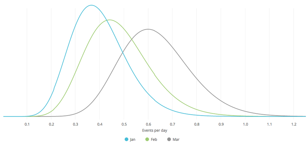
With our example, when you use the conjugate prior (gamma distribution), you see there is quite a bit of range, including lots of overlap between what the rate of errors may be for March and for February:

Just like in the A/B testing example, you could use the inverse distribution function to come up with credibility intervals and then visualize them using the timeline viz:

The upper/lower bound formulas for 90% credibility intervals would be
gamma_inv(
    0.5 +/- 0.45,
    ${...events} + 0.001,
    1/( ${...days} + 0.001)
)
Bonus: Anomaly Detection
Let’s try to detect when there is a drop in a rate of events. We’ll continue with the gamma distribution, but these concepts can just as easily be applied to detect a change in a proportion, with the beta distribution.
We’ll make a look that is designed to be run every day. We’ll have it pull some trailing activity by day, for example 60 days’ worth. Then we’ll add some formulas to detect when there is a significant drop:

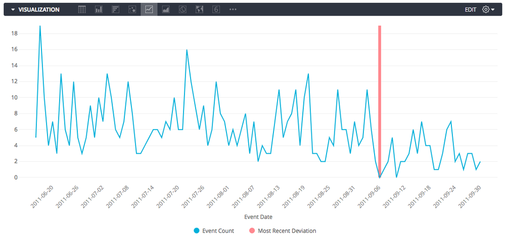
(In this example, the threshold happens to be on a day with 0 events, but it is highlighting a difference in data before and after the line, not simply highlighting that day for being 0)
A practical consideration is choosing the windows of time to compare. There are many ways to do this, with different levels of finesse such as dynamically choosing baseline periods, normalizing for weekly or seasonal trends, or pushing the window functions into SQL instead of table calcs, but for demonstrative purposes, I’ll simply use table calcs to consider windows of increasing size looking back from the current day, and to compare those windows to similarly sized prior windows. Then I’ll highlight in red the first day (if any) with a significant, sizable drop. Here are the specific formulas I used:

- N Periods: row()
-
2 N rows available?: row() <= count(${accidents.event_date}) / 2
^ We will use this to “Hide No’s” since we need half of the rows for comparison’s sake only - Trailing N Total: running_total(${accidents.count})
- Prior N Total: sum(offset_list(${accidents.count},1,row()))
- Trailing N Upper Bound: gamma_inv(0.95, ${trailing_n_total} + 0.001, 1 / (${n_periods} + 0.001))
- Prior N Lower Bound: gamma_inv(0.05, ${prior_n_total} + 0.001, 1 / (${n_periods} + 0.001))
-
Is practical difference?: ${trailing_n_upper_bound} < ${prior_n_lower_bound} * 0.667
^ Normally you want to specify a ratio of “practical equivalence”, here a drop of over 1/3rd - As 0/1: if( ${is_practical_difference}, 1, 0)
- Difference running total: running_total(${as_01})
-
Most Recent Deviation: if( ${difference_running_total}=1 AND offset(${difference_running_total},-1)=0, max(${accidents.count}), null)
^This will be used to highlight the deviation on the chart
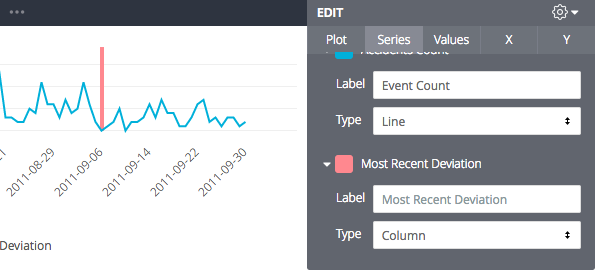
Setting that last measure to a column allows us to get a “highlight”:
In conclusion, we can say (with high probability) that to the right of this line, the true underlying rate of events has dropped by at least a third, as compared to the same sized period immediately to the left of this line. And because we’re using Bayesian statistics, these formulas are robust against small datasets, meaning no manual exception handling or awkward sample size declarations up front.
- Labels:
-
tablecalcs
-
access grant
4 -
actionhub
9 -
Actions
14 -
Admin
4 -
alert
29 -
Analytics
2 -
Analytics Block
56 -
API
12 -
bar
10 -
bestpractice
4 -
BigQuery
8 -
blocks
1 -
boards
4 -
Bug
168 -
cache
2 -
case
2 -
chart
17 -
cohort
1 -
connection
5 -
connection database
1 -
content access
1 -
content-validator
2 -
count
6 -
custom dimension
9 -
custom field
19 -
custom measure
8 -
customdimension
9 -
Dashboards
923 -
Data
5 -
Data Sources
4 -
data tab
4 -
Database
5 -
datagroup
2 -
date-formatting
14 -
dates
18 -
derivedtable
1 -
develop
1 -
development
3 -
dimension
17 -
done
8 -
download
19 -
downloading
9 -
drill-down
1 -
drilling
30 -
dynamic
1 -
embed
10 -
Errors
13 -
etl
1 -
explore
84 -
Explores
271 -
extends
1 -
feature-requests
10 -
filed
3 -
Filter
245 -
Filtering
192 -
folders
4 -
formatting
19 -
git
2 -
Google Data Studio
1 -
Google Sheets
2 -
googlesheets
7 -
graph
9 -
group by
6 -
html
12 -
i__looker
1 -
imported project
2 -
Integrations
4 -
javascript
2 -
join
2 -
json
3 -
label
4 -
line chart
17 -
link
5 -
links
3 -
liquid
22 -
Looker
6 -
Looker Studio Pro
78 -
LookerStudio
7 -
LookML
169 -
lookml dashboard
15 -
looks
291 -
manage projects
1 -
map
30 -
map_layer
5 -
Marketplace
4 -
measure
4 -
Memorystore for Memcached
1 -
merge
14 -
model
3 -
modeling
2 -
multiple select
1 -
ndt
1 -
parameter
11 -
pdf
8 -
pdt
8 -
Performance
7 -
periodoverperiod
5 -
permission management
1 -
persistence
1 -
pivot
21 -
postgresql
1 -
python
2 -
pythonsdk
2 -
Query
3 -
quickstart
4 -
ReactJS
1 -
redshift
4 -
release
16 -
rendering
8 -
Reporting
10 -
schedule
51 -
schedule delivery
5 -
sdk
1 -
Security
4 -
sharing
2 -
singlevalue
16 -
snowflake
3 -
SQL
24 -
SSO
1 -
stacked chart
10 -
System Activity
5 -
table chart
16 -
tablecalcs
144 -
Tile
12 -
time
8 -
time zone
3 -
totals
13 -
Training
1 -
Ui
19 -
usage
4 -
user access management
3 -
user management
3 -
user-attributes
6 -
value_format
4 -
view
4 -
Views
4 -
Visualizations
558 -
watch
1 -
webhook
2
- « Previous
- Next »

 Twitter