- Looker
- Looker Forums
- Exploring & Curating Data
- Timelines with dynamic date granularity
- Subscribe to RSS Feed
- Mark Topic as New
- Mark Topic as Read
- Float this Topic for Current User
- Bookmark
- Subscribe
- Mute
- Printer Friendly Page
- Mark as New
- Bookmark
- Subscribe
- Mute
- Subscribe to RSS Feed
- Permalink
- Report Inappropriate Content
- Mark as New
- Bookmark
- Subscribe
- Mute
- Subscribe to RSS Feed
- Permalink
- Report Inappropriate Content
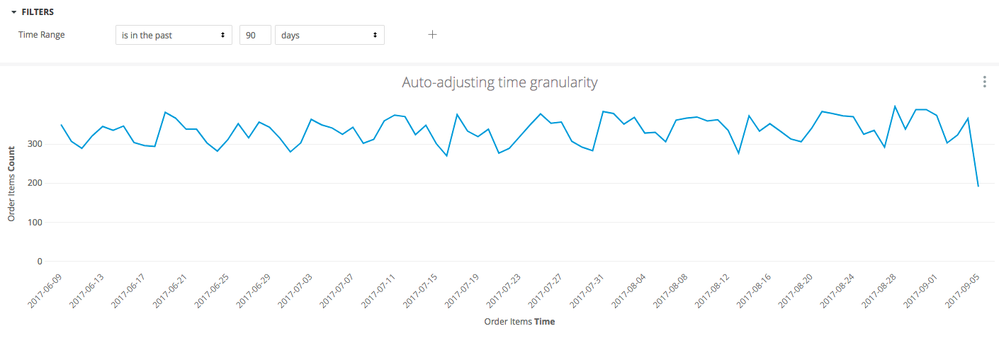
Let’s say I have graph on a dashboard that shows sales over time:

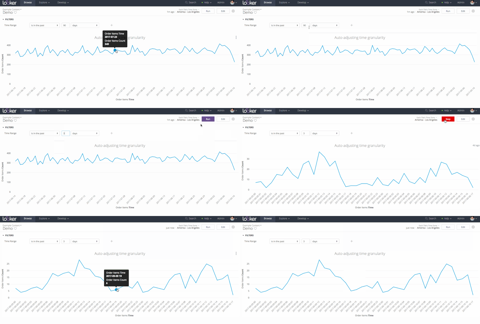
In this example, I’m looking at 90 days of daily data. Daily seems like a reasonable granularity for a 90 day time frame. But what if I filter down the dashboard to 3 days? Wouldn’t it be great if my dashboard could automatically adjust the x-axis to display finer-grained time slices? Hourly maybe?
Turns out you can set that up with just a couple of lines of LookML!
All I need is one new dimension, which returns different time granularities based on the users’s filter selection.
  dimension: time {
    sql:
    CASE
      WHEN
        datediff(
                'day',
                cast({% date_start created_date %} as date),
                cast({% date_end created_date  %} as date)
                ) >365
      THEN cast(${created_week} as varchar)

      WHEN
        datediff(
                'day',
                cast({% date_start created_date %} as date),
                cast({% date_end created_date  %} as date)
                ) >30
      THEN cast(${created_date} as varchar)


      WHEN
        datediff(
                'day',
                cast({% date_start created_date %} as date),
                cast({% date_end created_date  %} as date)
                ) >1
      THEN cast(${created_hour} as varchar)


      ELSE ${created_minute}
      END

    ;;


  }
For more info on how to use the date_start and date_end liquid parameters, see [this post] (https://discourse.looker.com/t/using-date-start-and-date-end-with-date-filters/2880).
This dimension will dynamically return a minute, hour, day, or week value, based on the duration of time applied to the ${created_date} dimension. Any Look that uses the time dimension as it’s x-axis will auto-adjust to show an appropriate amount of data based on the filter selection and the rules you’ve built.
Here’s what it looks like live:

-
access grant
4 -
actionhub
9 -
Actions
14 -
Admin
4 -
alert
29 -
Analytics
2 -
Analytics Block
36 -
Analytics General
1 -
API
12 -
bar
10 -
bestpractice
4 -
BigQuery
8 -
blocks
1 -
boards
4 -
Bug
168 -
cache
2 -
case
2 -
chart
17 -
cohort
1 -
connection
5 -
connection database
1 -
content access
1 -
content-validator
2 -
count
6 -
custom dimension
9 -
custom field
19 -
custom measure
8 -
customdimension
9 -
Dashboards
761 -
Data
5 -
Data Sources
4 -
data tab
4 -
Database
5 -
datagroup
2 -
date-formatting
14 -
dates
18 -
derivedtable
1 -
develop
1 -
development
3 -
dimension
17 -
done
8 -
download
19 -
downloading
9 -
drill-down
1 -
drilling
30 -
dynamic
1 -
embed
10 -
Errors
13 -
etl
1 -
explore
84 -
Explores
142 -
extends
1 -
feature-requests
10 -
filed
3 -
filter
245 -
Filtering
127 -
folders
4 -
formatting
19 -
git
2 -
Google Data Studio
2 -
Google Sheets
2 -
googlesheets
7 -
graph
9 -
group by
6 -
html
12 -
i__looker
1 -
imported project
2 -
Integrations
4 -
javascript
2 -
join
2 -
json
3 -
label
4 -
line chart
17 -
link
5 -
links
3 -
liquid
22 -
Looker
7 -
Looker Studio Pro
51 -
LookerStudio
7 -
lookml
169 -
lookml dashboard
15 -
looks
194 -
manage projects
1 -
map
30 -
map_layer
5 -
Marketplace
4 -
measure
4 -
Memorystore for Memcached
1 -
merge
14 -
model
3 -
modeling
2 -
multiple select
1 -
ndt
1 -
parameter
11 -
pdf
8 -
pdt
8 -
performance
7 -
periodoverperiod
5 -
permission management
1 -
persistence
1 -
pivot
21 -
postgresql
1 -
python
2 -
pythonsdk
2 -
Query
3 -
quickstart
4 -
ReactJS
1 -
redshift
4 -
release
16 -
rendering
8 -
Reporting
10 -
schedule
51 -
schedule delivery
5 -
sdk
1 -
Security
4 -
sharing
2 -
singlevalue
16 -
snowflake
3 -
sql
24 -
SSO
1 -
stacked chart
10 -
system activity
5 -
table chart
16 -
tablecalcs
144 -
Tile
12 -
time
8 -
time zone
3 -
totals
13 -
Training
1 -
Ui
19 -
usage
4 -
user access management
3 -
user management
3 -
user-attributes
6 -
value_format
4 -
view
4 -
Views
4 -
visualizations
558 -
watch
1 -
webhook
2
- « Previous
- Next »

 Twitter