- Looker
- Looker Forums
- Exploring & Curating Data
- Waterfall Charts
- Subscribe to RSS Feed
- Mark Topic as New
- Mark Topic as Read
- Float this Topic for Current User
- Bookmark
- Subscribe
- Mute
- Printer Friendly Page
- Mark as New
- Bookmark
- Subscribe
- Mute
- Subscribe to RSS Feed
- Permalink
- Report Inappropriate Content
- Mark as New
- Bookmark
- Subscribe
- Mute
- Subscribe to RSS Feed
- Permalink
- Report Inappropriate Content
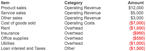
Waterfall charts are a good way to show how many parts can compose one final number Such as how revenue, minus expenses will create net profit. Here is how to create one of these charts in Looker, starting with some profit and loss data:
When modeling the data in Looker, the trick is, just make one additional row. I just UNION a total row and use a derived table
Old LookML
- view: profit_loss
  derived_table:
    sql: |
      SELECT item_number, item, category, amount
      FROM profit_loss_table
      UNION
      SELECT 9999, 'Total', 'Total', 0
New LookML
``` view: profit_loss { derived_table: { sql: SELECT item_number, item, category, amount FROM profit_loss_table UNION SELECT 9999, 'Total', 'Total', 0 ;; } } ```We model this quite straightforward, just creating a measure as needed:
Old LookML
fields:
  - dimension: item_number
    hidden: true

  - dimension: item
    order_by_field: item_number

  - dimension: category

  - dimension: amount

  - measure: total_amount
    type: sum
    sql: ${amount}
New LookML
dimension: item_number {
  hidden: yes
}

dimension: item {
  order_by_field: item_number
}

dimension: category {}
dimension: amount {}

measure: total_amount {
  type: sum
  sql: ${amount} ;;
}
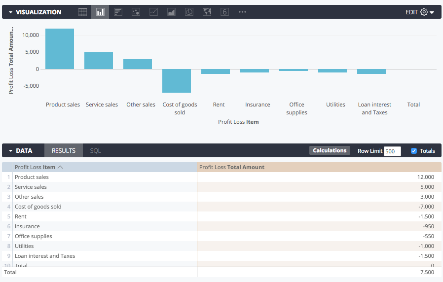
My explore at first is not very waterfall like. Note: I’ve turned on my totals, we will get to this in the next step.
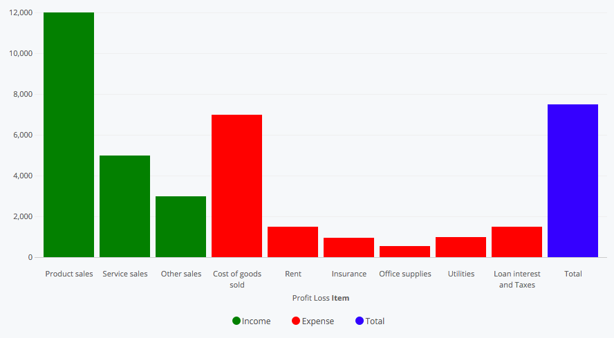
Then the explore will require some new calculated fields. In my example I just want green for income, red for expense, and a total bar. First, I create those as calculated columns:
Income: if(${profit_loss.total_amount}>=0,${profit_loss.total_amount},0)
Expenses: if(${profit_loss.total_amount}<0,-${profit_loss.total_amount},0)
Total: if(${profit_loss.item}="Total",${profit_loss.total_amount:total},0)
Then I set their colors in the ‘Series’ tab of the visualizaiton settings.
(In pre-series tab versions of Looker, you can change this by specifying the colors you want in the “series colors” box of the style tab, like expense: red )
Now I need to add an offset to bump up each bar by its previous bars. I use two functions: running_total() and offset(). Offset lets me use the previous income line, and the rest I just subtract so the bottoms of the expense and total bars line up.
Offset: running_total(offset(${income},-1)-${expense}-${total})
Now my chart looks something like this:
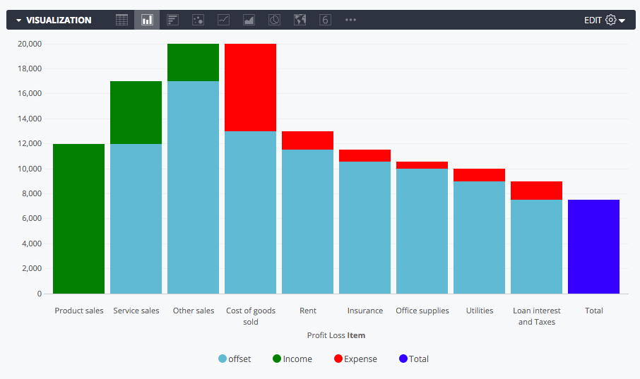
The data table should have any measures hidden outside of our calculated columns.

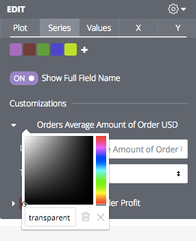
I just need to set my offset to “transparent” so that we don’t see it. Click on the color you would like to change in the Series tab, and type ‘transparent’ into the text box.
(Pre-color picker: just add offset: transparent to the style box in the visualization settings. )
You can even pass the transparency to the value labels. I used transparent, white, black, white for this. Check out the final product!
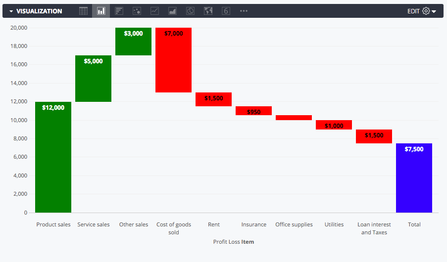
-
access grant
4 -
actionhub
9 -
Actions
14 -
Admin
4 -
alert
29 -
Analytics
2 -
Analytics Block
35 -
Analytics General
1 -
API
12 -
bar
10 -
bestpractice
4 -
BigQuery
8 -
blocks
1 -
boards
4 -
Bug
168 -
cache
2 -
case
2 -
chart
17 -
cohort
1 -
connection
5 -
connection database
1 -
content access
1 -
content-validator
2 -
count
6 -
custom dimension
9 -
custom field
19 -
custom measure
8 -
customdimension
9 -
Dashboards
758 -
Data
5 -
Data Sources
4 -
data tab
4 -
Database
5 -
datagroup
2 -
date-formatting
14 -
dates
18 -
derivedtable
1 -
develop
1 -
development
3 -
dimension
17 -
done
8 -
download
19 -
downloading
9 -
drill-down
1 -
drilling
30 -
dynamic
1 -
embed
10 -
Errors
13 -
etl
1 -
explore
84 -
Explores
136 -
extends
1 -
feature-requests
10 -
filed
3 -
filter
245 -
Filtering
122 -
folders
4 -
formatting
19 -
git
2 -
Google Data Studio
2 -
Google Sheets
2 -
googlesheets
7 -
graph
9 -
group by
6 -
html
12 -
i__looker
1 -
imported project
2 -
Integrations
4 -
javascript
2 -
join
2 -
json
3 -
label
4 -
line chart
17 -
link
5 -
links
3 -
liquid
22 -
Looker
6 -
Looker Studio Pro
49 -
LookerStudio
7 -
lookml
169 -
lookml dashboard
15 -
looks
189 -
manage projects
1 -
map
30 -
map_layer
5 -
Marketplace
4 -
measure
4 -
Memorystore for Memcached
1 -
merge
14 -
model
3 -
modeling
2 -
multiple select
1 -
ndt
1 -
parameter
11 -
pdf
8 -
pdt
8 -
performance
7 -
periodoverperiod
5 -
permission management
1 -
persistence
1 -
pivot
21 -
postgresql
1 -
python
2 -
pythonsdk
2 -
Query
3 -
quickstart
4 -
ReactJS
1 -
redshift
4 -
release
16 -
rendering
8 -
Reporting
10 -
schedule
51 -
schedule delivery
5 -
sdk
1 -
Security
4 -
sharing
2 -
singlevalue
16 -
snowflake
3 -
sql
24 -
SSO
1 -
stacked chart
10 -
system activity
5 -
table chart
16 -
tablecalcs
144 -
Tile
12 -
time
8 -
time zone
3 -
totals
13 -
Training
1 -
Ui
19 -
usage
4 -
user access management
3 -
user management
3 -
user-attributes
6 -
value_format
4 -
view
4 -
Views
4 -
visualizations
558 -
watch
1 -
webhook
2
- « Previous
- Next »

 Twitter