This website uses Cookies. Click Accept to agree to our website's cookie use as described in our Privacy Policy. Click Preferences to customize your cookie settings.
Turn on suggestions
Auto-suggest helps you quickly narrow down your search results by suggesting possible matches as you type.
Showing results for
- Looker
- Looker Forums
- Modeling
- Everybody loves maps!
Topic Options
- Subscribe to RSS Feed
- Mark Topic as New
- Mark Topic as Read
- Float this Topic for Current User
- Bookmark
- Subscribe
- Mute
- Printer Friendly Page
Solved

Post Options
- Mark as New
- Bookmark
- Subscribe
- Mute
- Subscribe to RSS Feed
- Permalink
- Report Inappropriate Content
Reply posted on
--/--/---- --:-- AM
Post Options
- Mark as New
- Bookmark
- Subscribe
- Mute
- Subscribe to RSS Feed
- Permalink
- Report Inappropriate Content
Recently I’ve been working with more data of my favourite kind - geospatial. I realised that this portion of Looker hasn’t been given the amount of love it deserves and thought of combining my feedback in this post, as well as sending it to Pendo, hopefully enriched by other people’s feedback and ideas as well.
It might be a long post but I think it’s worth it  I’ll try to break it down.
Maps and Layers
- Imagine that you already have a table called countries that has GEOJSON / TOPOJSON / GEOMETRY column. It would be great to be able to build maps from the data itself rather than managing it through files. I noticed that because of this I need to maintain maps and data so that my entity’s data gets exactly the same property_name. That equals double the work.
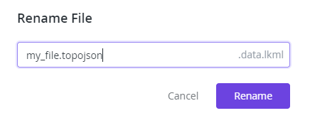
- If you upload a file to your instance and want to change its name the .data.lkml will be added automatically because file change modal has the LookML double extension built-in. (UPDATE Mar 17 - if you include your extension in the name then .data.lkml is not appended, which means it will be okay)
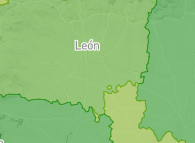
- label property in map_layer definition does not show up anywhere. I expected it to be shown here:
- File size matters. I have ~13MB map and upon uploading it to the project, everything gets slow. Mostly because when you create a new file like a view or a model, that file is opened automatically after creation. For big files it is a problem for browsers
- Files are cached by Looker and changing something in the file’s contents via Looker’s UI does not always refresh it in the visualisation.
Visualisations
- The concept of multiple data layers. Let’s say I have to measures and would like to have a colour scale of the polygons for one measure and maybe circles on top of it where its size would correspond to values of another measure.
- Ability to use dimensions as a second layer as well. Let’s say I have regions of a country and its population and population dictates the colour of the polygon but perhaps the other categorical dimension, pivoted or not, would have impact on the map as well.
- Ability to change the look of labels. Sometimes opacity of the background is not enough and labels become unreadable. It would be good to have a field where we can define the colour, it would be amazing if they could be smart just like labels in other charts.
- property_key_label doesn’t work for me at all. I expected, when using Static Map (Regions) for that label to show up on the map, not just tooltip but that isn’t happening.
-
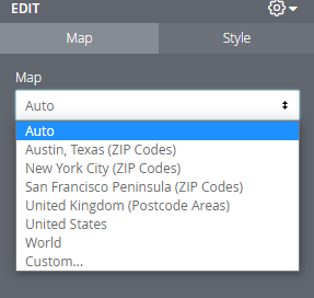
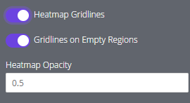
When I have to refresh the whole page, to populate new fields for example, I can see different options for some time:
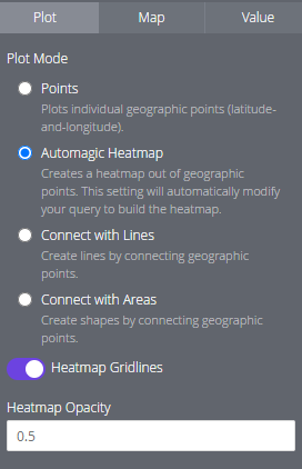
Before it settles:
Let me know if you have more items to put in the wishlist : )
8
10
3,289
Topic Labels
- Labels:
-
lookml
-
visualizations
10 REPLIES 10
Top Labels in this Space
-
access grant
6 -
actionhub
1 -
Actions
8 -
Admin
7 -
Analytics Block
27 -
API
25 -
Authentication
2 -
bestpractice
7 -
BigQuery
69 -
blocks
11 -
Bug
60 -
cache
7 -
case
12 -
Certification
2 -
chart
1 -
cohort
5 -
connection
14 -
connection database
4 -
content access
2 -
content-validator
5 -
count
5 -
custom dimension
5 -
custom field
11 -
custom measure
13 -
customdimension
8 -
Customizing LookML
118 -
Dashboards
144 -
Data
7 -
Data Sources
3 -
data tab
1 -
Database
13 -
datagroup
5 -
date-formatting
12 -
dates
16 -
derivedtable
51 -
develop
4 -
development
7 -
dialect
2 -
dimension
46 -
done
9 -
download
5 -
downloading
1 -
drilling
28 -
dynamic
17 -
embed
5 -
Errors
16 -
etl
2 -
explore
58 -
Explores
5 -
extends
17 -
Extensions
9 -
feature-requests
6 -
filter
220 -
formatting
13 -
git
19 -
googlesheets
2 -
graph
1 -
group by
7 -
Hiring
2 -
html
19 -
ide
1 -
imported project
8 -
Integrations
1 -
internal db
2 -
javascript
2 -
join
16 -
json
7 -
label
6 -
link
17 -
links
8 -
liquid
154 -
Looker Studio Pro
1 -
looker_sdk
1 -
LookerStudio
3 -
lookml
859 -
lookml dashboard
20 -
LookML Foundations
54 -
looks
33 -
manage projects
1 -
map
14 -
map_layer
6 -
Marketplace
2 -
measure
22 -
merge
7 -
model
7 -
modeling
26 -
multiple select
2 -
mysql
3 -
nativederivedtable
9 -
ndt
6 -
Optimizing Performance
30 -
parameter
70 -
pdt
35 -
performance
11 -
periodoverperiod
16 -
persistence
2 -
pivot
3 -
postgresql
2 -
Projects
7 -
python
2 -
Query
3 -
quickstart
5 -
ReactJS
1 -
redshift
10 -
release
18 -
rendering
3 -
Reporting
2 -
schedule
5 -
schedule delivery
1 -
sdk
5 -
singlevalue
1 -
snowflake
16 -
sql
222 -
system activity
3 -
table chart
1 -
tablecalcs
53 -
tests
7 -
time
8 -
time zone
4 -
totals
7 -
user access management
3 -
user-attributes
9 -
value_format
5 -
view
24 -
Views
5 -
visualizations
166 -
watch
1 -
webhook
1 -
日本語
3
- « Previous
- Next »

 Twitter