This website uses Cookies. Click Accept to agree to our website's cookie use as described in our Privacy Policy. Click Preferences to customize your cookie settings.
Turn on suggestions
Auto-suggest helps you quickly narrow down your search results by suggesting possible matches as you type.
Showing results for
- Google Cloud Security
- Security Forums
- SecOps SIEM
- Question about Google Secops Consumption metrics
Topic Options
- Subscribe to RSS Feed
- Mark Topic as New
- Mark Topic as Read
- Float this Topic for Current User
- Bookmark
- Subscribe
- Mute
- Printer Friendly Page
Solved

Post Options
- Mark as New
- Bookmark
- Subscribe
- Mute
- Subscribe to RSS Feed
- Permalink
- Report Inappropriate Content
Reply posted on
--/--/---- --:-- AM
Post Options
- Mark as New
- Bookmark
- Subscribe
- Mute
- Subscribe to RSS Feed
- Permalink
- Report Inappropriate Content
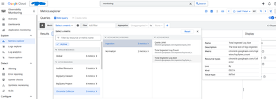
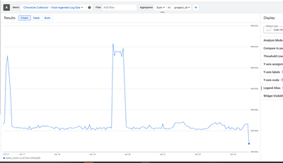
We're facing some difficulties building a graph in Google Cloud Monitoring (Metrics Explorer) to visualize ingestion metrics from Google SecOps:
Specifically, we need to create time series graphs that show:
-
The total amount of ingested GB over time
-
The total ingested GB per log source over time
We’ve confirmed that the Google SecOps integration is already set up in Cloud Monitoring and appears to be providing useful data. However, what we’re seeing in the graphs doesn’t match the ingestion values shown in Google SecOps or Bindplane dashboards.
For example:
-
Google Cloud Monitoring shows only a few KBs
-
While Google SecOps and Bindplane reflect ingestion in the GB range
Google Cloud Monitoring
Google Secops
Bindplane
We're trying to understand this discrepancy.
We noticed that the Total Ingested Log Size metric is of the "Delta" kind. From our understanding, delta metrics reflect only the change in value over time, rather than a cumulative total.
Is there a way to convert this into a raw value or cumulative total to better reflect actual ingestion volumes?
Is there a way to convert this into a raw value or cumulative total to better reflect actual ingestion volumes?
Additionally, we’d like to know if it's possible to customize the graphs based on specific time intervals. For instance:
-
At 23/04/2024 10:41 UTC we had 12GB being ingested
-
At 23/04/2024 10:42 UTC we had 13GB being ingested
-
At 23/04/2024 10:43 UTC we had 15GB being ingested
-
At 23/04/2024 10:44 UTC we had 9GB being ingested
-
At 23/04/2024 10:45 UTC we had 8GB being ingested
If we select a 5-minute interval, we’d expect the graph to display a data point reflecting the mean over that interval (in this case, 11.4GB). Is that achievable?
Could you help us understand the correct approach to build this type of graph?
Are we possibly missing a configuration step, or could this be related to permissions?
Are we possibly missing a configuration step, or could this be related to permissions?
Thanks in advance.
0
1
133
Topic Labels
- Labels:
-
SecOps
1 REPLY 1
Post Options
- Mark as New
- Bookmark
- Subscribe
- Mute
- Subscribe to RSS Feed
- Permalink
- Report Inappropriate Content
Reply posted on
--/--/---- --:-- AM
Post Options
- Mark as New
- Bookmark
- Subscribe
- Mute
- Subscribe to RSS Feed
- Permalink
- Report Inappropriate Content
You have a lot more control using promql - https://cloud.google.com/monitoring/promql?_gl=1*12hjkew*_ga*MjAzMzQwMzgzOC4xNzA0ODMzODQ2*_ga_WH2QY8....
> If we select a 5-minute interval, we’d expect the graph to display a data point reflecting the mean over that interval (in this case, 11.4GB). Is that achievable?
The underlying query is using the prometheus function `rate. Sounds like you want to use increase -https://prometheus.io/docs/prometheus/latest/querying/functions/#increase
Try
sum(increase(chronicle_googleapis_com:ingestion_log_bytes_count{monitored_resource="chronicle.googleapis.com/Collector"}[${__interval}]))
Top Labels in this Space
-
Admin
73 -
AI
11 -
API
82 -
Applied Analytics
4 -
BigQuery
11 -
Browser Management
4 -
Chrome Enterprise
5 -
Chronicle
323 -
Compliance
10 -
Curated Detections
37 -
Custom List
1 -
Dashboard
89 -
Data Management
63 -
Ingestion
213 -
Investigation
54 -
Logs
2 -
MCP
7 -
Parsers
177 -
Rules Engine
168 -
Search
87 -
SecOps
349 -
Security Command Center
1 -
SIEM
577 -
Siemplify
1 -
Slack
1 -
SOAR
68 -
Spotlight series
1 -
Threat Intelligence
49 -
Troubleshooting
76
- « Previous
- Next »

 Twitter


