- AppSheet
- Tips & Resources
- Tips & Tricks
- Re: Radial Gauge / "Meter" - Inline Dynamic Icon -...
- Subscribe to RSS Feed
- Mark Topic as New
- Mark Topic as Read
- Float this Topic for Current User
- Bookmark
- Subscribe
- Mute
- Printer Friendly Page
- Mark as New
- Bookmark
- Subscribe
- Mute
- Subscribe to RSS Feed
- Permalink
- Report Inappropriate Content
- Mark as New
- Bookmark
- Subscribe
- Mute
- Subscribe to RSS Feed
- Permalink
- Report Inappropriate Content
Dear community,
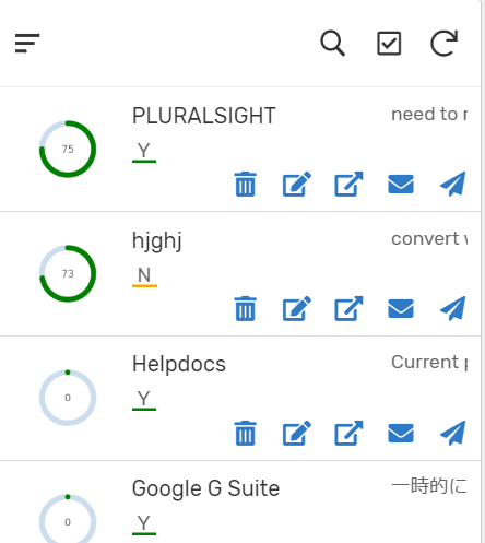
On various occasions, we wish to have some sort of KPI so that the user can get the better experience and insight. Most of the “icon” is basically “static”, but I found a way to create KIP radial gauge type of Icon, based on the data in Appsheet column/data field. This is super easy.
Borrowing code from ; -
This is Javascript open-source library, and they have bunch of chart image type. Among other, I use Radial Gauge meter to place the same an icon for inline display the same gauge.
It looks like this.
First, please create virtual column and insert following texts.
“https://quickchart.io/chart?c={type:‘radialGauge’,data:{datasets:[{data:[Number or Float type data field],backgroundColor:‘green’}]}}”
–
For the part of [Number or Float type data field], please refer to the data fileld you wish to show as KPI. For instance, the percent of achievement, kind of number should be best fitting for this kind of KPI indicator.
And make the column type to either IMAGE or THUMBNAIL.
Or you can hard-code the number as well optionally.
Thats it.
Bit of customise we ca like a color. Just change the last part of code, like ‘red’ or ‘blue’ etc
This is the easiest trick to place KPI indicator to the view .
Try it out.
I will test the other chart, but most of the type are on the Appsheet default chart features can manage, so it may not be useful, but if any user wish to have chart as INLINE, rather than Chart view, this javascript liberary could be found useful.
If anyone in the community to test this and found new tricks and tips, it is grateful if they share the finding in this post, thanks.
Additional Note
The texts in the vc looks like this fyg.
This case i have column callced “[Percent]”, i refer it in the strings and concat.
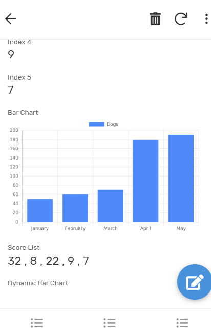
I tested another simple chart from the library, like bar chart. It looks like this within Appsheet detail view. Chart is now shown as inline!
- Labels:
-
UX
- Mark as New
- Bookmark
- Subscribe
- Mute
- Subscribe to RSS Feed
- Permalink
- Report Inappropriate Content
- Mark as New
- Bookmark
- Subscribe
- Mute
- Subscribe to RSS Feed
- Permalink
- Report Inappropriate Content
Hi @tsuji_koichi,
Thank you for another useful tip. Will try out and update.
- Mark as New
- Bookmark
- Subscribe
- Mute
- Subscribe to RSS Feed
- Permalink
- Report Inappropriate Content
- Mark as New
- Bookmark
- Subscribe
- Mute
- Subscribe to RSS Feed
- Permalink
- Report Inappropriate Content
Morning friend
Yes please test it out, I suppose we can find more of useful stuffs to create quick chart dynamically to decorate app. Looking forward to hearing your findings. ^.^ /
- Mark as New
- Bookmark
- Subscribe
- Mute
- Subscribe to RSS Feed
- Permalink
- Report Inappropriate Content
- Mark as New
- Bookmark
- Subscribe
- Mute
- Subscribe to RSS Feed
- Permalink
- Report Inappropriate Content
This is very usefull. Thank you
But if it can be done this easily then Surely the Appsheet Team can build this into the platform by using the GoogleCharts for Developers (https://developers.google.com/chart) or other chart dev libraries
- Mark as New
- Bookmark
- Subscribe
- Mute
- Subscribe to RSS Feed
- Permalink
- Report Inappropriate Content
- Mark as New
- Bookmark
- Subscribe
- Mute
- Subscribe to RSS Feed
- Permalink
- Report Inappropriate Content
Thank you very much @tsuji_koichi
There was a discussion about chart.googleapis.com and quickchart.io
I’m using the Doughnut Chart. The advantage is that you can have your values in different columns. Because when you want to use the AppSheet built in chart, the values have to be in the same column.
Adding @praveen
- Mark as New
- Bookmark
- Subscribe
- Mute
- Subscribe to RSS Feed
- Permalink
- Report Inappropriate Content
- Mark as New
- Bookmark
- Subscribe
- Mute
- Subscribe to RSS Feed
- Permalink
- Report Inappropriate Content
Hi Fabian,
Thank you for your feedback.
Every different library and service should have own pros and cons, so we should take the better option from each and combine to make the best app!
- Mark as New
- Bookmark
- Subscribe
- Mute
- Subscribe to RSS Feed
- Permalink
- Report Inappropriate Content
- Mark as New
- Bookmark
- Subscribe
- Mute
- Subscribe to RSS Feed
- Permalink
- Report Inappropriate Content
quickchart.io & chart.js are great solutions that I use often! I have been thinking about making up an app to show how to set up more of the advanced options. I’m working on a timeline sort of chart right now.
It’s important to encode the url of parameters (everything after the ?c=). When you get into long strings of data it will make everything much easier.
- Mark as New
- Bookmark
- Subscribe
- Mute
- Subscribe to RSS Feed
- Permalink
- Report Inappropriate Content
- Mark as New
- Bookmark
- Subscribe
- Mute
- Subscribe to RSS Feed
- Permalink
- Report Inappropriate Content
It is great if you could spent some moment to create the sample/portfolio app so that we learn more lesson. I tested other quickchart - chart type as well, and it generally worked well, as well.
I will try to find moment to create sample app as well, by pushing several chart into it.
- Mark as New
- Bookmark
- Subscribe
- Mute
- Subscribe to RSS Feed
- Permalink
- Report Inappropriate Content
- Mark as New
- Bookmark
- Subscribe
- Mute
- Subscribe to RSS Feed
- Permalink
- Report Inappropriate Content
Interesting Comparison Table:
- Mark as New
- Bookmark
- Subscribe
- Mute
- Subscribe to RSS Feed
- Permalink
- Report Inappropriate Content
- Mark as New
- Bookmark
- Subscribe
- Mute
- Subscribe to RSS Feed
- Permalink
- Report Inappropriate Content
Coming in late here: Excellent Tip, @tsuji_koichi !! As I walked through your notes and examples, I was running into errors. Your calculation has curly-quotes in it, which I don’t think our app enjoyed ![]() shame on me for copying and pasting
shame on me for copying and pasting ![]() Also a field of type percent needs to be multiplied by 100 for quickcharts to work best for a radial. The calculation that worked for me against quickchart.io looks like this (for the next person who tries)
Also a field of type percent needs to be multiplied by 100 for quickcharts to work best for a radial. The calculation that worked for me against quickchart.io looks like this (for the next person who tries)
concatenate("https://quickchart.io/chart?c={type:'radialGauge',data:{datasets:[{data:[",[PercentComplete]*100,"],backgroundColor:'green'}]}}")
- Given a field called PercentComplete which is of type “percent” inside of AppSheet
- mark this field as an image or a thumbnail
Hope this helps!
- Mark as New
- Bookmark
- Subscribe
- Mute
- Subscribe to RSS Feed
- Permalink
- Report Inappropriate Content
- Mark as New
- Bookmark
- Subscribe
- Mute
- Subscribe to RSS Feed
- Permalink
- Report Inappropriate Content
Hi Ty, @TyAlevizos
Thank you for your comment. Yes, you well founded, the percentage column is little tricky to generate. I faced the same problem at first. The thing i have to spend hours and hours was I didnot know appsheet currently not able to return decimal type even with number type divided by number type of column. I mean if we set two number column as NUMBER, and one has value of 3, and other have 2. Device 3 by 2. is equal to 1.5 mathematically, but Appsheet only return numbers I didnt know the trick…
Anyway, this is nothing to do with the subject.
I m now using bar chart, which I call as INLINE-CHART here and there. See sample screenshot.
It might be bit distractive, but i place inline chart as background for the header etc.
It is fun.
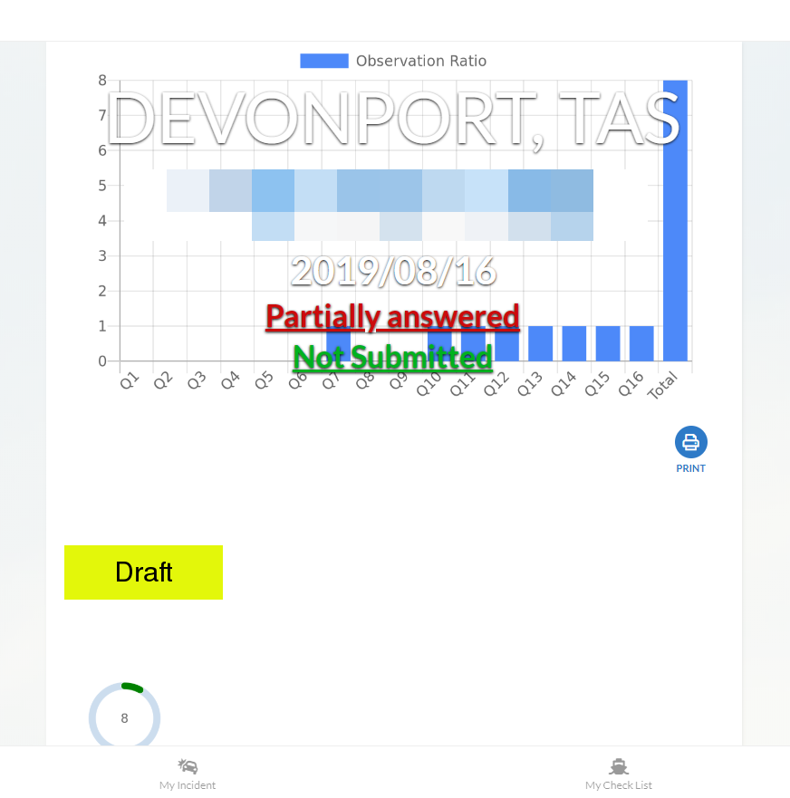
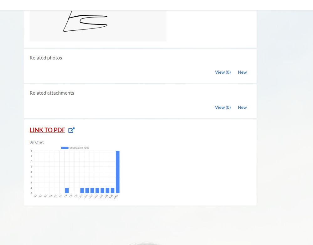
Good thing with this inline-chart.
It is difficult to generate the chart with Appsheet native chart for line by line chart. I mean Appsheet chart is not able to generate the chart for data which is coming from single row.
For this inline chart, we are able to easily achieve that, although this is static image, not interactive chart though.
- Mark as New
- Bookmark
- Subscribe
- Mute
- Subscribe to RSS Feed
- Permalink
- Report Inappropriate Content
- Mark as New
- Bookmark
- Subscribe
- Mute
- Subscribe to RSS Feed
- Permalink
- Report Inappropriate Content
This Works. Thanks a lot. You are a genius.
- Mark as New
- Bookmark
- Subscribe
- Mute
- Subscribe to RSS Feed
- Permalink
- Report Inappropriate Content
- Mark as New
- Bookmark
- Subscribe
- Mute
- Subscribe to RSS Feed
- Permalink
- Report Inappropriate Content
Hello tsuji_koichi,
I am unable to get Labels from array list trying to using Spider chart. The labels will change dinamically, depending for any case. When I could get the label from the virtual column, it is not conected with the data.
I have results ®, for which a certain number of indicators (IND) were defined in order to measure their progress. I want to be able to graph all the indicators for each result, but the names and values of the indicators change for each result.
Here you have the code I am using:
“https://quickchart.io/chart?c={type:‘radar’,data:{labels:[‘HERE I WANT TO INSERT VIRTUAL COLUMN NAME THAT HAS THE LIST THAT WILL CHANGE DINAMICALLY’], datasets:[{label:‘Resultado’,data:[”&[vcResultados_IND_Relacionados]&"]}]}}"
- Mark as New
- Bookmark
- Subscribe
- Mute
- Subscribe to RSS Feed
- Permalink
- Report Inappropriate Content
- Mark as New
- Bookmark
- Subscribe
- Mute
- Subscribe to RSS Feed
- Permalink
- Report Inappropriate Content
hi, there,
Yes, I understood what you want to do, dynamically change the labels, but I do have a workaround, which is little complicated.
I can have a look at your app, if you dont mind.
Share app to koichi.tsuji@vendolasolutions.com
- Mark as New
- Bookmark
- Subscribe
- Mute
- Subscribe to RSS Feed
- Permalink
- Report Inappropriate Content
- Mark as New
- Bookmark
- Subscribe
- Mute
- Subscribe to RSS Feed
- Permalink
- Report Inappropriate Content
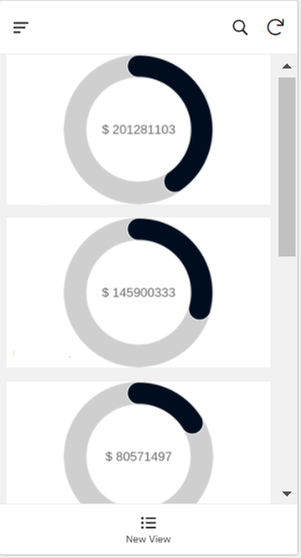
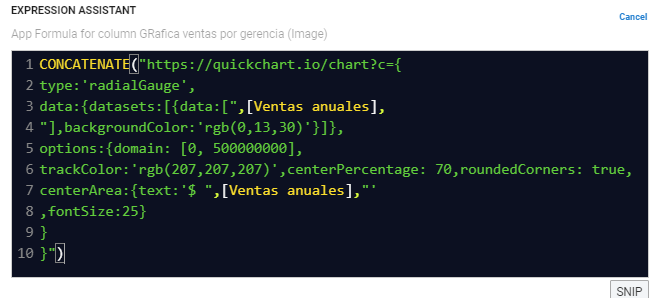
By chance, I found a way to add “options” to customize the gauge chart based on Quickchart.io.
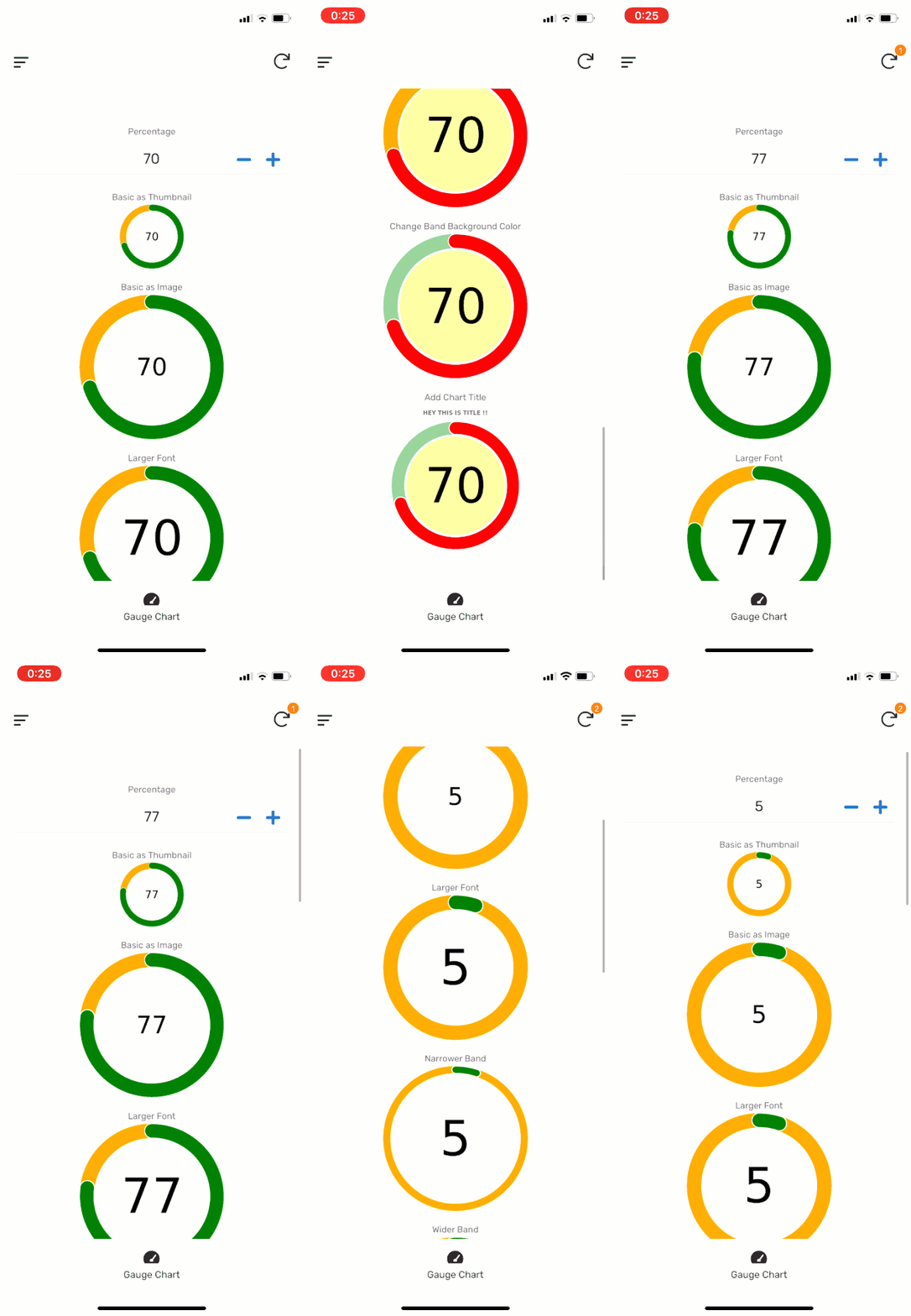
By changing the options and its parameters, the gauge chart can be easily customized. Change the font size in the centre of chart, change colors of band, change width of band etc.
- Mark as New
- Bookmark
- Subscribe
- Mute
- Subscribe to RSS Feed
- Permalink
- Report Inappropriate Content
- Mark as New
- Bookmark
- Subscribe
- Mute
- Subscribe to RSS Feed
- Permalink
- Report Inappropriate Content
Please, share the app
- Mark as New
- Bookmark
- Subscribe
- Mute
- Subscribe to RSS Feed
- Permalink
- Report Inappropriate Content
- Mark as New
- Bookmark
- Subscribe
- Mute
- Subscribe to RSS Feed
- Permalink
- Report Inappropriate Content
@Cristhian_Macias
You can change the dataset values of the gauge chart via appending option parameters to the chart URL in JSON form.
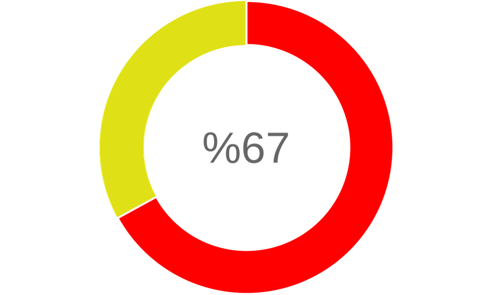
https://quickchart.io/chart?c={type:'radialGauge',data:{datasets:[{data:[67],backgroundColor:'red'}]},options:{trackColor: 'rgb(224, 224, 22)',centerPercentage: 70,roundedCorners: false}}

- Mark as New
- Bookmark
- Subscribe
- Mute
- Subscribe to RSS Feed
- Permalink
- Report Inappropriate Content
- Mark as New
- Bookmark
- Subscribe
- Mute
- Subscribe to RSS Feed
- Permalink
- Report Inappropriate Content
This method makes an external service call right?
Opposed to SVG doesn’t need to rely on external services. I’ve been doing dials with SVG… Curious if I should be doing this instead?
- Mark as New
- Bookmark
- Subscribe
- Mute
- Subscribe to RSS Feed
- Permalink
- Report Inappropriate Content
- Mark as New
- Bookmark
- Subscribe
- Mute
- Subscribe to RSS Feed
- Permalink
- Report Inappropriate Content
@Grant_Stead
I generally prefer this one as SVG coding is a bit painful actually. The JS code is open-source, it has a bunch of chart options and it’s broadly customizable thru URL body. The beauty is; as it generates a png as well, it can bu used with the SNAPSHOT() feature. I may recommend trying it.
- Mark as New
- Bookmark
- Subscribe
- Mute
- Subscribe to RSS Feed
- Permalink
- Report Inappropriate Content
- Mark as New
- Bookmark
- Subscribe
- Mute
- Subscribe to RSS Feed
- Permalink
- Report Inappropriate Content
Sounds like a deal.
- Mark as New
- Bookmark
- Subscribe
- Mute
- Subscribe to RSS Feed
- Permalink
- Report Inappropriate Content
- Mark as New
- Bookmark
- Subscribe
- Mute
- Subscribe to RSS Feed
- Permalink
- Report Inappropriate Content
Do you know if there’s a way to put a % with the number?
- Mark as New
- Bookmark
- Subscribe
- Mute
- Subscribe to RSS Feed
- Permalink
- Report Inappropriate Content
- Mark as New
- Bookmark
- Subscribe
- Mute
- Subscribe to RSS Feed
- Permalink
- Report Inappropriate Content
https://quickchart.io/chart?c={type:'radialGauge',data:{datasets:[{data:[67],backgroundColor:'red'}]},options:{trackColor: 'rgb(224, 224, 22)',centerPercentage: 70,roundedCorners: false,centerArea:{text:'%2567'}}}
- Mark as New
- Bookmark
- Subscribe
- Mute
- Subscribe to RSS Feed
- Permalink
- Report Inappropriate Content
- Mark as New
- Bookmark
- Subscribe
- Mute
- Subscribe to RSS Feed
- Permalink
- Report Inappropriate Content
Thanks, it’s not working when I use my own data though. I’ve got it set up on an virtual column as an image url
“https://quickchart.io/chart?c={type:‘radialGauge’,data:{datasets:[{data:[Offset Percentage],backgroundColor:‘red’}]},options:{trackColor: ‘rgb(224, 224, 22)’,centerPercentage: 70,roundedCorners: false,centerArea:{text:’%2567’}}}”
It works when I use [67] but not my own data [Offset Percentage].
- Mark as New
- Bookmark
- Subscribe
- Mute
- Subscribe to RSS Feed
- Permalink
- Report Inappropriate Content
- Mark as New
- Bookmark
- Subscribe
- Mute
- Subscribe to RSS Feed
- Permalink
- Report Inappropriate Content
Try wrapping your column brackets in an encode URL expression. ENCODEURL()
- Mark as New
- Bookmark
- Subscribe
- Mute
- Subscribe to RSS Feed
- Permalink
- Report Inappropriate Content
- Mark as New
- Bookmark
- Subscribe
- Mute
- Subscribe to RSS Feed
- Permalink
- Report Inappropriate Content
@Taylor_Felt2 you can try with this:
CONCATENATE(
	"https://quickchart.io/chart?c={type:'radialGauge',data:{datasets:[{data:[",
	NUMBER([Offset Percentage]*100),
	"],backgroundColor:'red'}]},options:{trackColor: 'rgb(224, 224, 22)',centerPercentage: 70,roundedCorners: false,centerArea:{text:'%25",
	NUMBER([Offset Percentage]*100),
	"'}}}"
)
- Mark as New
- Bookmark
- Subscribe
- Mute
- Subscribe to RSS Feed
- Permalink
- Report Inappropriate Content
- Mark as New
- Bookmark
- Subscribe
- Mute
- Subscribe to RSS Feed
- Permalink
- Report Inappropriate Content
Worked perfect, thank you very much! I don’t suppose there’s an easy way to move the percentage to the right of the number?
- Mark as New
- Bookmark
- Subscribe
- Mute
- Subscribe to RSS Feed
- Permalink
- Report Inappropriate Content
- Mark as New
- Bookmark
- Subscribe
- Mute
- Subscribe to RSS Feed
- Permalink
- Report Inappropriate Content
CONCATENATE(
	"https://quickchart.io/chart?c={type:'radialGauge',data:{datasets:[{data:[",
	NUMBER([Offset Percentage]*100),
	"],backgroundColor:'red'}]},options:{trackColor: 'rgb(224, 224, 22)',centerPercentage: 70,roundedCorners: false,centerArea:{text:'",
	NUMBER([Offset Percentage]*100),
	"%25'}}}"
)

- Mark as New
- Bookmark
- Subscribe
- Mute
- Subscribe to RSS Feed
- Permalink
- Report Inappropriate Content
- Mark as New
- Bookmark
- Subscribe
- Mute
- Subscribe to RSS Feed
- Permalink
- Report Inappropriate Content
Hmmm… when I copy/paste that into the expression editor is says the parentheses don’t match. I tried a few variations. It seems like it could be the first apostrophe after “text” but I can’t quite get it to work. Sorry to keep bothering you.
{text:’",
NUMBER([Offset Percentage]),
“%25’}}}”
CONCATENATE(
“https://quickchart.io/chart?c={type:‘radialGauge’,data:{datasets:[{data:[”,
NUMBER([Offset Percentage]),
“],backgroundColor:‘red’}]},options:{trackColor: ‘rgb(224, 224, 22)’,centerPercentage: 70,roundedCorners: false,centerArea:{text:’”,
NUMBER([Offset Percentage]),
“%25’}}}”
)
- Mark as New
- Bookmark
- Subscribe
- Mute
- Subscribe to RSS Feed
- Permalink
- Report Inappropriate Content
- Mark as New
- Bookmark
- Subscribe
- Mute
- Subscribe to RSS Feed
- Permalink
- Report Inappropriate Content
@Taylor_Felt2
A space after the apostrophe following the “text” will do the trick:
CONCATENATE(
	"https://quickchart.io/chart?c={type:'radialGauge',data:{datasets:[{data:[",
	NUMBER([Offset Percentage]*100),
	"],backgroundColor:'red'}]},options:{trackColor: 'rgb(224, 224, 22)',centerPercentage: 70,roundedCorners: false,centerArea:{text:' ",
	NUMBER([Offset Percentage]*100),
	"%25'}}}"
)
- Mark as New
- Bookmark
- Subscribe
- Mute
- Subscribe to RSS Feed
- Permalink
- Report Inappropriate Content
- Mark as New
- Bookmark
- Subscribe
- Mute
- Subscribe to RSS Feed
- Permalink
- Report Inappropriate Content
Awesome. Thank you!
- Mark as New
- Bookmark
- Subscribe
- Mute
- Subscribe to RSS Feed
- Permalink
- Report Inappropriate Content
- Mark as New
- Bookmark
- Subscribe
- Mute
- Subscribe to RSS Feed
- Permalink
- Report Inappropriate Content
You’re very welcome
- Mark as New
- Bookmark
- Subscribe
- Mute
- Subscribe to RSS Feed
- Permalink
- Report Inappropriate Content
- Mark as New
- Bookmark
- Subscribe
- Mute
- Subscribe to RSS Feed
- Permalink
- Report Inappropriate Content
@Taylor_Felt2 Today I learned that you can do this percentage stuff also with the formatter option.
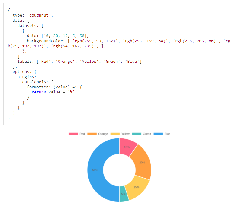
https://quickchart.io/documentation/chart-js/custom-pie-doughnut-chart-labels/
https://chartjs-plugin-datalabels.netlify.app/guide/formatting.html#data-transformation
- Mark as New
- Bookmark
- Subscribe
- Mute
- Subscribe to RSS Feed
- Permalink
- Report Inappropriate Content
- Mark as New
- Bookmark
- Subscribe
- Mute
- Subscribe to RSS Feed
- Permalink
- Report Inappropriate Content
I think quickcharts changed something because I can no longer get any radial chart to show a % sign. I noticed a few days ago that there was an issue with the chart.
I went back through your messages and couldn’t get anything to work until I did this code and it doesn’t render the same. https://quickchart.io/chart?c={type:‘radialGauge’,data:{datasets:[{data:[67],backgroundColor:‘red’}]},options:{trackColor: ‘rgb(224, 224, 22)’,centerPercentage: 70,roundedCorners: false,centerArea:{text:’%2567’}}}
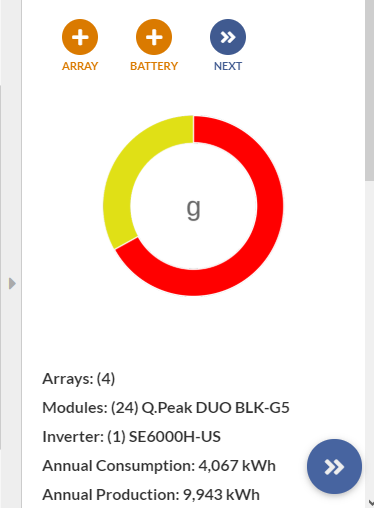
Not really sure what to make of it, do you think there is a work around?
It seems like it is actually working with my pdf reports though… just not in the app.
This is the code that is no longer working except in the report.
CONCATENATE( “https://quickchart.io/chart?c={type:‘radialGauge’,data:{datasets:[{data:[”, Round(NUMBER([VC Offset Percentage])),"], backgroundColor:‘Green’}]},options:{ title: { display: true, text:‘Energy Usage Offset’,fontSize:30 }, trackColor: ‘rgb(255,0,0)’,centerPercentage: 70,roundedCorners: false, centerArea: { text:’ “,Round(NUMBER([Offset Percentage])),”%25’}, } }")
- Mark as New
- Bookmark
- Subscribe
- Mute
- Subscribe to RSS Feed
- Permalink
- Report Inappropriate Content
- Mark as New
- Bookmark
- Subscribe
- Mute
- Subscribe to RSS Feed
- Permalink
- Report Inappropriate Content
@Taylor_Felt2
There might be a very small syntax error somewhere in your expression. My charts are working correctly actually.
- Mark as New
- Bookmark
- Subscribe
- Mute
- Subscribe to RSS Feed
- Permalink
- Report Inappropriate Content
- Mark as New
- Bookmark
- Subscribe
- Mute
- Subscribe to RSS Feed
- Permalink
- Report Inappropriate Content
Turns out that it was the % symbol after all. Appsheet won’t accept it within the app but it does work on pdf reports. I found a workaround by using the full width unicode symbol %.
- Mark as New
- Bookmark
- Subscribe
- Mute
- Subscribe to RSS Feed
- Permalink
- Report Inappropriate Content
- Mark as New
- Bookmark
- Subscribe
- Mute
- Subscribe to RSS Feed
- Permalink
- Report Inappropriate Content
Hi @Taylor,
I believe Im having the same problem here.
Using this formula I get a correct URL as result that shows on my browser, but it wont show on AppSheet:
CONCATENATE("https://quickchart.io/chart?c={
type:'radialGauge',
data:{datasets:[{data:[",[Avance]*100,"],backgroundColor:'green'}]},
options:{
trackColor:'rgb(255,0,0)',centerPercentage: 70,roundedCorners: true,
centerArea:{text:' ",[Avance]*100," %25',padding:10,backgroundColor: ‘rgb(238,238,162)’}
}
}")
How did you add the FF05 full width code for “%” to the formula?
Thanks!
- Mark as New
- Bookmark
- Subscribe
- Mute
- Subscribe to RSS Feed
- Permalink
- Report Inappropriate Content
- Mark as New
- Bookmark
- Subscribe
- Mute
- Subscribe to RSS Feed
- Permalink
- Report Inappropriate Content
Just copy and paste it. %
- Mark as New
- Bookmark
- Subscribe
- Mute
- Subscribe to RSS Feed
- Permalink
- Report Inappropriate Content
- Mark as New
- Bookmark
- Subscribe
- Mute
- Subscribe to RSS Feed
- Permalink
- Report Inappropriate Content
Awesome, this worked. Thanks @Taylor!
Also for future readers: After pastinh the symbol, I wasn´t able to see any data in the center of the graph, It took me a while to realize that to show all four “4 digits” of “100%” the max font size I could use was 55.
![]()
This is the final formula:
CONCATENATE(“https://quickchart.io/chart?c={
type:‘radialGauge’,
data:{datasets:[{data:[”,[Porcentaje],"],backgroundColor:‘green’}]},
options:{
trackColor:‘rgb(255,0,0)’,centerPercentage: 70,roundedCorners: true,
centerArea:{text:’ “,[Porcentaje],”%’
,fontSize:55,padding:10,backgroundColor: ‘rgb(238,238,162)’}
}
}")
- Mark as New
- Bookmark
- Subscribe
- Mute
- Subscribe to RSS Feed
- Permalink
- Report Inappropriate Content
- Mark as New
- Bookmark
- Subscribe
- Mute
- Subscribe to RSS Feed
- Permalink
- Report Inappropriate Content
- Mark as New
- Bookmark
- Subscribe
- Mute
- Subscribe to RSS Feed
- Permalink
- Report Inappropriate Content
- Mark as New
- Bookmark
- Subscribe
- Mute
- Subscribe to RSS Feed
- Permalink
- Report Inappropriate Content
Hi Cristhian,
You will have to set the text option dynamically using Javascript. Please see the following:
{
  type: 'radialGauge',
  data: { datasets: [{ data: [80571497], backgroundColor: 'rgb(0,13,30)' }] },
  options: {
    domain: [0, 500000000],
    trackColor: 'rgb(207,207,207)',
    centerPercentage: 70,
    centerArea: {
      fontSize: 25,
      text: (val) => {
        return '$ ' + val.toLocaleString('es');
      },
    },
  },
}
-
Account
7 -
App Management
37 -
Automation
207 -
Data
153 -
Errors
29 -
Expressions
220 -
Integrations
125 -
Intelligence
26 -
Other
57 -
Resources
38 -
Security
16 -
Templates
64 -
Users
20 -
UX
242

 Twitter