- AppSheet
- Release Notes & Announcements
- Announcements
- Re: New Charts in AppSheet applications - in Previ...
- Subscribe to RSS Feed
- Mark Topic as New
- Mark Topic as Read
- Float this Topic for Current User
- Bookmark
- Subscribe
- Mute
- Printer Friendly Page
- Mark as New
- Bookmark
- Subscribe
- Mute
- Subscribe to RSS Feed
- Permalink
- Report Inappropriate Content
- Mark as New
- Bookmark
- Subscribe
- Mute
- Subscribe to RSS Feed
- Permalink
- Report Inappropriate Content
The following feature has been added to the Preview Program. Feel free to test the feature and report issues or possible improvements in this thread.
App Creators can now make use of our new chart editor and the new and improved charts it can create. There are still features to be added before general availability, and the new charts should not be used in production apps until general availability as they may be unstable in the future.
We’ve been trying to create a charting experience that allows creators to create charts with more flexibility than they currently have, and which tries to be smart about picking the type of chart that will best represent your data.
How do I start creating new charts?
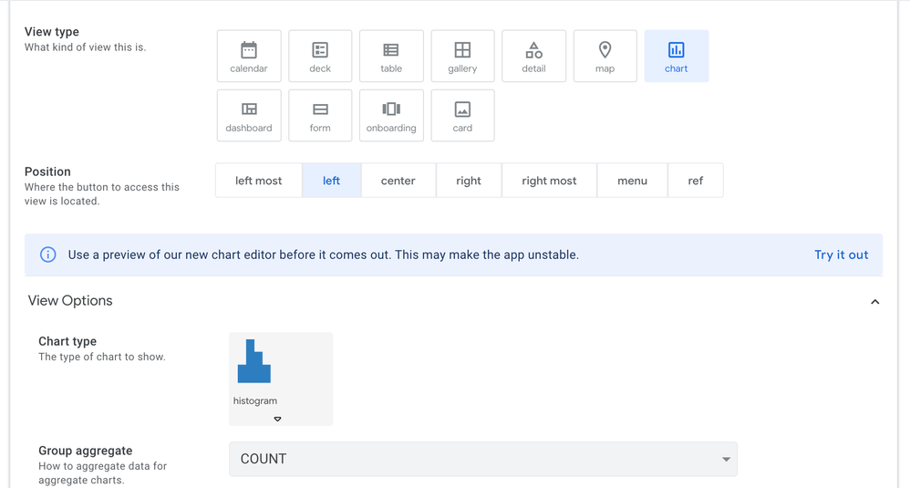
If you have enabled the preview program for your app (make sure to save after turning on the preview program), you should be able to see a toggle to switch between the current experience and the new experience the next time you are viewing a chart under UX → Views. Just press “Try it out” and you should be able to play with it.
How do I use the new editor?
The new editor will show you the columns in your app, and you can drag them into appropriate Configuration slots. We will then try to guess the type of chart that is appropriate for that type of data - however you can change this should you wish.
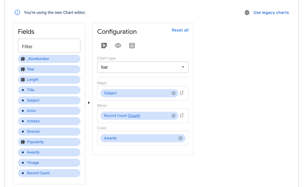
We’re also very interested in feedback as to the usability and discoverability of the features of this editor, so do please explore and let us know what you found.
What chart types are we supporting?
We are currently supporting bar, line, area, scatter, pie, and doughnut charts.
But what about my existing charts?
You can feel free to play around with this chart editor even on top of an existing chart, as they are co-existing alongside one another. You can switch back to your old chart by just pressing the “Use legacy charts” button.
What features are upcoming?
We’ll be rolling out new improvements to this periodically (so stay tuned to the Release Notes to get an exact accounting of what’s coming!), some notable features that will be coming soon are
- The ability to pick from several different themes for the colours in the chart
- The ability to show and hide the title and the ability to turn off clicking through the data on the chart
- The ability to customize what is in the tooltips that users see when over a chart
And more!
- Labels:
-
UX
- Mark as New
- Bookmark
- Subscribe
- Mute
- Subscribe to RSS Feed
- Permalink
- Report Inappropriate Content
- Mark as New
- Bookmark
- Subscribe
- Mute
- Subscribe to RSS Feed
- Permalink
- Report Inappropriate Content
@benhare
Thanks for working on this a letting us try it out. This is an improvement area that will really help. Discoveries so far:
-
When switching an existing chart to use the new editor, it would be better to bring over the current chart setup (eg: Major and Minor Fields).
-
I could never get TRENDLINES to work reliably. Is that setting discontinued in the new editor? At least for Bar charts could not add a trend line.
(but that would actually be a multi chart type). -
Love the date SLIDER at the bottom, with ability to use mouse or finger to scroll the visible chart area (in browser)! Works well on web. Wished it worked on mobile! Very cool.
-
Like the ability to hide the DATA button. Sometimes good to have and in other cases good to hide.
-
Where do you set the bar colors? I could find sort order but not COLOR.
-
Definitions of “Major” vs “Minor” axis would help (or X/Y).
-
Chart Types very limited. I am hoping there will be more with this implementation?
more to come as I play more…
- Mark as New
- Bookmark
- Subscribe
- Mute
- Subscribe to RSS Feed
- Permalink
- Report Inappropriate Content
- Mark as New
- Bookmark
- Subscribe
- Mute
- Subscribe to RSS Feed
- Permalink
- Report Inappropriate Content
HI Mike,
For your question number 2 what would trendline means for bar charts (which are used with categorical field on Major)? For now Trendlines are only implemented on Line chart (since they have a continuous field on Major axis, or for Scatter plot which are defined by continuous field on both axis.
Trend line are only meaningful for continuous axis like time or numerical fields.
Are you using bar chart with a Time axis or a numerical measure axis?
For your question 5, there should be a Color drop zone when using a single measure. When you use more than one measure, then the color are already assigned. There is currently not yet the ability to customized color assignment for each measure. I believe Ben and Arthur have this in their future backlog though.
For #6. We have struggled with that. Depending on the chart type, Major can receive Measure or categorical dimension.
Minor is most often a measure only.
But since you can pivot axis using the pivot icon, Major and Minor do not necessarily represent X or Y always and definitely not with Pie or doughnut charts. so it is a bit tricky to find a general term that can work with all Chart type configuration.
Any creative suggestions?
For #7, what other chart type are you hoping the future brings?
Thierry
- Mark as New
- Bookmark
- Subscribe
- Mute
- Subscribe to RSS Feed
- Permalink
- Report Inappropriate Content
- Mark as New
- Bookmark
- Subscribe
- Mute
- Subscribe to RSS Feed
- Permalink
- Report Inappropriate Content
There are few bits and pieces as feedback for the latest version of new chart.
Firstly, I noticed the trendline is drawable on the dimention in addition to the continoous time line and numbercal value. See this screenshot
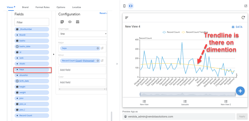
For the x axis, the dimention value is selected, but still we are able to draw trendline.
For other points. It looks odd to me, for some cases as datetime continuous value as selected axis, we are able to draw, but sometime we are not able to drow trendline. For the part part of this short video, you see, i swap the datetime filed from one to other. Then first datetime field not give trendline, while 2nd one gives.
–
On pie/donuts chart, once we select the items, I expected we will jump to the associated set of rows as either table or deck view whicheve the list type view, but strangely, we see detail view…
At the same tim,e we see noisy labels, percentages, row count and lbel names which are not control to show and hide.
–
Lastly, the most of the case where the trendline is useful which is scatter plot. But due to no control over the size of circle and colors (transparency level), trendline is hidden. Also, the tredline seems to be incorrect for some type. You see this on this video.
- Mark as New
- Bookmark
- Subscribe
- Mute
- Subscribe to RSS Feed
- Permalink
- Report Inappropriate Content
- Mark as New
- Bookmark
- Subscribe
- Mute
- Subscribe to RSS Feed
- Permalink
- Report Inappropriate Content
Additions. The auto generated count fileds are useful, but it is defined as dimension wrongly.
It should be correctly as measures.
–
Probably because of this, we are not able to throw count field to color where it should be supported.
- Mark as New
- Bookmark
- Subscribe
- Mute
- Subscribe to RSS Feed
- Permalink
- Report Inappropriate Content
- Mark as New
- Bookmark
- Subscribe
- Mute
- Subscribe to RSS Feed
- Permalink
- Report Inappropriate Content
Firsly, managed to draw the trendline with line char. I know the same is not supported on bar or area, other type of chart apart from scatter plot.
Once we change the chart type, still there is indication on minor section that type of trendline. THis indication may give confusion to the users . Why we have trendline type is indicate on the chart where the trendline is NOT supported.
- Mark as New
- Bookmark
- Subscribe
- Mute
- Subscribe to RSS Feed
- Permalink
- Report Inappropriate Content
- Mark as New
- Bookmark
- Subscribe
- Mute
- Subscribe to RSS Feed
- Permalink
- Report Inappropriate Content
HI Koichi,
I believe Ben is aware of the first set of issues with trendline and is in the process of fixing it.
For now he has implemented Trend line on Line chart in general and disabled it on Bar chart. So yes if you use categorical dimension on line chart it will allow you to compute a trendline but as you know you should not be using a line chart if you have categorical dimension on Major. It is not analytically accurate. SO I guess we could ask Ben to be more restrictive and only enable Trendline on Continuous filed in Major regardless of the chart type (Bar or line)… Something for Ben and Arthur to ponder on…
Pie/Donught. Being able to jump to underlying table is on the backlog and speced, just not implemented yet.
Customization of label is on the backlog and speced already, just not implemented yet.
Regarding scatter plot, control of size is also speced and on backlog but not implemented yet.
Regarding accuracy of trendline, I will let Ben comment on this.
Thierry
- Mark as New
- Bookmark
- Subscribe
- Mute
- Subscribe to RSS Feed
- Permalink
- Report Inappropriate Content
- Mark as New
- Bookmark
- Subscribe
- Mute
- Subscribe to RSS Feed
- Permalink
- Report Inappropriate Content
Yes, for me, it is meaningless to draw the trendline when we have dimension value as axis, but maybe just leave option as is basis, and let the app creator to decide.
I can not come up with immidiate use cases, but there might be.
Option is always an option, take it or not.
- Mark as New
- Bookmark
- Subscribe
- Mute
- Subscribe to RSS Feed
- Permalink
- Report Inappropriate Content
- Mark as New
- Bookmark
- Subscribe
- Mute
- Subscribe to RSS Feed
- Permalink
- Report Inappropriate Content
(2) I now see trendline once I click the “major” field (using Line chart). Bar chart has a Date/Time axis. Trendlines can be helpful there as well (but more often I am using new AREA chart – love that!). No big deal.
(5) I found the color drop zone, but as you said, only if I have a single measure. I still think option to have color selection would be good for every measure as it allows matching a color scheme.
(3) Really need the slider in mobile as well or the experience is inconsistent. Idea that user could “zoom” in a look closer at a dense chart is very compelling.
new: I created a Line, Area, and Bar chart in new editor, and they render fine in a browser, all three show as Bar charts in the iPhone app. Maybe not ready for mobile? Can you confirm if new charts are only working in web browser at this point (and not in mobile - like iPhone) @benhare
5APR: latest update: new charts are working on iphone. Not sure if coincidence or changes made by Dev team. Either way, works now - including filter slider! Two-finger pinch-zoom (i am sooo happy!). Very nice end user feature.
- Mark as New
- Bookmark
- Subscribe
- Mute
- Subscribe to RSS Feed
- Permalink
- Report Inappropriate Content
- Mark as New
- Bookmark
- Subscribe
- Mute
- Subscribe to RSS Feed
- Permalink
- Report Inappropriate Content
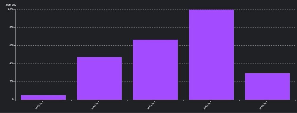
In some case, trendlines are useful and meaningful for bar charts.
- Mark as New
- Bookmark
- Subscribe
- Mute
- Subscribe to RSS Feed
- Permalink
- Report Inappropriate Content
- Mark as New
- Bookmark
- Subscribe
- Mute
- Subscribe to RSS Feed
- Permalink
- Report Inappropriate Content
We use a lot of pie/donut charts, and having the ability to select the color for each measure would be awesome.
All of the new feature and functionality adds are much appreciated.
Glen
- Mark as New
- Bookmark
- Subscribe
- Mute
- Subscribe to RSS Feed
- Permalink
- Report Inappropriate Content
- Mark as New
- Bookmark
- Subscribe
- Mute
- Subscribe to RSS Feed
- Permalink
- Report Inappropriate Content
I noticed that the mouse cursor changed across the entire axis adjuster bar, however it can only be dragged by grabbing on the end. Confused me for a solid couple of minutes.
- Mark as New
- Bookmark
- Subscribe
- Mute
- Subscribe to RSS Feed
- Permalink
- Report Inappropriate Content
- Mark as New
- Bookmark
- Subscribe
- Mute
- Subscribe to RSS Feed
- Permalink
- Report Inappropriate Content
HI Marc,
The horizontal and vertical axis adjuster bar can do 3 things. You can filter out form the left by dragging the left edge inward, you can filter values out form the right edge by dragging the right edge inward and then you can scroll the whole thing left and right after you have brought these edges inward. That is why the cursor changes, so that you can tank and handle of it and pan it left and right… Give it a try.
I agree it is not easily discoverable but when discovered, it is quite efficiently usable…
Thierry
- Mark as New
- Bookmark
- Subscribe
- Mute
- Subscribe to RSS Feed
- Permalink
- Report Inappropriate Content
- Mark as New
- Bookmark
- Subscribe
- Mute
- Subscribe to RSS Feed
- Permalink
- Report Inappropriate Content
Ohhhh. Cool!
- Mark as New
- Bookmark
- Subscribe
- Mute
- Subscribe to RSS Feed
- Permalink
- Report Inappropriate Content
- Mark as New
- Bookmark
- Subscribe
- Mute
- Subscribe to RSS Feed
- Permalink
- Report Inappropriate Content
HI all
First of all, many thanks to the AppSheet Team for doing such amazing job on it !
I’ve been waiting for that feature for a long time, happy to see it now ![]()
Some feedbacks (it may have been reported yet but I did not see it):
- if I use Dynamic Chart in a dashboard, with a gallery view in order to sort figures (interactive mode) ==> works pretty well, but if one item selected has no data to show, it stops the entire vie
example below:
AppSheet Community - dashbo... - I would use the ability to pick timeline view, or X axis items, as I would do in a dynamic chart on MS Excel (I’m asking a lot, I know
 ) For example, if I want to display X-axis weekly or monthly, I need to create both view from editor, I think it could be a good thing to leave that choice to user.
AppSheet Community - Time A...
another example with filtering X-axis (currently available with the toggle under the graph on AppSheet, but I don’t see how to pick to items that are not contiguous)
AppSheet Community - X-axis... - if I pick a ref column for legend, it could be nice to have label displayed instead of rows_ID. We can easily workaround it, but could be nice.
AppSheet Community - label_... - if I click on a bar with color, I will have access to one row from the whole dataset that was behind my chart, while I prefer to see the dataset table contributing to the bar which I’m clicking.
AppSheet Community - bar da...
I notice frequently a new feature on these charts : once again, many thanks and congratulations for the job you do !
- Mark as New
- Bookmark
- Subscribe
- Mute
- Subscribe to RSS Feed
- Permalink
- Report Inappropriate Content
- Mark as New
- Bookmark
- Subscribe
- Mute
- Subscribe to RSS Feed
- Permalink
- Report Inappropriate Content
Hey!
I did some small tests of the new diagrams.
And I want to add some comments:
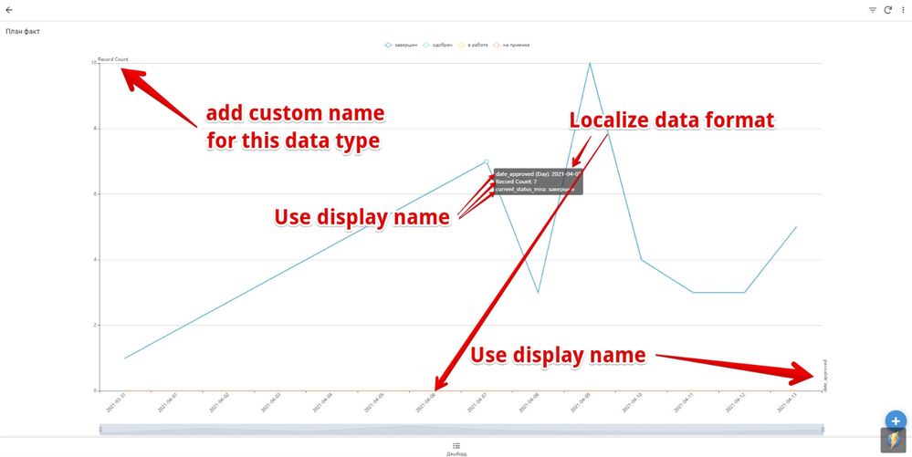
- Mark as New
- Bookmark
- Subscribe
- Mute
- Subscribe to RSS Feed
- Permalink
- Report Inappropriate Content
- Mark as New
- Bookmark
- Subscribe
- Mute
- Subscribe to RSS Feed
- Permalink
- Report Inappropriate Content
Hello all, and thank you for the interest in the feature. I do know that I have a bunch of things to do before launching this, and just since it’s come up a few times I wanted to mention that I know we have to use displace name properly and that the clickthrough is imperfect right now w.r.t. the data that you drill down into. As to other improvement requests - we’re looking through and prioritizing them and trying to figure out not just how to make the improvement happen on the chart, but also the best way to let people actually change the underlying property on the editor.
Again, thanks for the interest!
- Mark as New
- Bookmark
- Subscribe
- Mute
- Subscribe to RSS Feed
- Permalink
- Report Inappropriate Content
- Mark as New
- Bookmark
- Subscribe
- Mute
- Subscribe to RSS Feed
- Permalink
- Report Inappropriate Content
HI @benhare
Thanks for your efforts.
New Chart it’s not displaying anything anymore (not even axis).
Based on the tries I made, it seems the New Chart Feature stopped working, I’m in a discussion with Support to solve that.
@raketa, everything keeps working fine for you?
@benhare for information, is there a limit to:
- how many New Chart I can use ?
- how many New Chart can I use in a dashboard view ?
Many thanks in advance for your answers
- Mark as New
- Bookmark
- Subscribe
- Mute
- Subscribe to RSS Feed
- Permalink
- Report Inappropriate Content
- Mark as New
- Bookmark
- Subscribe
- Mute
- Subscribe to RSS Feed
- Permalink
- Report Inappropriate Content
Aurelien, hello!
I made a test and diagrams don’t work for me.
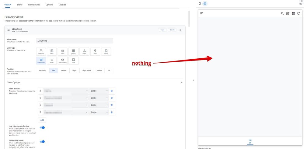
Namely, I can create a new view with a diagram, but nothing is displayed inside the admin panel. It’s the same on the user side.
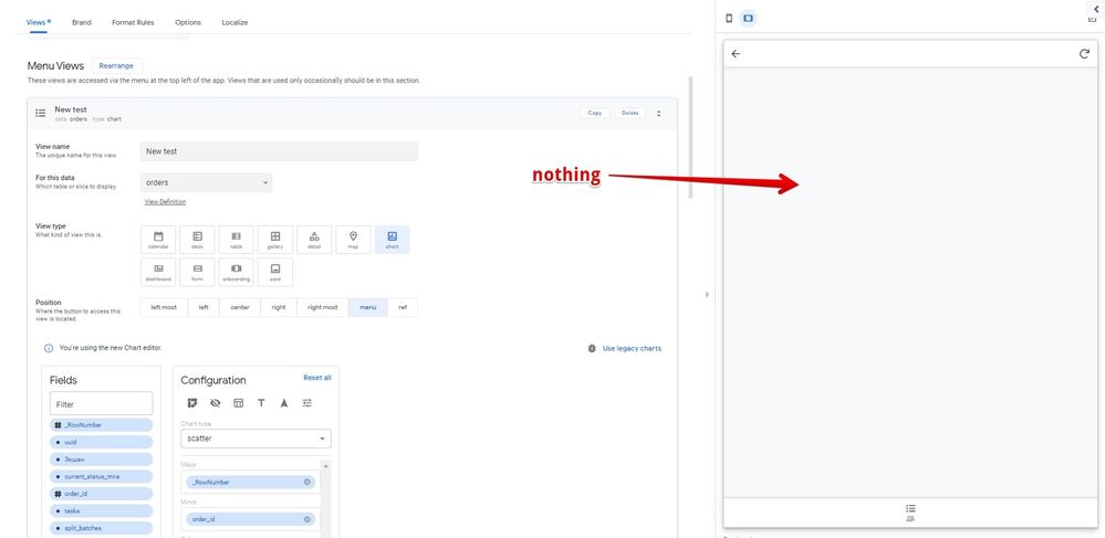
Plus, the dashboard type stopped working:
- Mark as New
- Bookmark
- Subscribe
- Mute
- Subscribe to RSS Feed
- Permalink
- Report Inappropriate Content
- Mark as New
- Bookmark
- Subscribe
- Mute
- Subscribe to RSS Feed
- Permalink
- Report Inappropriate Content
Thank you @raketa for your quick response.
I reported your post in my discussion with Support, you may want to contact them in order to solve that issue as well.
I’ll keep you updated if the situation gets back to normal on my side.
Cheers
- Mark as New
- Bookmark
- Subscribe
- Mute
- Subscribe to RSS Feed
- Permalink
- Report Inappropriate Content
- Mark as New
- Bookmark
- Subscribe
- Mute
- Subscribe to RSS Feed
- Permalink
- Report Inappropriate Content
I also made a support ticket.
- Mark as New
- Bookmark
- Subscribe
- Mute
- Subscribe to RSS Feed
- Permalink
- Report Inappropriate Content
- Mark as New
- Bookmark
- Subscribe
- Mute
- Subscribe to RSS Feed
- Permalink
- Report Inappropriate Content
Hi All,
i can confirm the issue!
I would like to follow this thread just to get some good news.
Thank you.
- Mark as New
- Bookmark
- Subscribe
- Mute
- Subscribe to RSS Feed
- Permalink
- Report Inappropriate Content
- Mark as New
- Bookmark
- Subscribe
- Mute
- Subscribe to RSS Feed
- Permalink
- Report Inappropriate Content
Hello all - apologies for this, made a mistake and broke the new charts. There is a fix for it which will go out today.
- Mark as New
- Bookmark
- Subscribe
- Mute
- Subscribe to RSS Feed
- Permalink
- Report Inappropriate Content
- Mark as New
- Bookmark
- Subscribe
- Mute
- Subscribe to RSS Feed
- Permalink
- Report Inappropriate Content
Everything works, thank you!
- Mark as New
- Bookmark
- Subscribe
- Mute
- Subscribe to RSS Feed
- Permalink
- Report Inappropriate Content
- Mark as New
- Bookmark
- Subscribe
- Mute
- Subscribe to RSS Feed
- Permalink
- Report Inappropriate Content
Back to normal, thanks ! ![]()
- Mark as New
- Bookmark
- Subscribe
- Mute
- Subscribe to RSS Feed
- Permalink
- Report Inappropriate Content
- Mark as New
- Bookmark
- Subscribe
- Mute
- Subscribe to RSS Feed
- Permalink
- Report Inappropriate Content
Ok that’s great to hear ![]()
- Mark as New
- Bookmark
- Subscribe
- Mute
- Subscribe to RSS Feed
- Permalink
- Report Inappropriate Content
- Mark as New
- Bookmark
- Subscribe
- Mute
- Subscribe to RSS Feed
- Permalink
- Report Inappropriate Content
Hi @benhare here are some questions:
- How does the Color field work?
- I would like to see the Number on the Bar. Is this possible?
- How is the Click Through working? It always opens the same random row.
- Mark as New
- Bookmark
- Subscribe
- Mute
- Subscribe to RSS Feed
- Permalink
- Report Inappropriate Content
- Mark as New
- Bookmark
- Subscribe
- Mute
- Subscribe to RSS Feed
- Permalink
- Report Inappropriate Content
Hi @benhare
Thanks a lot for your great job and new chart editor. It's look cool. But iI'm very frustrated. I have tryed many times, but anyway I can't find any way to change colors what i need. How is field "Color" works? Please lead me to correct way to change them. Thansk!
- Mark as New
- Bookmark
- Subscribe
- Mute
- Subscribe to RSS Feed
- Permalink
- Report Inappropriate Content
- Mark as New
- Bookmark
- Subscribe
- Mute
- Subscribe to RSS Feed
- Permalink
- Report Inappropriate Content
@benhare
It would be great if it would be possible to build a chart based on more than one table.
Are you thinking about it?
- Mark as New
- Bookmark
- Subscribe
- Mute
- Subscribe to RSS Feed
- Permalink
- Report Inappropriate Content
- Mark as New
- Bookmark
- Subscribe
- Mute
- Subscribe to RSS Feed
- Permalink
- Report Inappropriate Content
- So the color field can be used to add another dimension to your data, for instance coloring based on a categorical field will show the bars broken down by that field. Play around with it and let me know if you’re finding it un-intuitive, always looking for ways to make this more usable!
- I don’t exactly know how I’d do that, but it’s probably possible. I’d have to converse with some other people internally as I don’t think I’d want that to be the default option.
- Click Through is broken in some cases, I have an open bug for fixing that.
@11179 Hmm I haven’t been thinking about that actually. I wonder if you could do what you’re thinking of doing by creating an appropriate slice? Charts can be built off of slices along with just off of tables themselves.
- Mark as New
- Bookmark
- Subscribe
- Mute
- Subscribe to RSS Feed
- Permalink
- Report Inappropriate Content
- Mark as New
- Bookmark
- Subscribe
- Mute
- Subscribe to RSS Feed
- Permalink
- Report Inappropriate Content
Hi @benhare
Just added another new dynamic chart on a view, I just got to believe I broke my view again ![]()
But everything went back to normal once I removed it.
Is there a limit to the number of new dynamic Chart I can use ?
- Mark as New
- Bookmark
- Subscribe
- Mute
- Subscribe to RSS Feed
- Permalink
- Report Inappropriate Content
- Mark as New
- Bookmark
- Subscribe
- Mute
- Subscribe to RSS Feed
- Permalink
- Report Inappropriate Content
Hmm there shouldn’t be a limit. One thing that we’re doing that I’m curious about is that when you switch to a new chart you get no like, placeholder chart until you add data and it can give you a chart. Maybe that’s what you’re seeing? If not then I’m not sure.
- Mark as New
- Bookmark
- Subscribe
- Mute
- Subscribe to RSS Feed
- Permalink
- Report Inappropriate Content
- Mark as New
- Bookmark
- Subscribe
- Mute
- Subscribe to RSS Feed
- Permalink
- Report Inappropriate Content
I’m pretty sure there is data to show ![]()
It worked, until I added it to a dashboard view.
Then…boom ![]()
I just tried again to make sure.
Every dashboard view that used to work before I add a new dynamic chart to one of these dashboard, suddenly stop to display anything.
But if I keep the new dynamic chart aside, that’s OK.
Edit : Let me know if you need further information or access to my app.
- Mark as New
- Bookmark
- Subscribe
- Mute
- Subscribe to RSS Feed
- Permalink
- Report Inappropriate Content
- Mark as New
- Bookmark
- Subscribe
- Mute
- Subscribe to RSS Feed
- Permalink
- Report Inappropriate Content
Hello @benhare
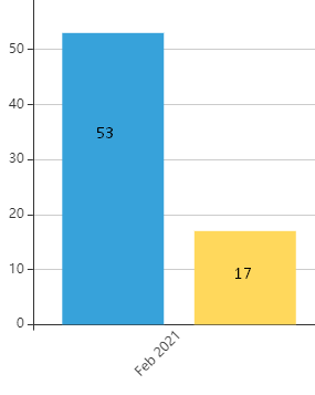
I found one bug (I believe it’s bug), old and new chart get different results:
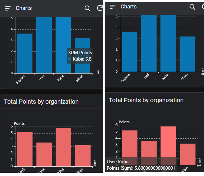
Blue is the old one with correct count 5,8 and the red one is new with wrong result: 5,8000000001
- Mark as New
- Bookmark
- Subscribe
- Mute
- Subscribe to RSS Feed
- Permalink
- Report Inappropriate Content
- Mark as New
- Bookmark
- Subscribe
- Mute
- Subscribe to RSS Feed
- Permalink
- Report Inappropriate Content
Thank you for finding that - I’ll log that in my backlog of work for charts. Can you share with me the configuration you used for this? Notably what aggregation function you’re using (sum/average/etc).
- Mark as New
- Bookmark
- Subscribe
- Mute
- Subscribe to RSS Feed
- Permalink
- Report Inappropriate Content
- Mark as New
- Bookmark
- Subscribe
- Mute
- Subscribe to RSS Feed
- Permalink
- Report Inappropriate Content
Hi @benhare
I have a question that comes straight to my head ![]()
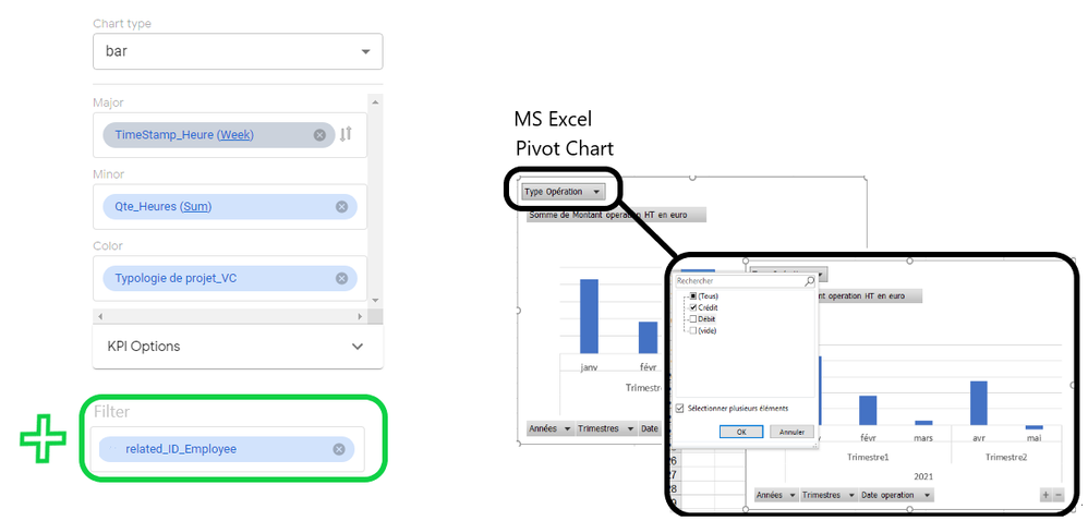
Do you know, by any chance, if filter in new chart are on the plan to be implemented, or should I make a feature request for it ?
Thanks ![]()
- Mark as New
- Bookmark
- Subscribe
- Mute
- Subscribe to RSS Feed
- Permalink
- Report Inappropriate Content
- Mark as New
- Bookmark
- Subscribe
- Mute
- Subscribe to RSS Feed
- Permalink
- Report Inappropriate Content
Hello @Aurelien, I don’t think something like this is on our roadmap. Just so I understand you - the wish here is for there to be a way to filter it beforehand (on the editor) or configure something that the users can then use to filter by (and add a similar dropdown to the one from your Excel screenshot)?
- Mark as New
- Bookmark
- Subscribe
- Mute
- Subscribe to RSS Feed
- Permalink
- Report Inappropriate Content
- Mark as New
- Bookmark
- Subscribe
- Mute
- Subscribe to RSS Feed
- Permalink
- Report Inappropriate Content
Yes, it is something that the users can use to filter datas, similar to the one on the Excel screenshot.
I had in mind something where you can set any column “OK to be used to filter datas”, such as Employee in my example, and then users can then decide to filter data with only John and Kelly, for example, or just John if they which to focus on him.
- Mark as New
- Bookmark
- Subscribe
- Mute
- Subscribe to RSS Feed
- Permalink
- Report Inappropriate Content
- Mark as New
- Bookmark
- Subscribe
- Mute
- Subscribe to RSS Feed
- Permalink
- Report Inappropriate Content
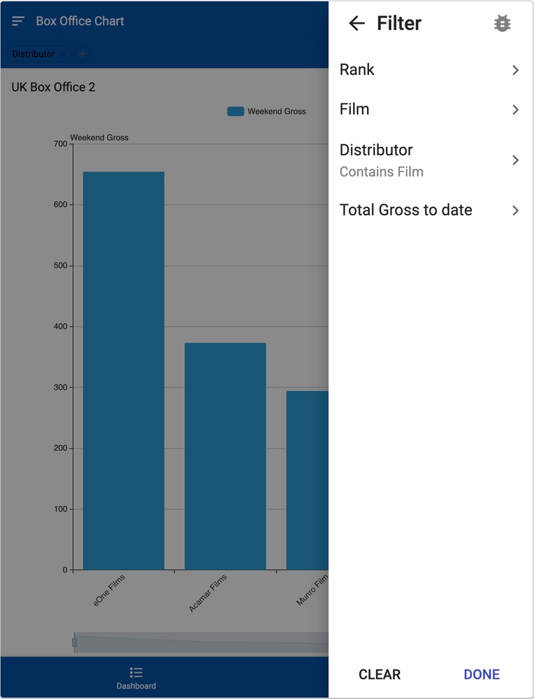
Here’s what you can already do if you’re willing to use features in the Preview Program (which seems to be the case since you’re using the new Chart Authoring experience).
1- You create a slice with the columns that you want your users to be able to visualize
2- In the table of that slice, check that the appropriate fields are marked as “Search”-able - this will let your users use a general filter (see Filters in AppSheet applications - in Preview Program)
3- Create your chart using the slice created in step 1
4- Your users should see your chart, and they will be able to access the general filter. If they specify filter values there, the chart should get updated.
There are a couple of caveats:
1- Both features are in the Preview Program and so we’re still working on it
2- A slice does not prevent your users to access the columns you left out of the slice and even though they won’t be able to filter your charts based on that, they might still see the data of these columns somewhere else. If you truly don’t want users to see these columns, you should consider using Security Filters.
3- The filter described above is general to the app and so you could end up a dead-end if you want to use a set of filters in one view and have different filter options in your chart view that are incompatible .
- Mark as New
- Bookmark
- Subscribe
- Mute
- Subscribe to RSS Feed
- Permalink
- Report Inappropriate Content
- Mark as New
- Bookmark
- Subscribe
- Mute
- Subscribe to RSS Feed
- Permalink
- Report Inappropriate Content
Awesome, thank you very much for this tip.
I will implement that as a temporary solution, I know about the filter feature but I didn’t think to use it in association to the Chart.
Many thanks !
-
Account
3 -
Announcements
30 -
App Management
8 -
Automation
33 -
Data
32 -
Errors
17 -
Expressions
21 -
Integrations
25 -
Intelligence
6 -
Other
15 -
Resources
15 -
Security
5 -
Templates
13 -
Users
7 -
UX
34

 Twitter