This website uses Cookies. Click Accept to agree to our website's cookie use as described in our Privacy Policy. Click Preferences to customize your cookie settings.
Turn on suggestions
Auto-suggest helps you quickly narrow down your search results by suggesting possible matches as you type.
Showing results for
- AppSheet
- AppSheet Forum
- AppSheet Q&A
- Charting/Graphs: Is there a way to use other field...
Topic Options
- Subscribe to RSS Feed
- Mark Topic as New
- Mark Topic as Read
- Float this Topic for Current User
- Bookmark
- Subscribe
- Mute
- Printer Friendly Page
Solved

Post Options
- Mark as New
- Bookmark
- Subscribe
- Mute
- Subscribe to RSS Feed
- Permalink
- Report Inappropriate Content
Reply posted on
--/--/---- --:-- AM
Post Options
- Mark as New
- Bookmark
- Subscribe
- Mute
- Subscribe to RSS Feed
- Permalink
- Report Inappropriate Content
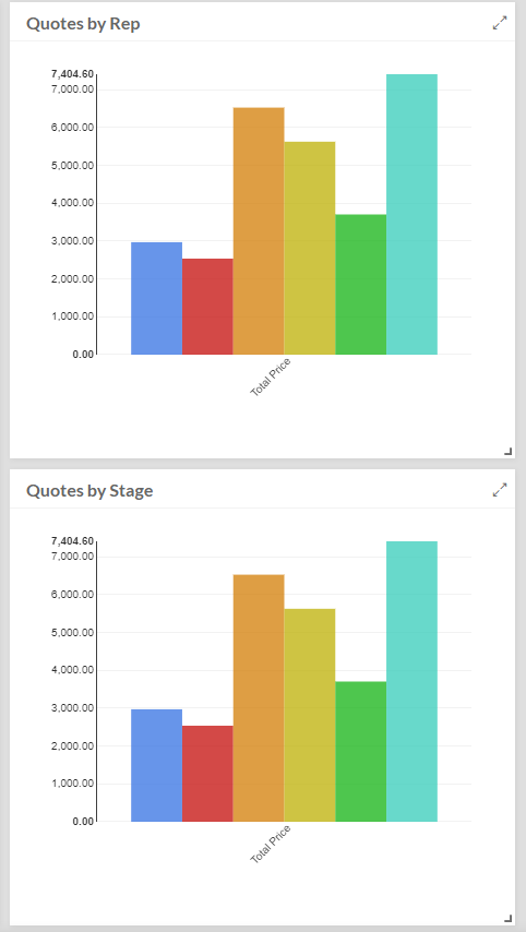
I have a client who’s extremely excited about the charting capability but find that unfortunately they’re limited to only the label associated with each table for the x-axis. If I change the label for the chart, this affects the remainder of the app screens. Client would like to see the value of quotes by sales rep and by quote stage - none of which are the main labels for the Quote table.
Has anyone found a way to handle this?
Thanks
3
2
668
Topic Labels
- Labels:
-
Data
2 REPLIES 2
Post Options
- Mark as New
- Bookmark
- Subscribe
- Mute
- Subscribe to RSS Feed
- Permalink
- Report Inappropriate Content
Reply posted on
--/--/---- --:-- AM
Post Options
- Mark as New
- Bookmark
- Subscribe
- Mute
- Subscribe to RSS Feed
- Permalink
- Report Inappropriate Content
Would like to know this answer as well
Post Options
- Mark as New
- Bookmark
- Subscribe
- Mute
- Subscribe to RSS Feed
- Permalink
- Report Inappropriate Content
Reply posted on
--/--/---- --:-- AM
Post Options
- Mark as New
- Bookmark
- Subscribe
- Mute
- Subscribe to RSS Feed
- Permalink
- Report Inappropriate Content
I will adopt @WillowMobileSystems suggestion to create other datasheets.
Top Labels in this Space
-
Account
1,857 -
Affiliate Program
1 -
App Management
4,130 -
AppSheet
1 -
Automation
11,539 -
Best Practice
1 -
Bug
1,569 -
Cloud Deploy
1 -
core
1 -
Data
10,838 -
Errors
6,533 -
Expressions
13,055 -
free
1 -
General Miscellaneous
1 -
image and text
1 -
Integration
1 -
Integrations
1,971 -
Intelligence
690 -
Introductions
117 -
Learning Hub
1 -
Other
3,383 -
Panel
1 -
Photos
1 -
plans
1 -
Resources
682 -
Security
931 -
subscription
1 -
Templates
1,539 -
Users
1,817 -
UX
9,812
- « Previous
- Next »
Top Solution Authors
| User | Count |
|---|---|
| 15 | |
| 11 | |
| 9 | |
| 8 | |
| 4 |

 Twitter