This website uses Cookies. Click Accept to agree to our website's cookie use as described in our Privacy Policy. Click Preferences to customize your cookie settings.
Turn on suggestions
Auto-suggest helps you quickly narrow down your search results by suggesting possible matches as you type.
Showing results for
- AppSheet
- AppSheet Forum
- AppSheet Q&A
- Deck view summary column
Topic Options
- Subscribe to RSS Feed
- Mark Topic as New
- Mark Topic as Read
- Float this Topic for Current User
- Bookmark
- Subscribe
- Mute
- Printer Friendly Page
Solved

Post Options
- Mark as New
- Bookmark
- Subscribe
- Mute
- Subscribe to RSS Feed
- Permalink
- Report Inappropriate Content
Reply posted on
--/--/---- --:-- AM
Post Options
- Mark as New
- Bookmark
- Subscribe
- Mute
- Subscribe to RSS Feed
- Permalink
- Report Inappropriate Content
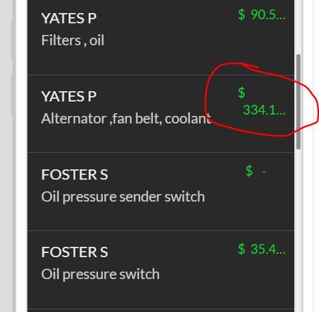
Hi, Should m deck view summary column look like this?
Solved! Go to Solution.
1 ACCEPTED SOLUTION
Post Options
- Mark as New
- Bookmark
- Subscribe
- Mute
- Subscribe to RSS Feed
- Permalink
- Report Inappropriate Content
Reply posted on
--/--/---- --:-- AM
Post Options
- Mark as New
- Bookmark
- Subscribe
- Mute
- Subscribe to RSS Feed
- Permalink
- Report Inappropriate Content
I think the Deck View is one of the strongest views in the app but does have limitations like this that make it a challenge and more limited than I think it could be. One solution is to use Format Rules in the UX to shrink your text for that column so more can fit.
8 REPLIES 8
Top Labels in this Space
-
Account
1,870 -
App Management
4,181 -
Automation
11,604 -
Bug
1,614 -
Data
10,917 -
Errors
6,602 -
Expressions
13,119 -
Integrations
1,992 -
Intelligence
702 -
Introductions
119 -
Other
3,421 -
Resources
689 -
Security
937 -
Templates
1,551 -
Users
1,828 -
UX
9,854
- « Previous
- Next »
Top Solution Authors
| User | Count |
|---|---|
| 16 | |
| 11 | |
| 7 | |
| 3 | |
| 2 |

 Twitter