This website uses Cookies. Click Accept to agree to our website's cookie use as described in our Privacy Policy. Click Preferences to customize your cookie settings.
Turn on suggestions
Auto-suggest helps you quickly narrow down your search results by suggesting possible matches as you type.
Showing results for
Announcements
This site is in read only until July 22 as we migrate to a new platform; refer to this community post for more details.
- AppSheet
- AppSheet Forum
- AppSheet Q&A
- Is it possible to create a Stack chart using aggre...
Topic Options
- Subscribe to RSS Feed
- Mark Topic as New
- Mark Topic as Read
- Float this Topic for Current User
- Bookmark
- Subscribe
- Mute
- Printer Friendly Page
Solved

Post Options
- Mark as New
- Bookmark
- Subscribe
- Mute
- Subscribe to RSS Feed
- Permalink
- Report Inappropriate Content
Reply posted on
--/--/---- --:-- AM
Post Options
- Mark as New
- Bookmark
- Subscribe
- Mute
- Subscribe to RSS Feed
- Permalink
- Report Inappropriate Content
Hi, is it possible to create a Stack chart using aggregate (group / count) of columns?
Selecting Horizontal Histogram I have then the option to group aggregate via Count:
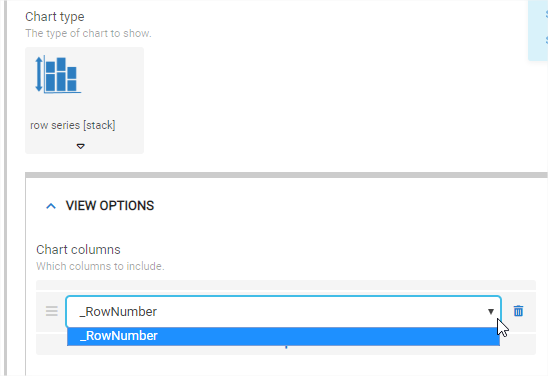
However, when selecting Row Series (Stack) chart type, there is no option to Group Aggregate. Furthermore, I can not see any of my columns in the drop-down…
I want to create this horizontal bars chart of Abandonments by month, but Stacked: i.e. composed of Justified (green) and Not Justified (red) abandonments.
I tried creating some helper columns in the google sheet to follow the example of Stacked Chart of the manual, however could not include them in the Row Series Stack chart above because it would not show any of my columns in the dropdown…
Help!
thanks
0
6
1,948
Topic Labels
- Labels:
-
UX
6 REPLIES 6
Top Labels in this Space
-
Account
1,879 -
App Management
4,228 -
Automation
11,650 -
Bug
1,648 -
Data
10,961 -
Errors
6,647 -
Expressions
13,170 -
Integrations
2,005 -
Intelligence
706 -
Introductions
121 -
Login
1 -
Other
3,446 -
Resources
694 -
Security
943 -
Templates
1,558 -
Users
1,836 -
UX
9,887
- « Previous
- Next »
Top Solution Authors
| User | Count |
|---|---|
| 36 | |
| 9 | |
| 3 | |
| 3 | |
| 2 |

 Twitter


