This website uses Cookies. Click Accept to agree to our website's cookie use as described in our Privacy Policy. Click Preferences to customize your cookie settings.
Turn on suggestions
Auto-suggest helps you quickly narrow down your search results by suggesting possible matches as you type.
Showing results for
- AppSheet
- :
- AppSheet Forum
- :
- AppSheet Q&A
- :
- Re: Stacked Chart
Topic Options
- Subscribe to RSS Feed
- Mark Topic as New
- Mark Topic as Read
- Float this Topic for Current User
- Bookmark
- Subscribe
- Mute
- Printer Friendly Page
Solved

Post Options
- Mark as New
- Bookmark
- Subscribe
- Mute
- Subscribe to RSS Feed
- Permalink
- Report Inappropriate Content
Reply posted on
--/--/---- --:-- AM
Post Options
- Mark as New
- Bookmark
- Subscribe
- Mute
- Subscribe to RSS Feed
- Permalink
- Report Inappropriate Content
Hi All
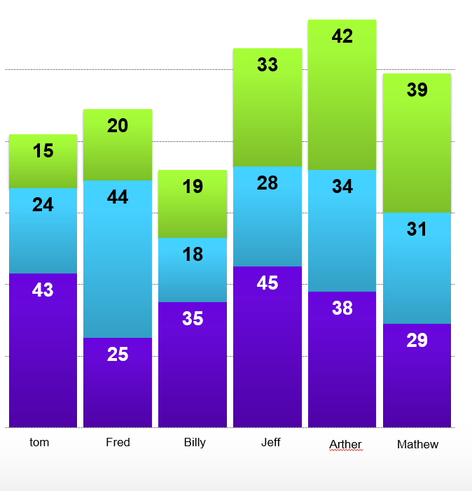
I need to create a stacked chart like the following:

Each colour of each column denotes a count of hours per day. How would I need to construct my table to recreate the chart?
Cheers
0
3
994
Topic Labels
- Labels:
-
Data
3 REPLIES 3
Post Options
- Mark as New
- Bookmark
- Subscribe
- Mute
- Subscribe to RSS Feed
- Permalink
- Report Inappropriate Content
Reply posted on
--/--/---- --:-- AM
Post Options
- Mark as New
- Bookmark
- Subscribe
- Mute
- Subscribe to RSS Feed
- Permalink
- Report Inappropriate Content
Hi @Dave_Willett,
Just in case you have not, could you take a look at the following article and section " Column/Row Series [Stack]" in that article. The section describes the required table structure.
Post Options
- Mark as New
- Bookmark
- Subscribe
- Mute
- Subscribe to RSS Feed
- Permalink
- Report Inappropriate Content
Reply posted on
--/--/---- --:-- AM
Post Options
- Mark as New
- Bookmark
- Subscribe
- Mute
- Subscribe to RSS Feed
- Permalink
- Report Inappropriate Content
Each person would be a row, with the column containing the name as the label column. And as you said, each color(day) would be a column. Then when you create the chart view, you select ‘col series (stack)’ and add each color(day) column to the ‘chart columns’ section.
Post Options
- Mark as New
- Bookmark
- Subscribe
- Mute
- Subscribe to RSS Feed
- Permalink
- Report Inappropriate Content
Reply posted on
--/--/---- --:-- AM
Post Options
- Mark as New
- Bookmark
- Subscribe
- Mute
- Subscribe to RSS Feed
- Permalink
- Report Inappropriate Content
Thanks guys, I’ll give it a go. Much appreciated
Top Labels in this Space
-
!
1 -
Account
1,688 -
App Management
3,153 -
AppSheet
1 -
Automation
10,395 -
Bug
1,010 -
Data
9,741 -
Errors
5,782 -
Expressions
11,871 -
General Miscellaneous
1 -
Google Cloud Deploy
1 -
image and text
1 -
Integrations
1,631 -
Intelligence
588 -
Introductions
87 -
Other
2,941 -
Photos
1 -
Resources
546 -
Security
837 -
Templates
1,322 -
Users
1,566 -
UX
9,143
- « Previous
- Next »
Top Solution Authors
| User | Count |
|---|---|
| 33 | |
| 31 | |
| 30 | |
| 19 | |
| 18 |

 Twitter