This website uses Cookies. Click Accept to agree to our website's cookie use as described in our Privacy Policy. Click Preferences to customize your cookie settings.
Turn on suggestions
Auto-suggest helps you quickly narrow down your search results by suggesting possible matches as you type.
Showing results for
- AppSheet
- AppSheet Forum
- AppSheet Q&A
- Text & Image Alignment in a Onboarding View
Topic Options
- Subscribe to RSS Feed
- Mark Topic as New
- Mark Topic as Read
- Float this Topic for Current User
- Bookmark
- Subscribe
- Mute
- Printer Friendly Page
Solved

Post Options
- Mark as New
- Bookmark
- Subscribe
- Mute
- Subscribe to RSS Feed
- Permalink
- Report Inappropriate Content
Reply posted on
--/--/---- --:-- AM
Post Options
- Mark as New
- Bookmark
- Subscribe
- Mute
- Subscribe to RSS Feed
- Permalink
- Report Inappropriate Content


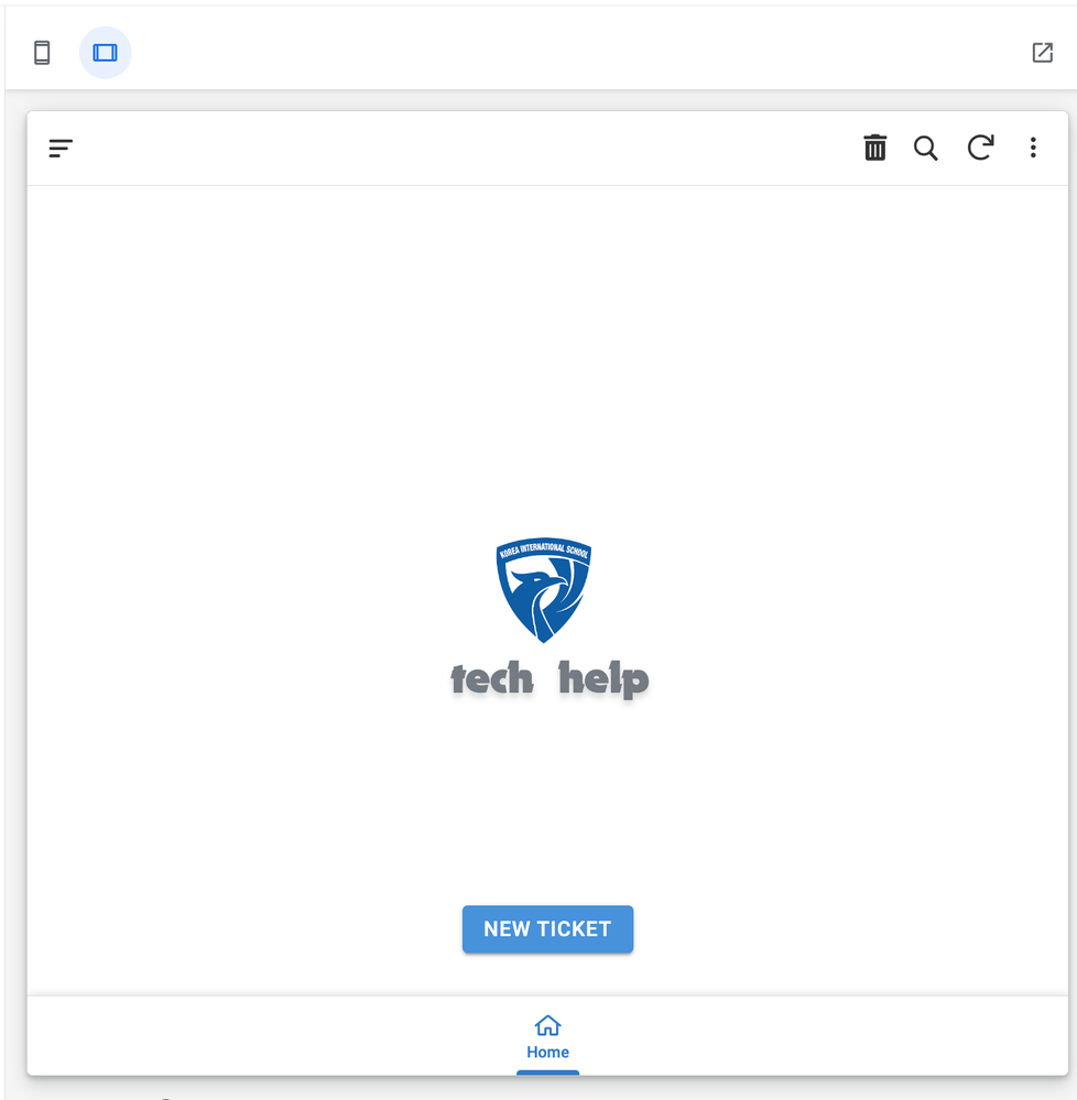
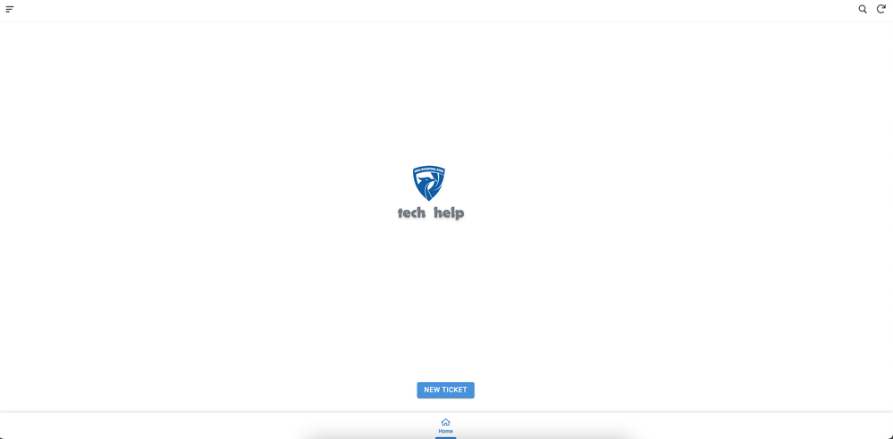
1. Why is this happening?
2. Is there any options to customize text alignment in the AppSheet Onboarding view?
Solved! Go to Solution.
1 ACCEPTED SOLUTION
Post Options
- Mark as New
- Bookmark
- Subscribe
- Mute
- Subscribe to RSS Feed
- Permalink
- Report Inappropriate Content
Reply posted on
--/--/---- --:-- AM
Post Options
- Mark as New
- Bookmark
- Subscribe
- Mute
- Subscribe to RSS Feed
- Permalink
- Report Inappropriate Content
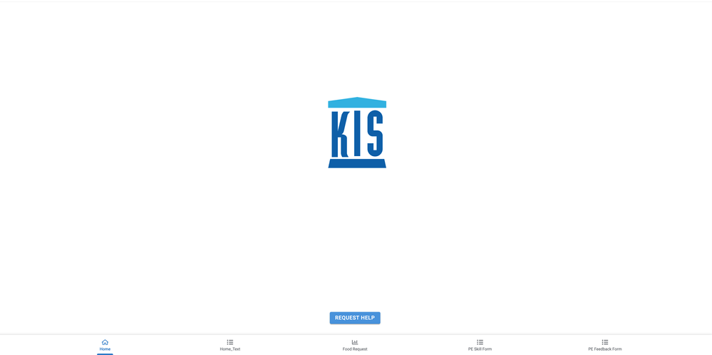
Here is my solution:


3 REPLIES 3
Top Labels in this Space
-
Account
1,873 -
App Management
4,200 -
Automation
11,627 -
Bug
1,628 -
Data
10,936 -
Errors
6,620 -
Expressions
13,141 -
Integrations
1,995 -
Intelligence
704 -
Introductions
119 -
Login
1 -
Other
3,430 -
Resources
691 -
Security
939 -
Templates
1,554 -
Users
1,833 -
UX
9,869
- « Previous
- Next »
Top Solution Authors
| User | Count |
|---|---|
| 16 | |
| 15 | |
| 4 | |
| 3 | |
| 2 |

 Twitter