- AppSheet
- AppSheet Forum
- AppSheet Q&A
- Re: Pie chart colors applied to [COLOR] and switch...
- Subscribe to RSS Feed
- Mark Topic as New
- Mark Topic as Read
- Float this Topic for Current User
- Bookmark
- Subscribe
- Mute
- Printer Friendly Page
- Mark as New
- Bookmark
- Subscribe
- Mute
- Subscribe to RSS Feed
- Permalink
- Report Inappropriate Content
- Mark as New
- Bookmark
- Subscribe
- Mute
- Subscribe to RSS Feed
- Permalink
- Report Inappropriate Content
@tony @morgan @Aleksi I’m having trouble with pie chart colors similar to the following post: [Pie chart colors! Is there a way to tie spec]
However, rather than using an ENUM column, I’m using a COLOR column with a single option “Green” that renders as a checkbox in a form. An IF expression changes the color of a STATUS column (box checked = GREEN, box unchecked=RED) and a switch expression is used to create more meaningful labels for the chart legend - SWITCH([DAILY], “Green”, “complete”, “Red”, “not done”, “”).
I would like for the “Green” (or “complete”, after the switch expression) to be rendered in the green color in the pie chart and “Red” (or “not done”) to be red in the pie chart. However, as in the referenced post, the pie chart colors seem to be applied in descending order as configured in the UX/Chart/View Options/Chart Colors rather than applied strictly by category.
Any suggestions? Thanks in advance!
Solved! Go to Solution.
- Mark as New
- Bookmark
- Subscribe
- Mute
- Subscribe to RSS Feed
- Permalink
- Report Inappropriate Content
- Mark as New
- Bookmark
- Subscribe
- Mute
- Subscribe to RSS Feed
- Permalink
- Report Inappropriate Content
It will display in alphabetical order but when there is no data for a category it will skip that one, so for example if all of your statuses are “Not Done” it will incorrectly use the first color instead of the second. There is no way to set the color dynamically like you want (but that seems like a reasonable feature request).
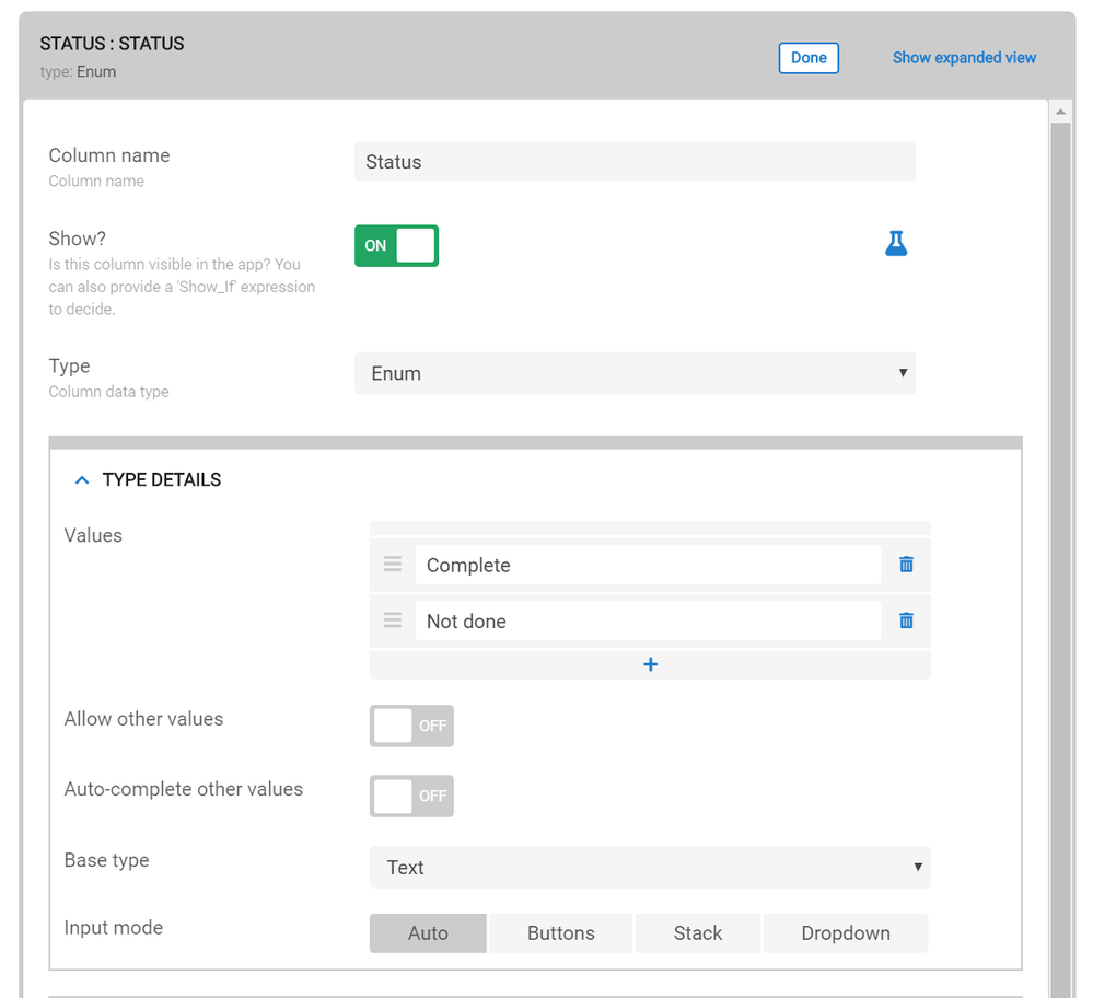
To workaround this, I recommend you change your label type to an enum and be sure to add the two options: “Complete”, “Not Done” then the color order should always match even when one of the categories is empty.
Like this:

- Mark as New
- Bookmark
- Subscribe
- Mute
- Subscribe to RSS Feed
- Permalink
- Report Inappropriate Content
- Mark as New
- Bookmark
- Subscribe
- Mute
- Subscribe to RSS Feed
- Permalink
- Report Inappropriate Content
Any thoughts on this inquiry?
- Mark as New
- Bookmark
- Subscribe
- Mute
- Subscribe to RSS Feed
- Permalink
- Report Inappropriate Content
- Mark as New
- Bookmark
- Subscribe
- Mute
- Subscribe to RSS Feed
- Permalink
- Report Inappropriate Content
As far as I know, chart column colors are ordered alphabetically based on the label column. So in your case you should be able to use your label column with “Green” followed by “Red” in your aggregate pie chart, because “complete” is before “not done” alphabetically.
The color column is not used directly in this case (only to compute your label column) and color is determined by that the order specified in the aggregate pie chart view.
If doesn’t work, let me know, I’m happy to follow-up on this.
- Mark as New
- Bookmark
- Subscribe
- Mute
- Subscribe to RSS Feed
- Permalink
- Report Inappropriate Content
- Mark as New
- Bookmark
- Subscribe
- Mute
- Subscribe to RSS Feed
- Permalink
- Report Inappropriate Content
@nico, apologies for the late response, I didn’t see your post come through. My understanding is the same as yours - alphabetical order. However, that is not the behavior I’m seeing in my app - at least not at the start of the day. At the start of the day, our daily tasks haven’t been done yet, so I would expect to see a pie chart that is all red in color and labeled “not done”. Instead, I see a pie chart that is all green in color and labeled “not done”.
As tasks are completed and both “complete”, and “not done” appear on the graph then the colors and labels match up.
Any thoughts? again, apologies for the very late reply.
- Mark as New
- Bookmark
- Subscribe
- Mute
- Subscribe to RSS Feed
- Permalink
- Report Inappropriate Content
- Mark as New
- Bookmark
- Subscribe
- Mute
- Subscribe to RSS Feed
- Permalink
- Report Inappropriate Content
It will display in alphabetical order but when there is no data for a category it will skip that one, so for example if all of your statuses are “Not Done” it will incorrectly use the first color instead of the second. There is no way to set the color dynamically like you want (but that seems like a reasonable feature request).
To workaround this, I recommend you change your label type to an enum and be sure to add the two options: “Complete”, “Not Done” then the color order should always match even when one of the categories is empty.
Like this:

- Mark as New
- Bookmark
- Subscribe
- Mute
- Subscribe to RSS Feed
- Permalink
- Report Inappropriate Content
- Mark as New
- Bookmark
- Subscribe
- Mute
- Subscribe to RSS Feed
- Permalink
- Report Inappropriate Content
@nico thanks! Enum column type works a treat. Why does this work and text columns doesn’t?

- Mark as New
- Bookmark
- Subscribe
- Mute
- Subscribe to RSS Feed
- Permalink
- Report Inappropriate Content
- Mark as New
- Bookmark
- Subscribe
- Mute
- Subscribe to RSS Feed
- Permalink
- Report Inappropriate Content
The reason is with that a enum has the complete list of statuses whereas the text type it guesses by looking at the data in the spreadsheet. When they are all the same it will assume there is just one status when there are in fact two but one of them (“complete”) has 0 entries.
At any rate, I’m glad this worked for you!
-
Account
1,878 -
App Management
4,219 -
Automation
11,644 -
Bug
1,641 -
Data
10,953 -
Errors
6,635 -
Expressions
13,158 -
Integrations
2,001 -
Intelligence
706 -
Introductions
120 -
Login
1 -
Other
3,440 -
Resources
691 -
Security
941 -
Templates
1,555 -
Users
1,834 -
UX
9,880
- « Previous
- Next »
| User | Count |
|---|---|
| 28 | |
| 14 | |
| 3 | |
| 3 | |
| 3 |

 Twitter